Question:
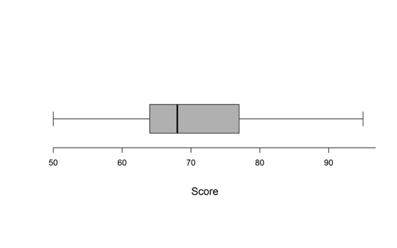
The boxplot below describes standardized test scores for 1031 students.
 Which of the following statements must be true?
(A) At least 60% of the students scored less than 70 on the test.
(B) At least 60% of the students scored greater than 70 on the test.
(C) At least 30% of the students scored less than 70 on the test.
(D) At least 30% of the students scored greater than 70 on the test.
Level:
Intermediate
Standards
6.SP.4: Display numerical data in plots on a number line, including dot plots, histograms, and box plots.
S-ID.1: Represent data with plots on the real number line (dot plots, histograms, and box plots).
Correct answer and commentary
Student performance
The correct answer to this question is Option (C). A boxplot is a visual representation of the five-number summary of a dataset: minimum, first quartile (Q1), median (second quartile, Q2), third quartile (Q3), and maximum. In a traditional boxplot, the whiskers extend to the minimum and maximum, and the three vertical lines of the box represent the first quartile, median, and third quartile. The length of the box (Q3 minus Q1) is the interquartile range (IQR), a measure of variability. There are variations on this basic construction that are often used in practice (e.g., the whiskers may extend to the lowest and highest non-outlier points and outliers are then indicated with points), but the purpose and use is generally the same. Boxplots display the values below which 25%, 50%, and 75% of the data can be found. These are ordinal statistics that can be used with datasets for which the mean and standard deviation are not appropriate measures (e.g., datasets that are skewed or have outliers).
Of the four answer choices, only Option (C) is correct. That option states that at least 30% of the students scored less than 70 on the test, and it is correct because the median is below 70. If the median is below 70, then at least 50% scored less than 70 on the test. Because the median is clearly below 70, option (B) is false because no more than 50% scored higher than the median, which is less than 70.
Options (A) and (D) are both tempting incorrect answers, since one may be inclined to believe that students’ scores are distributed in a somewhat continuous fashion throughout the range of the data (e.g., uniformly throughout or following some bell-shaped distribution). Even though this may be a reasonable assumption, it is an assumption that cannot be justified using a boxplot alone. It is possible that not a single student scored between the median value and 70. If nobody scored between the median and 70, then we cannot say that “at least 60% of the students scored less than 70 on the test” so Option (A) is incorrect. Similarly, it may be that every student who scored between the median and the 3rd quartile scored less than 70 and nobody scored between 70 and the 3rd quartile. In this case, we would not be able to say that “at least 30% of the students scored greater than 70 on the test” so Option (D) is incorrect.
If the raw data, a dot plot, or a histogram with sufficiently narrow bin widths were available, the assumption underlying Options (A) and (D) may be supported. Without these, however, only Option (C) is supported by the boxplot.