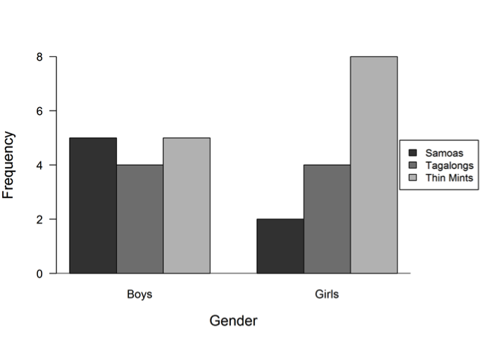
Samoas, Tagalongs, and Thin Mints are the most popular types of Girl Scout cookies in a school. Students in a sixth-grade class want to know which of the three types of cookies their classmates like the most. They also want to know how the popularity of the three types of cookies compares between boys and girls. Data from a class survey are summarized in the bar graphs below.
 (a) Which of the three types of cookies is most popular for the class? Justify your response.
(b) Which of the three types of cookies is least popular for the class? Justify your response.
(c) Were girls or boys more variable in their choices for favorite cookie? Justify your response.
Overview of the question
Question 1 is designed to assess the student’s ability to:
1. Use data presented in bar graphs to answer questions about the number of data points in a category.
2. Use bar graphs to compare the variability in categorical data for two groups.
Ideal response and scoring
Part (a):
An ideal response to part (a) recognizes that the data must be combined across the two groups (boys and girls) to determine which cookie is most popular for the whole class. Thin Mints should be identified as the top choice with a justification that explicitly refers to combining the results: 5+2=7 students like Samoas the best, 4+4=8 students like Tagalongs the best, and 5+8=13 students like Thin Mints the best. If the top choice is identified for each gender separately or the justification provided is weak, the response is considered only partially correct. An answer with no justification (e.g., “Thin Mints”) is considered incorrect.
Part (b):
Similarly, an ideal response to part (b) recognizes that the data must be combined across the two groups (boys and girls) to determine which cookie is least popular for the whole class. Samoas should be identified as the least popular choice with a justification that explicitly refers to the combined results from part (a). If the least popular choice is identified for each gender separately or the justification provided is weak, the response is considered only partially correct. An answer with no justification (e.g., “Samoas”) is considered incorrect.
Part (c):
An ideal response to part (c) recognizes that categorical data are highly variable when there are similar numbers of data points in each category. Since four or five boys chose each of the three types of cookies, there is much disagreement among the boys about which type of cookie is best; that is, the boys’ responses are highly variable. In contrast, because more than half of the girls agree that they like Thin Mints, there is some consensus among the girls that Thin Mints are best. Thus, the boys’ choices were more variable than the girls’ choices. If the justification provided is weak, the response is considered only partially correct. An answer with no justification (e.g., “boys”) is considered incorrect.
Sample responses indicating solid understanding
The following student response shows a good understanding of the concepts assessed by this question and received a score of 4. Thin Mints are correctly chosen as the most popular cookie in part (a) and Samoas are correctly chosen as the least popular cookie in part (b) with justification based on adding the boys’ and girls’ votes together. The response in part (c) recognizes that the boys’ choices were more variable, because their votes were evenly spread, while the girls’ choices were less variable, because there was a clear favorite. With all three parts essentially correct, this student response received a score of 4.


 There are a variety of ways that a student could phrase the explanation in part (c). For example, the following responses were also scored as essentially correct.


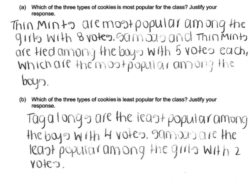
 Some students read the bar graphs correctly, but they did not combine the data across the genders to find the most and least popular cookies in the class. Instead they reported the most and least popular cookies for each gender separately, which was scored as partially correct. An example is given below.
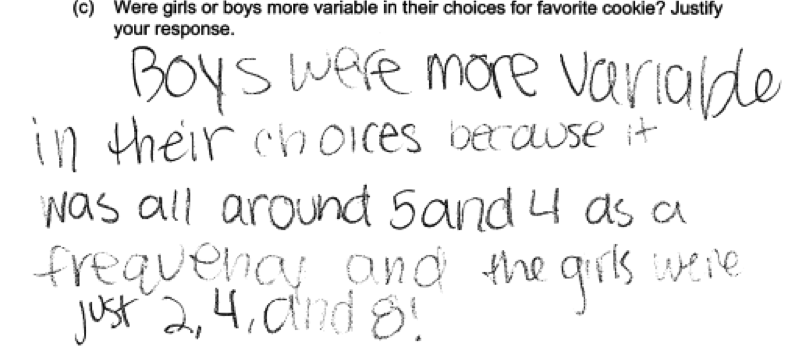
 Some students who correctly concluded that the boys were more variable in their choices did not provide clear explanations of their reasoning. The following response was scored as partially correct for part (c) because the explanation does not clearly demonstrate understanding of the concept of variability in categorical data.
Common misunderstandings
Parts (a) and (b) ask students to use data presented in bar graphs to answer questions about the number of data points in a category.
Many students answered parts (a) and (b) correctly. Responses that were not considered essentially correct on parts (a) and (b) generally made one of two errors. Some identified the most and least popular cookies without showing their work. Others identified the most and least popular cookies for each gender and did not combine the data across groups. It is important that students read the question carefully and provide all of the information requested.
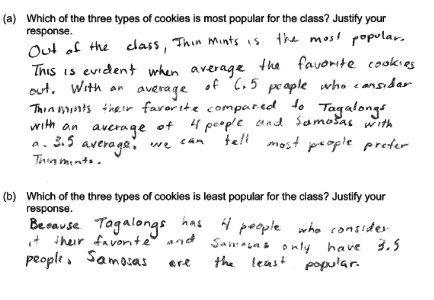
A few students combined the data from the two groups by averaging frequencies across genders. Although comparing these averages leads to the same conclusion as comparing class totals, the mean of two frequencies is not an easily interpretable statistic. Students who calculated averages often referred to the values as if they were totals in the explanation. The following response was scored as partially correct.
Part (c) asks students to use bar graphs to compare the variability in categorical data for two groups.
On part (c), many student responses demonstrated the misconception that variability in categorical data is determined by variability in the heights of the bars or the frequencies themselves. These responses demonstrate a lack of understanding of how the graphical representation relates to the context. As discussed above, one category that contains more data points than the others (one bar that is considerably taller than the others) actually represents consensus and lower variability. On the other hand, similar numbers of data points in each category (bars of fairly even heights) represents greater variability in the students’ choices. The responses below illustrate how attention to variability in the heights of the bars or the frequencies themselves results in an incorrect conclusion:

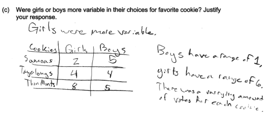
 Some responses more explicitly referenced the variability in frequencies by treating the frequencies as quantitative data. The range is a measure of variability for quantitative data, but calculating the range of these frequencies is not meaningful. The student response below indicates that the girls’ choices were more variable because the girls have a larger “range.”
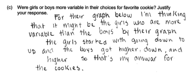
 Other responses attended to patterns in the bar heights. Because these data are categorical and not ordered, patterns in the bar heights are not meaningful. The responses below incorrectly identify the girls’ choices as more variable, because they consistently increase (from left to right) or that the pattern in the boys’ choices is “non-organized," with an incorrect understanding of variability atttibuted to the alternating bar heights.

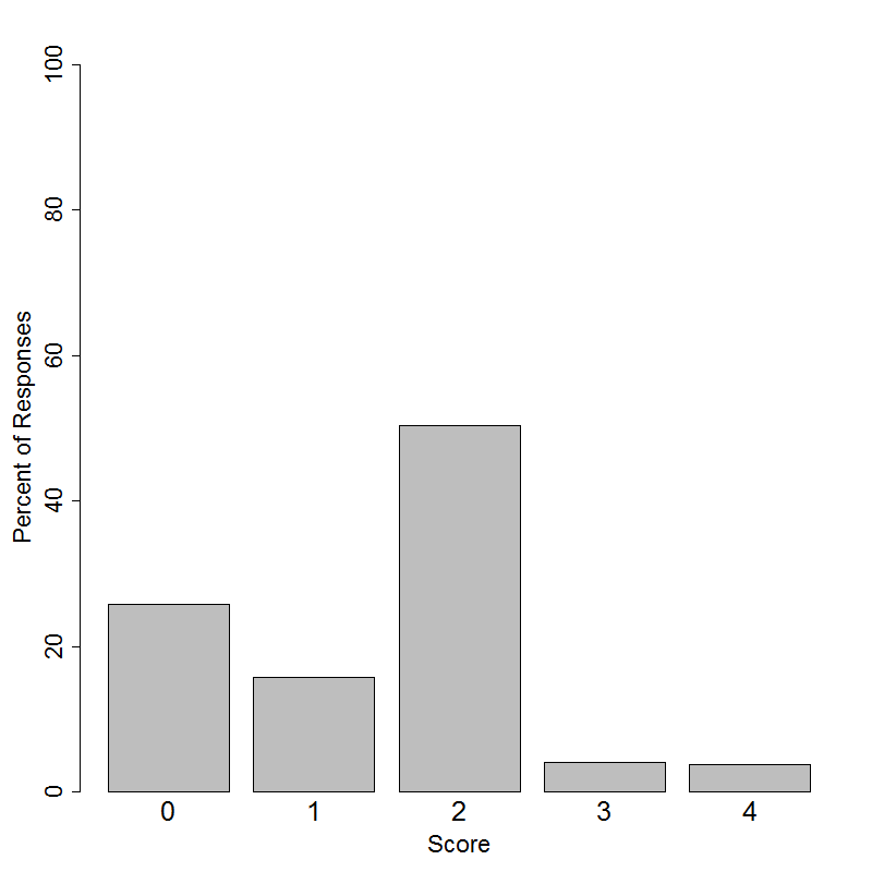
Student performance
Resources
The ability to use data presented in bar graphs to answer questions and compare distributions is an important skill for data analysis.
More information about this topic can be found in the following resources.
Free Resources
Lessons
Statistics Education on the Web (STEW) has peer reviewed lessons related to the use of bar graphs:
Spinners at the School Carnival (Equal Sections)
Spinners at the School Carnival (Unequal Sections)
Lesson plans related to bar graphs do not always attend to variability in categorical data, but lessons can be extended using follow-up questions appropriate for the context. For example, students may be asked to consider which is more variable: Girls’ choices for favorite candy or boys’ choices? The outcomes of a spinner with equal sections or the outcomes of a spinner with one section that is much larger than the others?
Classroom and Assessment Tasks
Illustrative Mathematics has peer reviewed tasks that are indexed by Common Core Standard. Standard 1.MD.C.4 involves organizing, representing, and interpreting categorical data. The tasks linked below, appropriate for young children, can be extended to illustrate combining data across groups.
Guidelines for Assessment and Instruction in Statistics Education (GAISE)
Published by the American Statistical Association and available online, this document contains an example of using bar graphs to compare groups on pages 39 – 40.
Common Core Progressions Documents
A discussion of the how understanding categorical data supports understanding of more advanced statistical topics and how this content might be developed in the classroom can be found in Common Core Tools progressions document for categorical data in grades 2 – 5.
Resources from the National Council of Teachers of Mathematics
The NCTM publication Navigating through Data Analysis and Probability in Grades K – 2 includes a chapter titled “Data Collection, Organization, and Display” that is related to the concepts assessed in this question.
The NCTM publication Developing Essential Understanding of Statistics in Grades 6 – 8 includes a section on the big idea “Variability in Data and Distributions.” See the discussion on pages 13 – 19.
The NCTM and ASA publication Bridging the Gap between the Common Core State Standards and Teaching Statistics includes a section titled “Looking at Data” that is related to the concepts assessed in this question.


