Fifth-grade students conducted a nutritional study regarding Girl Scout cookies. They asked the question, Do types of Girl Scout cookies that contain a chocolate ingredient typically have more calories than those that do not contain a chocolate ingredient?
To gather data, the students found the nutritional data for the various types of Girl Scout cookies. The data are shown in the tables below.
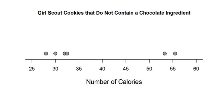
Girl Scout Cookies that Do Not Contain a Chocolate Ingredient
| Type of Girl Scout Cookie |
Number of Calories per cookie |
| Do-si-dos | 55.5 |
| Peanut Butter Sandwich | 53.3 |
| Savannah Smiles | 28 |
| Shortbread | 30 |
| Shout Outs! | 32.5 |
| Trefoils | 32 |
Girl Scout Cookies that Contain a Chocolate Ingredient
| Type of Girl Scout Cookie | Number of Calories per cookie |
| Caramel deLites | 70 |
| Dolce de Leche | 40 |
| Peanut Butter Patties | 65 |
| Samoas | 70 |
| Tagalongs | 70 |
| Thanks-A-Lot | 75 |
| Thin Mints | 40 |
Elizabeth constructed the dotplot below for the number of calories per cookie in cookies that do not contain a chocolate ingredient.
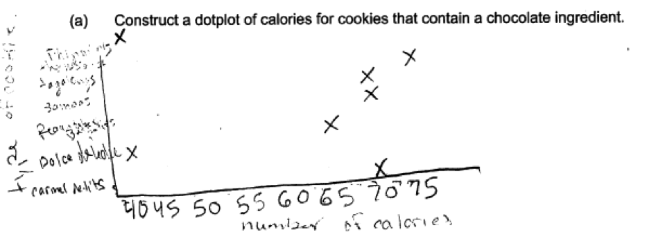
 (a) Construct a dotplot of calories for cookies that contain a chocolate ingredient.
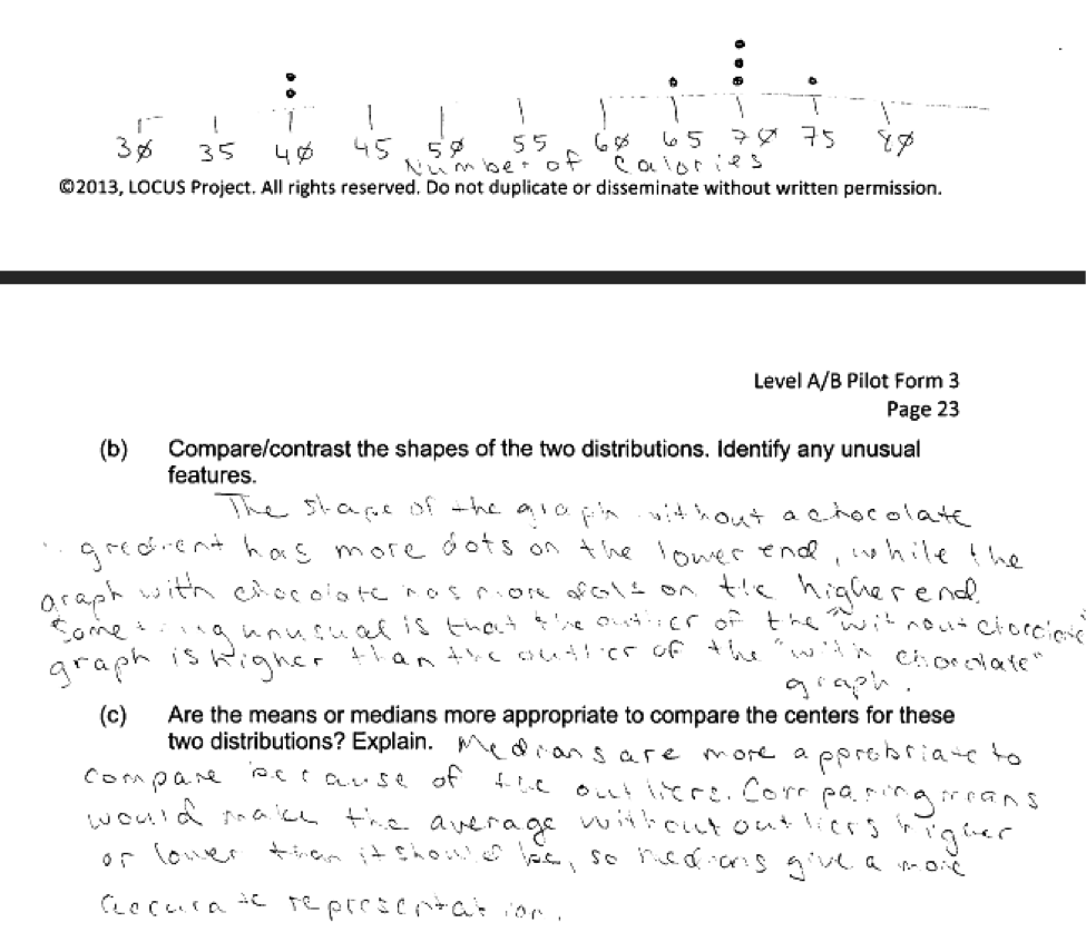
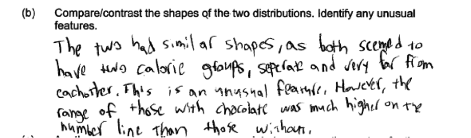
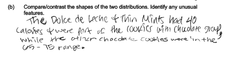
(b) Compare/contrast the shapes of the two distributions. Identify any unusual features.
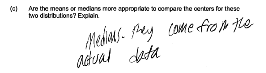
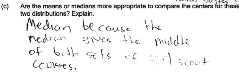
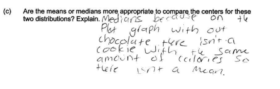
(c) Are the means or medians more appropriate to compare the centers for these two distributions? Explain.
The table below summarizes the data for cookies that do and do not have a chocolate ingredient.
| Mean | Median | MAD | IQR | ||
| Contain Chocolate? | Yes | 61.4 | 70 | 12.2 | 30 |
| No | 38.7 | 32.5 | 10.6 | 23 |
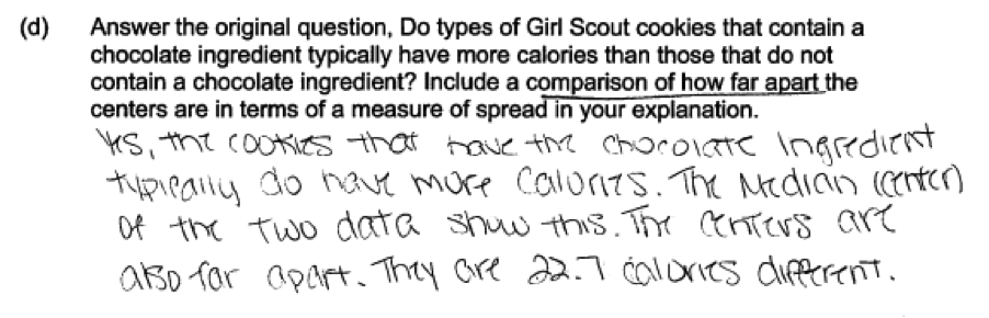
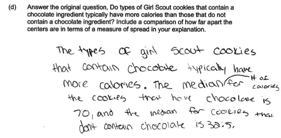
(d) Answer the original question, Do types of Girl Scout cookies that contain a chocolate ingredient typically have more calories than those that do not contain a chocolate ingredient? Include a comparison of how far apart the centers are in terms of a measure of spread in your explanation.
Overview of the question
This question is designed to assess the student’s ability to:
1. Construct a dot plot (part (a)).
2. Use dot plots to compare two distributions and identify outliers (part (b)).
3. Choose an appropriate measure of center based on the shape of the data distribution (part (c)).
4. Use measures of center and variability to draw an informal comparative inference about two populations (part (d)).
Standards
6.SP.2: Understand that a set of data collected to answer a statistical question has a distribution which can be described by its center, spread, and overall shape.
6.SP.4: Display numerical data in plots on a number line, including dot plots, histograms, and box plots.
6.SP.5c: Summarize numerical data sets in relation to their context, such as by: Giving quantitative measures of center (median and/or mean) and variability (interquartile range and/or mean absolute deviation), as well as describing any overall pattern and any striking deviations from the overall pattern with reference to the context in which the data were gathered.
6.SP.5d: Summarize numerical data sets in relation to their context, such as by: Relating the choice of measures of center and variability to the shape of the data distribution and the context in which the data
were gathered.
7.SP.3: Informally assess the degree of visual overlap of two numerical data distributions with similar variabilities, measuring the difference between the centers by expressing it as a multiple of a measure of
variability.
7.SP.4: Use measures of center and measures of variability for numerical data from random samples to draw informal comparative inferences about two populations.
Ideal response and scoring
Parts (a) and (b):
Parts (a) and (b) were scored together. Part (a) asks students to use data on calorie content of Girl Scout cookies that contain chocolate to construct a dot plot. A dot plot for the calorie contents of Girl Scout cookies that do not contain chocolate is given, so students have an example that can be used as a model. In an ideal response to part (a), students represent each of the 7 data values as a dot placed in the appropriate location along a number line with an appropriate scale.
Part (b) asks students to use the dot plot they constructed in part (a) for cookies that contain chocolate and the given dot plot for cookies that do not contain chocolate to compare the shapes of the two distributions and to identify any unusual features. An ideal response to part (b) makes at least one correct comparative statement about the shapes and notes the existence of a gap and outliers in each distribution as unusual features of the two dot plots. For example, the response might state that the two distributions were both skewed, but that the direction of the skew was different for the two distributions (right skew for coolies without chocolate and left skew for cookies with chocolate). Or the response might indicate that each distribution had two unusual observations, but that for the cookies without chocolate, the unusual observations were on the high end, while the unusual observations were on the low end for cookies that contained chocolate.
Responses that provided a correctly drawn dot plot with an appropriate scale and that included at least one correct comparative statement about the shapes and unusual features of the two dot plots were considered to be essentially correct for the combined parts (a) and (b). Responses that include errors in the placement of the dots in the dot plot but did have a correct comparative statement about shape in part (b) were considered to be partially correct for the combined parts (a) and (b). Similarly, responses that provided a correct dot plot in part (a) but did not include at least one correct comparison related to shape in part (b) were also considered partially correct.
Part (c):
In part (b), students are asked whether it would be more appropriate to use the mean or the median as a measure of center for the two distributions. An ideal response to part (c) indicates that the median would be the most appropriate choice and justifies this choice by noting that both data distributions were skewed or by noting that both data distributions contained outliers. Responses in which the explanation of why the median was selected was weak or poorly communicated were considered to be partially correct for part (c). Responses that noted the presence of outliers and their effect on the value of the mean, but then still selected the mean as the most appropriate measure of center for these distributions were also considered to be only partially correct.
Part (d):
Part (d) asks students to use given summary statistics and the dot plots from the earlier parts to decide if Girl Scout cookies that contain chocolate typically have more calories than those that do not. Students were asked to take the variability in the data into account when making this determination and to explain how they did this as part of their answer. An ideal response to part (d) would indicate that based on the data and summary statistics, Girl Scout cookies that contain chocolate do typically have more calories than those that do not. This decision would be based on relating the difference in medians for the two distributions to an appropriate measure of variability. For example, a student might say that the difference in medians is 37.5 calories, which is about 3 times the MAD or about 1.25 times the IQR. This indicates that the difference in medians is large, relative to the variability in the two data distributions.
Responses that indicated that Girl Scout cookies that contain chocolate typically have more calories than those that do not, but did not provide a rationale that is based on variability in the two distributions were considered to be only partially correct.
Sample responses indicating solid understanding
The following student response shows a good understanding of the concepts assessed by parts (a), (b) and (c) of this question. In part (a), the dotplot is drawn correctly with all 7 data values represented in the dot plot and an appropriate scale is shown. In part (b), the response correctly recognizes that the two distributions are skewed and that the direction of the skew is different by saying “without chocolate has more dots on the lower end, while the graph with chocolate has more dots on the higher end.” It also makes note of the outliers. In part (c) the median is chosen as the more appropriate measure of center and the justification is based on the outliers in the two distributions. This response was scored as essentially correct for the combined parts (a) and (b) and for part (c).
 The following response to part (b) was also considered to be correct, and paired with a correct dot plot in part (a), this response was scored as essentially correct for the combined parts (a) and (b). This response focuses on the gaps that are evident in the two dot plots.
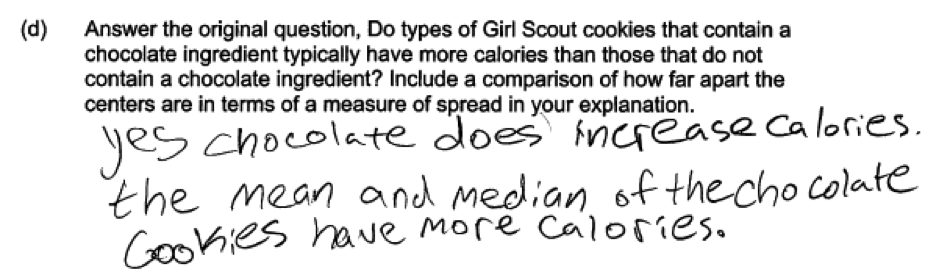
Student responses to part (d) were a bit disappointing, and no students in the groups of students who took the initial administrations of this form provided a response that was scored as essentially correct. Although students were specifically asked to “include a comparison of how far apart the centers are in terms of a measure of spread” in the explanation, none of the students even attempted to do this. The typical response to part (d) is illustrated in the following two student responses, which were each scored as only partially correct for part (d).
Common misunderstandings
Part (a) Construct a dot plot
Responses that were not scored as essentially correct for part (a) generally made one of three common mistakes. A few students knew how to construct a dot plot, but misplaced one of more of the dots. This is illustrated in the following student response.
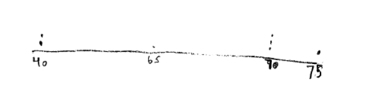
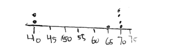 Other students did not use an appropriate scale when constructing the dot plot. For example in the following student response, the scale is not marked correctly, with the distance between 40 and 65 on the scale smaller than the distance from 65 to 75.
 Finally, a number of students did not seem to know what a dot plot was and did not realize that they could model their plot on the dot plot for Girl Scout cookies that did not contain chocolate that was provided. These students produced incorrect graphs or graphs that were not dotplots. For example, the following student response to part (a) made a plot that tries to incorporate the cookie name into the display.
Part (b) Use dot plots to compare two distributions and identify outliers
Part (b) asks students to compare the shape of the two distributions. The most common error in part (b) was to just describe the distribution for the data for Girl Scout cookies that contain chocolate. This is illustrated in the following student response, which only describes the with chocolate distribution and fails to compare it to the distribution for the cookies that do not contain chocolate.
Part (c) Choose an appropriate measure of center based on the shape of the data distribution
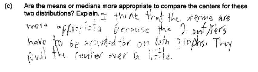
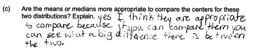
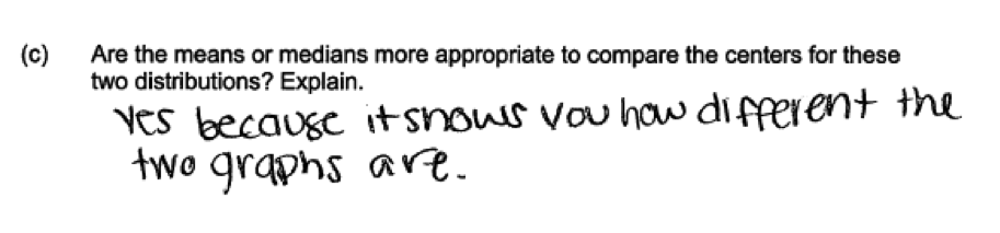
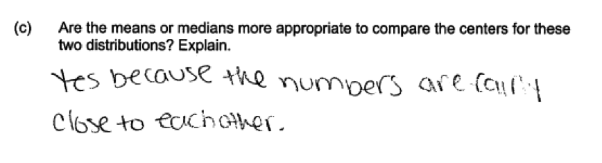
Students made a variety of errors in answering part (c), where they had to indicate whether the mean or the median would be a more appropriate measure of center and explain the choice based on the shape of the distribution or the presence of outliers. Some students correctly chose the median, but provided an explanation for their choice that was incorrect. This is error is illustrated by the following three student responses, all of which were scored as incorrect for part (c) because they did not relate the choice of the measure of center to the shape of the data distribution.
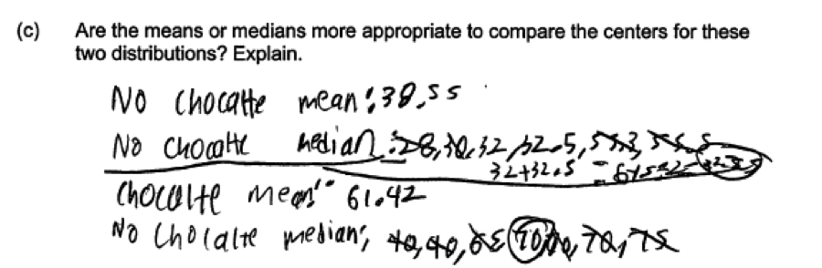
 Other students noted that the outliers that are present in both of the distributions would have an impact on the mean, but then still chose the mean as the most appropriate measure of center. As an example of this error, consider the following student response which was scored as partially correct for part (c).
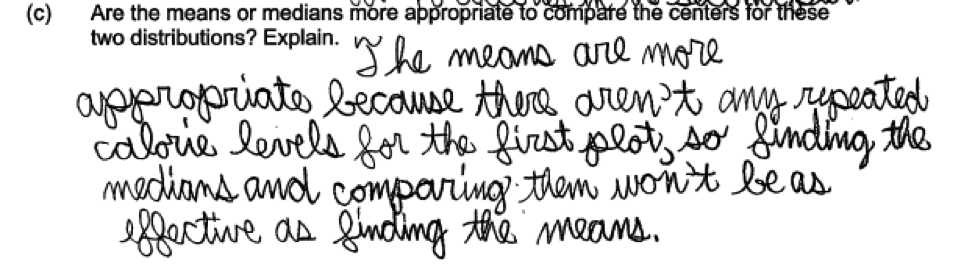
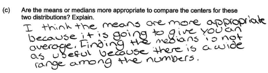
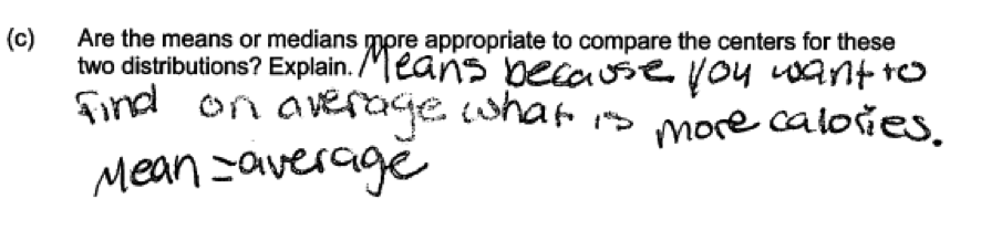
 The most common student error was to make an incorrect choice of measure of center with an accompanying explanation that did not relate the choice to shape of the presence of outliers. This is illustrated by the following three student responses. Each of these responses was scored as incorrect for part (c).
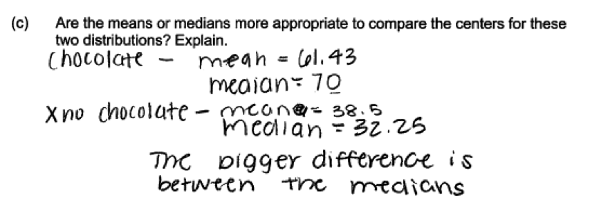
 There were also three other common errors that were all related to students not reading the question carefully or not understanding that the question was asking them to choose between the mean and the median. Some student just calculated the values of the means and the medians for the two distributions. For example, the following two student responses were scored as incorrect because even though some of the calculations are correct, they do not address the question asked.
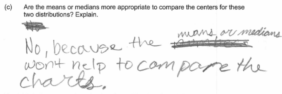
 Some students misunderstood the question and thought that they were to either say yes to both the mean and the median or no to both. The following two student responses indicate that neither the mean nor median would be appropriate as a measure of center and were scored as incorrect for part (c).
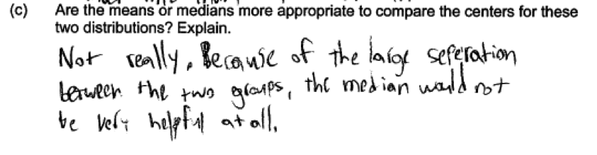 A similar error was to indicate that either the mean or the median would be appropriate, missing that the questions asks which would be more appropriate. The following three student responses illustrate this error and were all scored as incorrect for part (c).
Part (d) Use measures of center and variability to draw an informal comparative inference about two populations
An essentially correct response to part (d) required a decision about the difference in the two distributions that was made in a way that took variability into account. None of the students who participated in the initial administrations of this form produced a response that was considered essentially correct.
Part (d) was designed to address two of the more challenging standards in the Common Core State Standards (7.SP.3 and 7.SP.4). Developing an understanding that informal inferences about differences in population need to take variability in the data distributions is sure to present a challenge for middle school teachers who are introducing this topic into their curriculum for the first time.
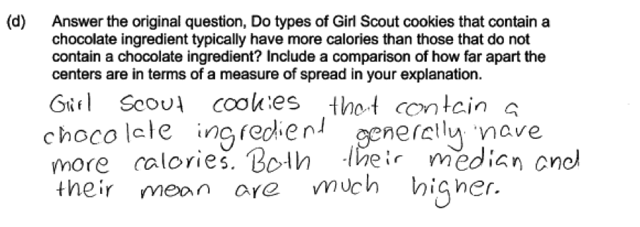
The most common error in part (d), made by virtually every student who participated in the initial administrations, was to ignore the part of the problem that asked them to include a comparison of how far apart the centers were in terms of a measure of variability. Many student responses were scored as only partially correct for part (d) because of this omission. The following three student responses were typical of those that were scored as partially correct for part (d) because variability was not addressed in the response.
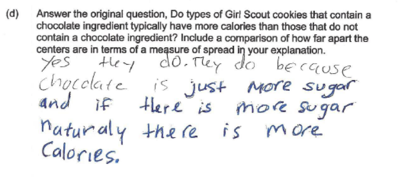
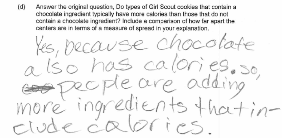
 Another student error in answering part (d) is illustrated in the following two student responses. These responses ignore the given summary measures and dot plots altogether and just provided an explanation based on thinking that adding chocolate must add calories. Because they provide an explanation that is based on neither center nor variability, these responses were scored as incorrect for part (d).
Resources
More information about the topics assessed in this question can be found in the following resources.
Free Resources
Common Core Progressions Documents
A discussion on informal comparative inference and of the intent of Common Core standards 7.SP.3 and 7.SP.4 and how this content might be developed in the classroom can be found in Common Core Tools progressions document for statistics in grades 6 – 8. See the discussion on pages 9 - 10.
Lessons
Statistics Education on the Web (STEW) has peer reviewed lessons plans. The following two lessons focus on comparing two distributions. Although these lessons ask students to make the comparison based on box plots rather than dot plots, it would be easy to adapt these lessons to use dot plots.
Classroom and Assessment Tasks
Illustrative Mathematics has peer reviewed tasks that are indexed by Common Core Standard.
A task that involves creating and interpreting graphical displays for numerical data is
A task that has students compare distributions for two numerical data sets is
Two tasks that involve choosing between the mean and the median as a measure of center for a data distribution are
A task that involves drawing informal inferences about the differences between two groups is Offensive Linemen. The reasoning involved is similar to what is needed to answer part (d) of this LOCUS question.
Guidelines for Assessment and Instruction in Statistics Education (GAISE)
Published by the American Statistical Association and available online, this document contains a section on comparing groups using numerical data (pages 27 – 30).
Resources from the American Statistical Association
Bridging the Gap Between Common Core State Standards and Teaching Statistics is a collection of investigations suitable for classroom use. This book contains two investigations that involve constructing and interpreting dot plots (Who Has the Longest First Name?, pages 72 – 84 and How Expensive is Your Name?, pages 85 - 97). The second of these investigations involves using constructing a dot plot, with a focus on considering the shape of the distribution.
Resources from the National Council of Teachers of Mathematics
The NCTM publication Developing Essential Understanding of Statistics in Grades 6 – 8 includes a section on making and interpreting dot plots on pages 19 – 21. There is also a section on comparing distributions on pages 42 – 51. The focus of this discussion is on the median as a measure of center and the interquartile range as a measure of variability, and there is an illustration of expressing a difference in centers as a multiple of a measure of variability (see page 50) that is particularly relevant to the content assessed in part (d) of this LOCUS question.