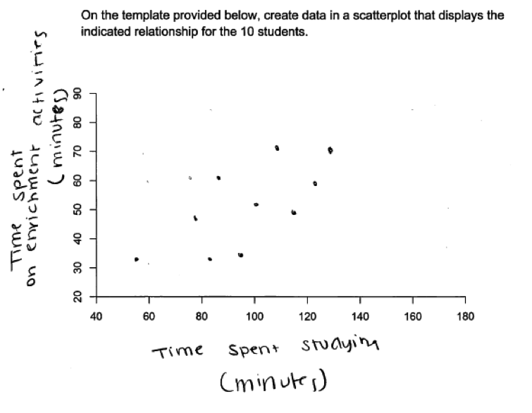
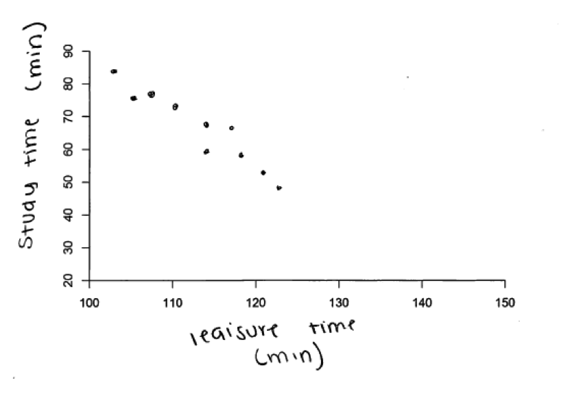
A teacher wants to know how involvement in school enrichment programs, and other activities outside of school affect the amount of time students study. The teacher randomly selects 10 students involved with an after school enrichment program and collected data on the following variables: study time, time on enrichment activities, time on leisure activities, and travel time from home to school. All data were recorded in minutes.
After organizing the data, the teacher makes the following statement:
There is moderate positive relationship between study time and the amount of time spend students spend on enrichment activities.
(a) On the template provided below, create data in a scatterplot that displays the indicated relationship for the 10 students.
After organizing the data, the teacher makes the following statement:
There is strong negative relationship between study time and the amount of time spend students spend on leisure activities.
(b) On the template provided below, create data in a scatterplot that displays the indicated relationship for the 10 students.

After organizing the data, the teacher makes the following statement:
There is no relationship between study time and the time it takes to from home to school.
(c) On the template provided below, create data in a scatterplot that displays the indicated relationship for the 10 students.

Overview of the question
This question is designed to assess the student’s ability to:
1. Represent patterns of association in bivariate numerical data using a scatterplot (parts (a) and (b)).
2. Distinguish between positive and negative relationships in bivariate numerical data (parts (a) and (b)).
3. Distinguish between weak, moderate and strong relationships in bivariate numerical data (parts (a) and (b)).
4. Understand that when there is no relationship between two numerical variables, there will be no apparent pattern in a scatterplot of the data (part (c)).
Standards
8.SP.1: Construct and interpret scatter plots for bivariate measurement data to investigate patterns of association between two quantities. Describe patterns such as clustering, outliers, positive or negative
association, linear association, and nonlinear association.
Ideal response and scoring
Parts (a) and (b):
Parts (a) and (b) ask students to create scatterplots with 10 data points that could represent a given description of a relationship between two numerical variables (moderate positive relationship and strong negative relationship). Parts (a) and (b) were each scored as essentially correct, partially correct or incorrect. An ideal response to parts (a) and (b) includes scatterplots with labeled axes. The scatterplot drawn for part (a) includes some scatter around a pattern that shows a positive relationship. The scatterplot in part (b) shows points fairly tightly clustered around a pattern that shows a negative relationship, and the relationship represented in part (b) should be clearly stronger (less scatter around the pattern) than the relationship represented in part (a).
It was anticipated that students would put study time on the y axis because the problem implies that study time is the dependent variable. However, this was not required in order for a response to be considered essentially correct. Similarly, it was anticipated that student-produced scatterplots would show a linear pattern. However, because it was not stated in the problem that the relationships were linear, a response showing a nonlinear pattern was still considered to be essentially correct as long as it represented the appropriate strength and direction.
Responses that do not include labels on the axes but which represent the given relationship correctly are considered partially correct for parts (a) and (b). If the scatterplot correctly represents only one of direction or strength, it is considered to be partially correct, as long as axes are labeled.
Part (c)
In part (c), students are asked to construct a scatterplot that represents no relationship between two numerical variables. An ideal response to part (c) would include a scatter plot with labeled axes and that includes 10 data points. There would be no apparent pattern in the scatterplot and the points would appear scattered at random.
Sample responses indicating solid understanding
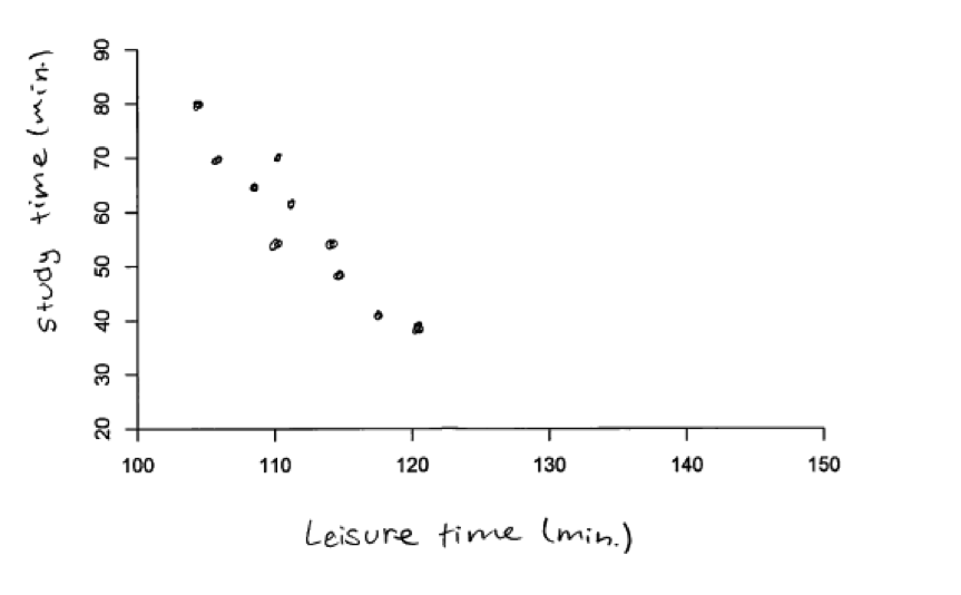
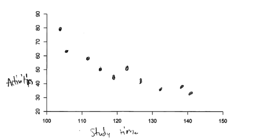
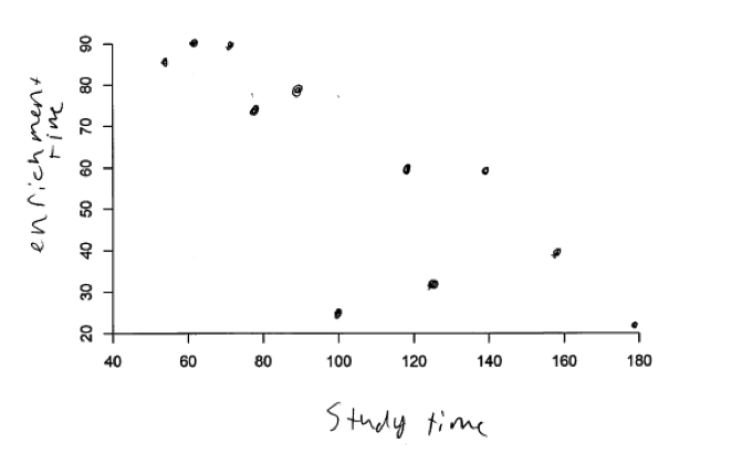
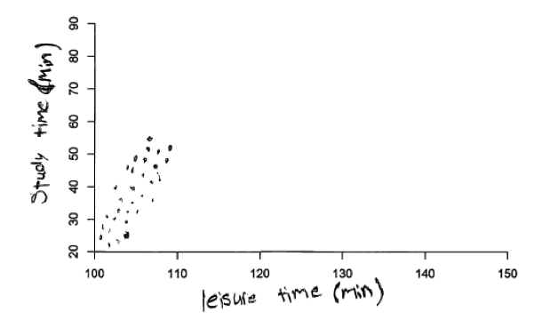
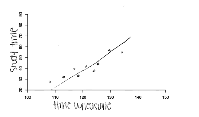
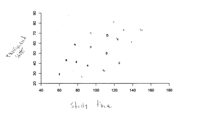
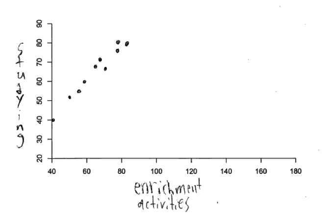
The following student response shows a good understanding of the concepts assessed by parts (a) and (b) of this question. The two scatterplots shown below are from the same student and each of parts (a) and (b) were scored as essentially correct. Both scatterplots have labeled axes and show 10 data points. The direction of the relationship shown in each scatterplot is correct (positive for part (a) and negative for part (b)). The scatterplot in part (a) is consistent with a description of “moderate” relationship and the relationship represented in the scatterplot for part (b) is clearly stronger than the relationship represented in the scatterplot for part (a).
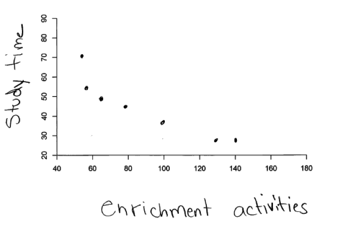
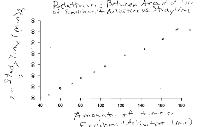
 Another example of a student response that was scored as essentially correct for both parts (a) and (b) is shown in the scatterplots below.
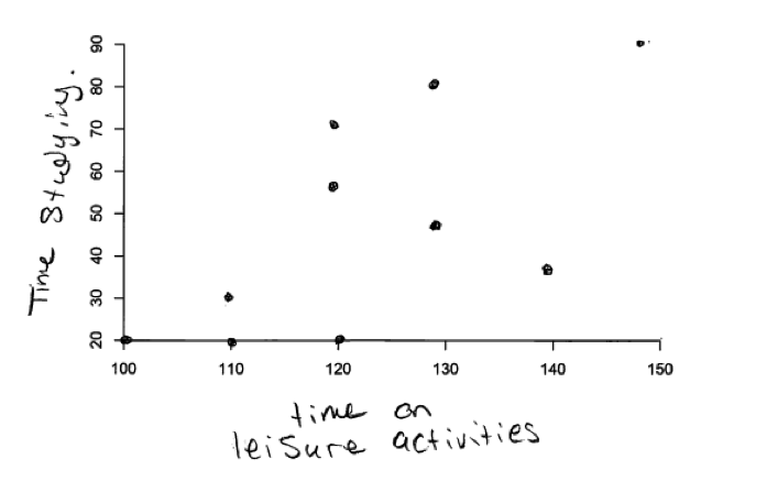
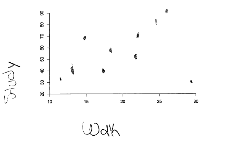
 It was anticipated that students would construct scatterplots with study time on y axis and the other variable on the x axis because of the way the problem was introduced (it said that the teacher was interested in knowing how the other variables affect study time). Even so, responses that placed study time on the x axis but correctly represent the relationship described demonstrate and understanding of strength and direction of relationship, and such responses were considered to be essentially correct. For example, the student response to part (b) shown below was scored as essentially correct even though study time is on the x axis because it does depict a strong negative relationship between study time and time spent on leisure activities.
 It was anticipated that students would construct scatterplots for parts (a) and (b) that showed liner relationships between variables, but the problem did not specify that the relationship was linear, so other nonlinear patterns were acceptable as long as the strength and direction of the relationship were correct. For example, consider the following student response to part (a). The scatterplot in this response shows a nonlinear pattern. This response was considered as incorrect for part (a) because the strength and direction of the relationship were not correct for “moderate positive”, but had the strength and direction been correct, the nonlinear pattern would not have prohibited this response from being considered correct. Had this pattern appeared in the response to part (b) of the question, it would have been scored as essentially correct.
Part (c)
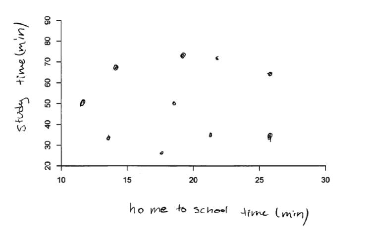
In part (c), students are asked to construct a scatterplot that represents no relationship between two numerical variables. The sample student response below was scored as essentially correct for part (c) because it includes 10 data points that appear to be scattered at random and the axes are labeled.
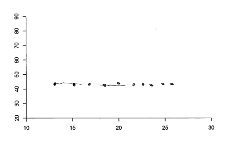
 In answering part (c), some students provided a scatterplot with 10 data points that had different values for the time it takes to get to school but where all had the same value for study time. This results in a scatterplot with the points falling on a horizontal line, as illustrated in the student response below. Although this is not a realistic scatterplot for one based on the scenario of selecting 10 students at random, it does represent a situation where study time is unrelated to the time it takes to get to school. The student response below was scored as only partially correct because it did not include axis labels, but had the axes been labeled, this student response would have been considered to be essentially correct.
Common misunderstandings
Parts (a) and (b) Represent patterns of association in bivariate numerical data using a scatterplot; distinguish between positive and negative relationships in bivariate numerical data; distinguish between weak, moderate and strong relationships in bivariate numerical data
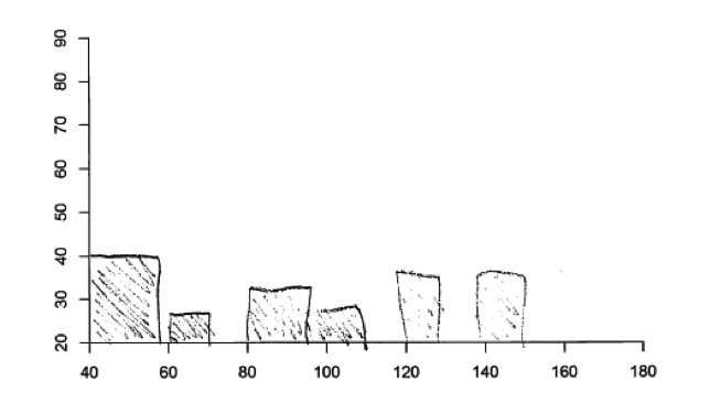
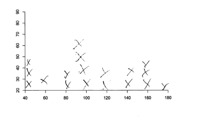
Responses that were not scored as essentially correct for parts (a) and (b) generally made one of five common mistakes. Some students did not know how to construct a scatterplot and instead tried to create some other type of graphical display. Some students created displays that are appropriate for univariate data (such as a histogram or a dot plot) rather than a display that is appropriate for bivariate data. Because of the univariate nature of these graphical displays, they were unable to represent the type of relationship between two variable stated in the question. This is illustrated in the following three student responses to part (a), each of which was scored as incorrect.
 Some students did try to convey that there were two variables, but did not successfully crate a scatterplot. While the two student responses below do convey some understanding of what it means for a relationship to be positive (the first response below, which was a student response to part (a)) and of what it means for a relationship to be negative (the second response below, which was a different student’s response to part (b)), each of these responses was considered incorrect.
A second relatively common student error was incorrectly representing the direction of a relationship. Some students did not realize that for a positive relationship between two variables, larger values of one variable tend to be paired with larger values of the second variable and that for a negative relationship, larger values of one variable tend to be paired with smaller values of the second variable. Some students reversed positive and negative, and provided a scatterplot that exhibited a negative relationship in part (a) where the stated relationship was positive and a positive relationship in part (b) where the stated relationship was negative. Other students appeared to think that the pattern in the scatterplot would always slope upwards in moving from left to right for both positive and negative relationships.
This error is illustrated in the following four student responses. The first scatterplot below is a response to part (a) (which described a moderate positive relationship), but the relationship represented in this scatterplot is clearly a negative relationship. The next three scatterplots were all student responses to part (b), which asked for a representation of a strong negative relationship. Two of these student responses clearly show a positive relationship and the final one shown is more consistent with no relationship than a strong negative relationship.
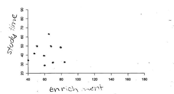
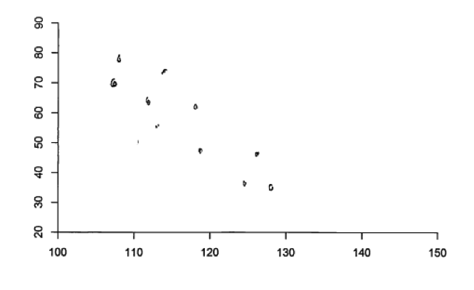
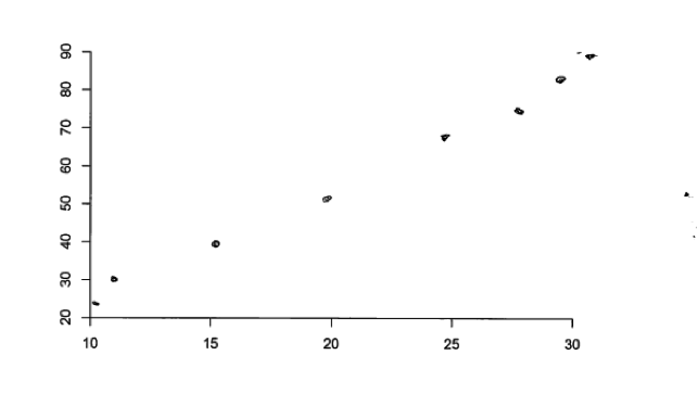
 A third common student misconception is related to how the strength of a relationship is represented in a scatterplot. In constructing a scatterplot in part (a) to represent a moderate positive relationship, many students drew scatterplots that did not include enough scatter around the pattern in the scatterplot, often depicting very strong relationships. Others constructed scatterplots that would best be described as representing a very weak relationship. These responses did not demonstrate a clear understanding of the strength of a relationship. For example, consider the following two student responses to part (a). While each of these two scatterplots represents a positive relationship, the relationship would be described as weak rather than moderate.
 The following two student responses to part (a) illustrate the opposite error with respect to strength. The relationships represented in these two scatterplots are very strong, and would not be considered to be moderate positive relationships.
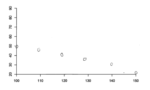
Similarly, in part (b), some students created scatterplots that would not be considered to represent a strong relationship. For example, the following student response to part (b) was considered to be incorrect because the direction of the relationship is not correct and the scatter of the points in the scatterplot is not consistent with a strong relationship.
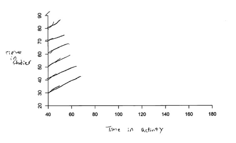
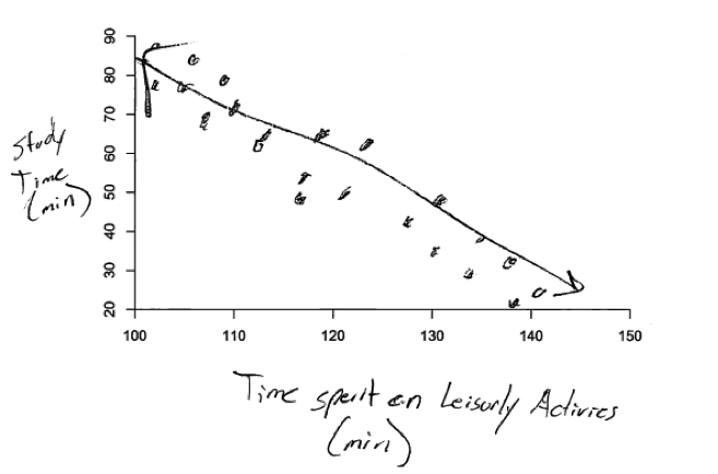
 A final type of misunderstanding related to representing strength of relationships is illustrated in the following student response to parts (a) and (b). In these responses, the scatterplot in part (a) (the moderate relationship) shows a stronger relationship than the one shown in part (b) (the strong relationship). This student also makes the mistake of failing to include axis labels.
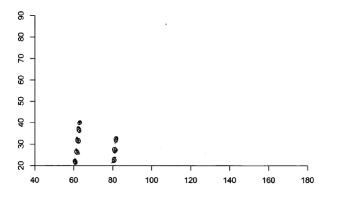
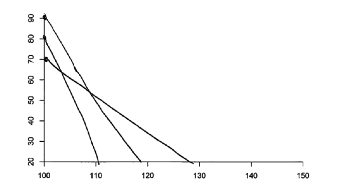
 The fourth type of student error that was fairly common in responses to all parts of this question was to create scatterplots that included more than or fewer than 10 data points. This is illustrated in the following two student responses to part (b). This error is most likely the result of failure to read the question carefully than of a more fundamental misunderstanding of scatterplots.
 The fifth, and by far the most common student error was failure to include labels on the axes. This error is illustrated in the sample student response above. While this does not represent a conceptual misunderstanding, it does indicate that the student does not understand the importance of always including labels and scales on the axes in graphical displays.
Part (c) Understand that when there is no relationship between two numerical variables, there will be no apparent pattern in a scatterplot of the data
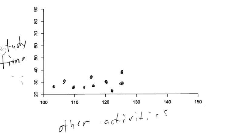
In answering part (c), the only common student error (other than the omission of axis labels) was to create a scatterplot in which there was a notable linear or nonlinear pattern. These students did not recognize that if there is no relationship between two numerical variables, there should be no discernible pattern in the scatterplot of the data. For example, consider the following two responses to part (c). Both of these scatterplots show a pattern and neither is compatible with the description of no relationship. The second plot below also makes the error of not labeling the axes.
Resources
More information about the topics assessed in this question can be found in the following resources.
Free Resources
Classroom and Assessment Tasks
Illustrative Mathematics has peer reviewed tasks that are indexed by Common Core Standard.
A task that involves describing the strength and direction of a linear relationship is
Guidelines for Assessment and Instruction in Statistics Education (GAISE)
Published by the American Statistical Association and available online, this document contains a discussion of the strength of association between two numerical variables (pages 48 – 49).
Resources from the American Statistical Association
Bridging the Gap Between Common Core State Standards and Teaching Statistics is a collection of investigations suitable for classroom use. This book contains an investigation that involves constructing and interpreting scatterplots for both positive and negative linear relationships (Do Names and Cost Relate?, pages 164 – 174).
Resources from the National Council of Teachers of Mathematics
The NCTM publication Developing Essential Understanding of Statistics in Grades 6 – 8 includes a section on displaying bivariate distributions on pages 56 – 59.