Taylor wants to compare clean water access in African countries and South American countries.
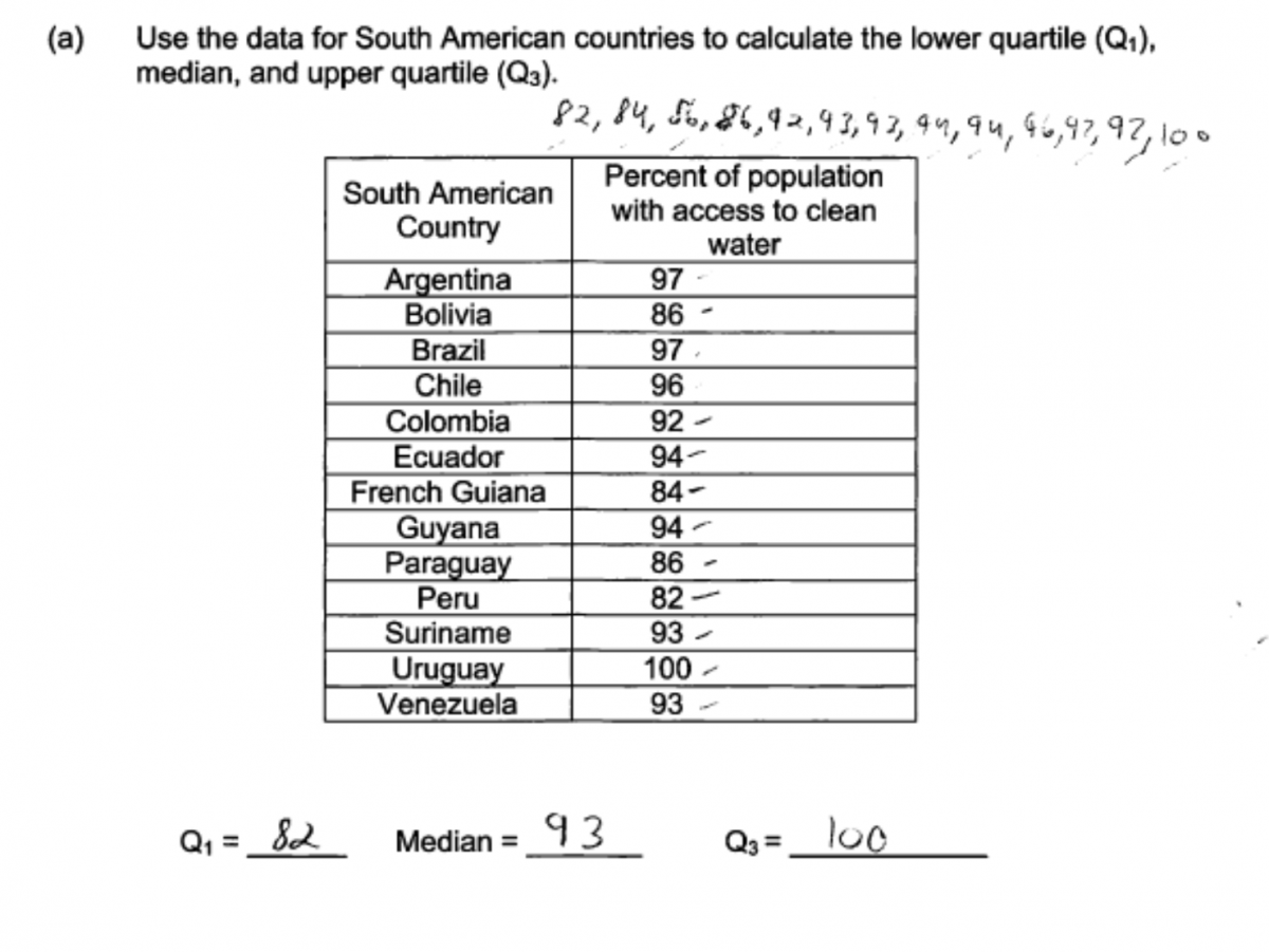
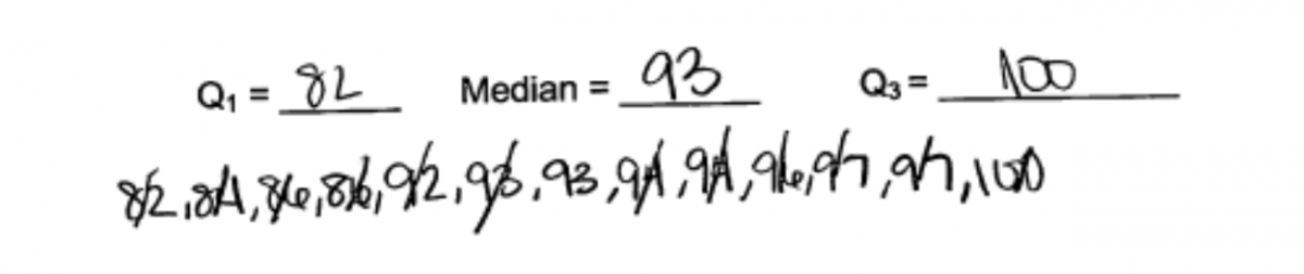
(a) Use the data for South American countries to calculate the lower quartile (Q1), median, and upper quartile (Q3).
| South American Country | Percent of population with access to clean water |
| Argentina | 97 |
| Bolivia | 86 |
| Brazil | 97 |
| Chile | 96 |
| Colombia | 92 |
| Ecuador | 94 |
| French Guiana | 84 |
| Guyana | 94 |
| Paraguay | 86 |
| Peru | 82 |
| Suriname | 93 |
| Uruguay | 100 |
| Venezuela | 93 |
Q1 = ___________
Median = __________
Q3 = ___________
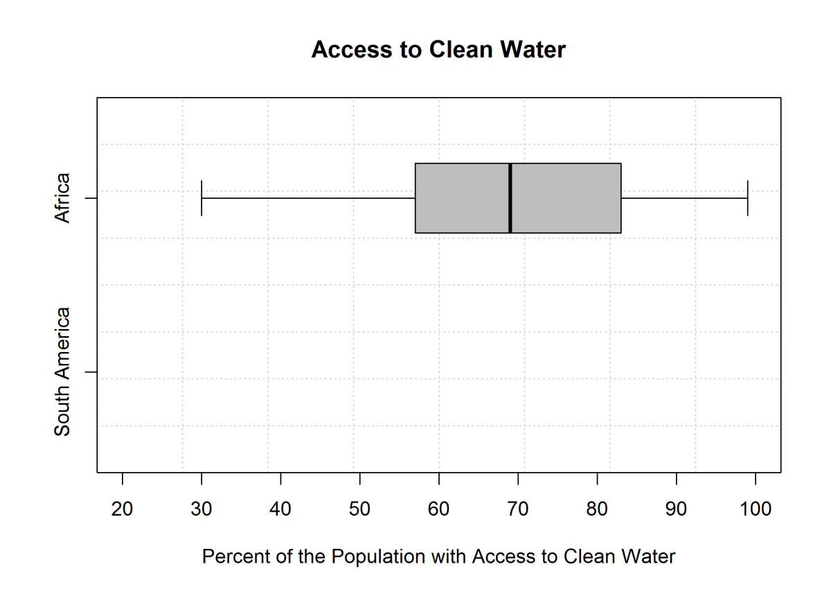
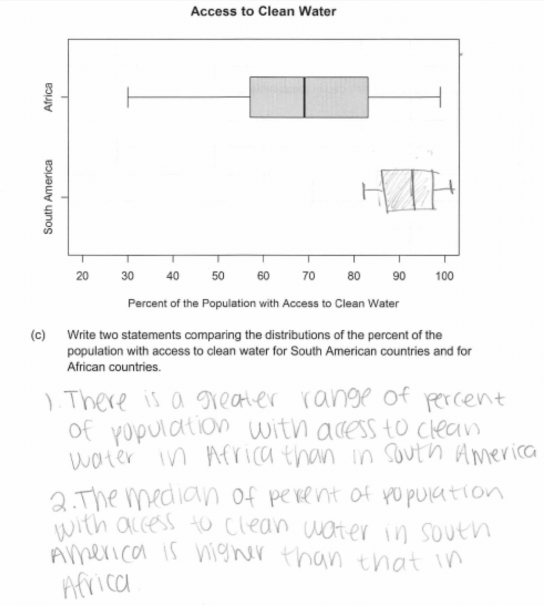
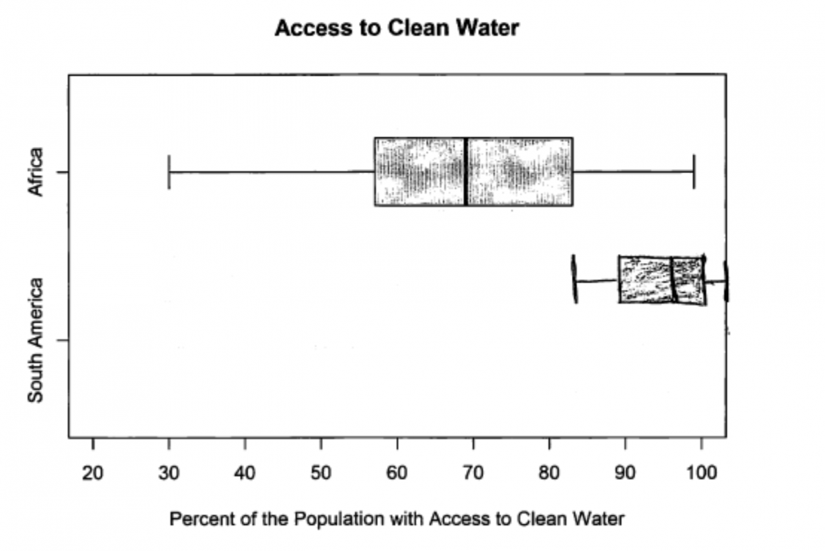
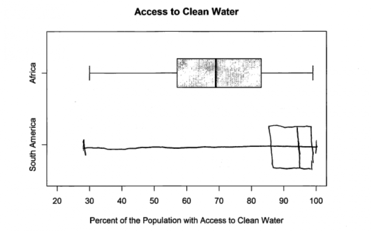
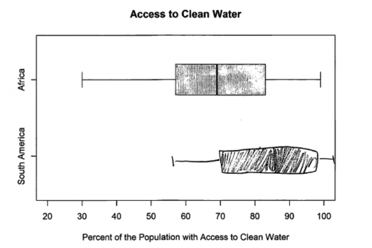
(b) She constructed a boxplot using clean water access data for 51 African countries. Use the data for South American countries to construct a boxplot below the one for African countries.
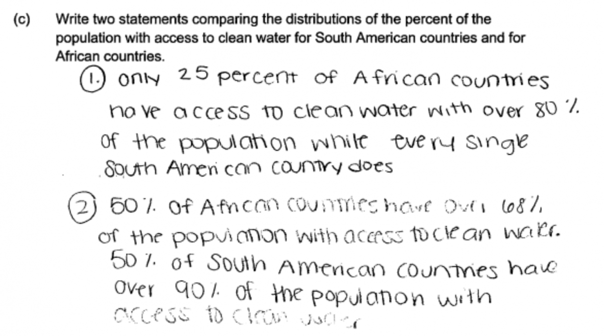
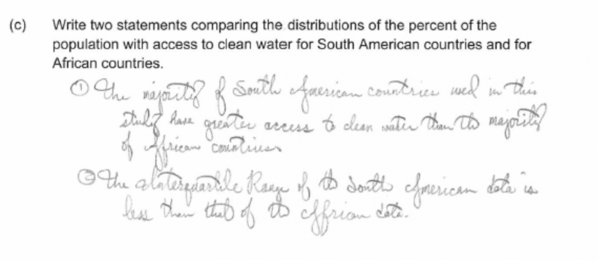
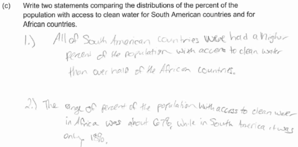
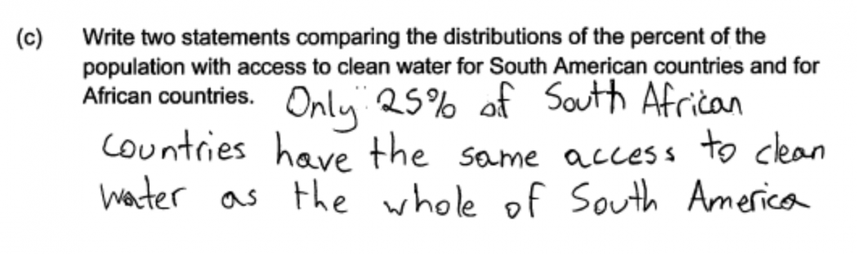
(c) Write two statements comparing the distributions of the percent of the population with access to clean water for South American countries and for African countries.
Overview of the question
This question is designed to assess the student’s ability to:
1. Calculate the median and quartiles for a given data set (part (a)).
2. Construct a box plot (part (b)).
3. Use information provided by box plots to compare two data distributions (part (c)).
Standards
6.SP.4: Display numerical data in plots on a number line, including dot plots, histograms, and box plots.
S-ID.1: Represent data with plots on the real number line (dot plots, histograms, and box plots).
S-ID.2: Use statistics appropriate to the shape of the data distribution to compare center (median, mean) and spread (interquartile range, standard deviation) of two or more different data sets.
Ideal response and scoring
Part (a):
Part (a) asks students to calculate the median and quartiles for a data set consisting of the percent of the population with access to clean water for 13 countries in South America. There are two common methods for finding the quartiles of a data set, and they sometimes result in different values for the quartiles. Both methods are based on dividing the data set into a lower half and an upper half. The only difference is what is done with the median value when the number of observations in the data set is odd. One method excludes the median for the lower and upper halves when finding quartiles and the other method includes the value of the median in both the lower half and the upper half when finding the quartiles. For this data set, both methods result in a value of 86% for the lower quartile. The value for the upper quartile is 96.5% for the method that excludes the median from both halves and it is 96% for the method that includes the value of the median in both halves. Either answer for the upper quartile is considered to be correct.
If the median and both quartiles are correctly calculated, part (a) is considered to be essentially correct for part (a). Responses in which the median is correctly calculated but one or both of the quartiles are incorrect are scored as partially correct. Responses that include correct values for both quartiles but an incorrect value for the median are also scored as partially correct for part (a).
Part (b):
Part (b) asks students construct a boxplot for the data for South America using the scale provided. An ideal response shows a correctly drawn boxplot with all five values in the five number summary (minimum, lower quartile, median, upper quartile and maximum) represented correctly in the box plot. If one or two of the values in the five number summary are represented incorrectly, the response is considered to be only partially correct for part (b). If a student made an error in calculating the median or quartiles in part (a) but then represented the calculated values correctly in the boxplot, the response was scored as essentially correct for part (b).
Part (c):
Part (c) asks students to compare the distributions of the percent of the population with access to clean water for South American countries and African countries. Students are asked to write two comparative statements. There are many different statements that could be made based on the boxplots. Students might compare centers by noting that the median for South American countries is greater than the median for African countries. They could also compare the spread of distributions (the data for South American countries is much less spread out than the data for African countries) or distribution shape (both distributions appear to be approximately symmetric with no outliers). In addition, comparisons based on quartiles are also acceptable.
An ideal response would include at least two different correct comparative statements. Such responses are considered to be essentially correct for part (c). If a response includes only one correct statement or if it includes two correct comparisons but also includes statements that are not correct, the response is scored as partially correct for part (c).
Sample responses indicating solid understanding
The majority of students were able to correctly calculate the median and quartiles in part (a). The following student response demonstrates a good understand of the content assessed in Parts (b) and (c) of this question. In part (b) the boxplot is correctly drawn and this response was scored as essentially correct for part (b).
In part (c), the student notes that the range is greater for the African countries than for the South American countries and also notes that the median percent of the population with access to clean water is greater for the South American countries than for the African countries. Because two correct comparative statements are provided, this response was scored as essentially correct for part (c). With all three parts essentially correct, this student paper received a score of 4.
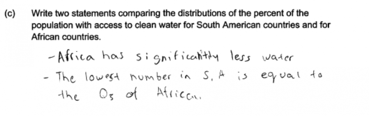
There were a number of ways that students could write statements comparing the two distributions in part (c). For example, consider the two statements given in the following student response. The first statement is correct and is based on noting that the minimum for the South American countries is about equal to the upper quartile for the African countries. The second statement is equivalent to comparing the medians of the two distributions. This response received a score of essentially correct for part (c).
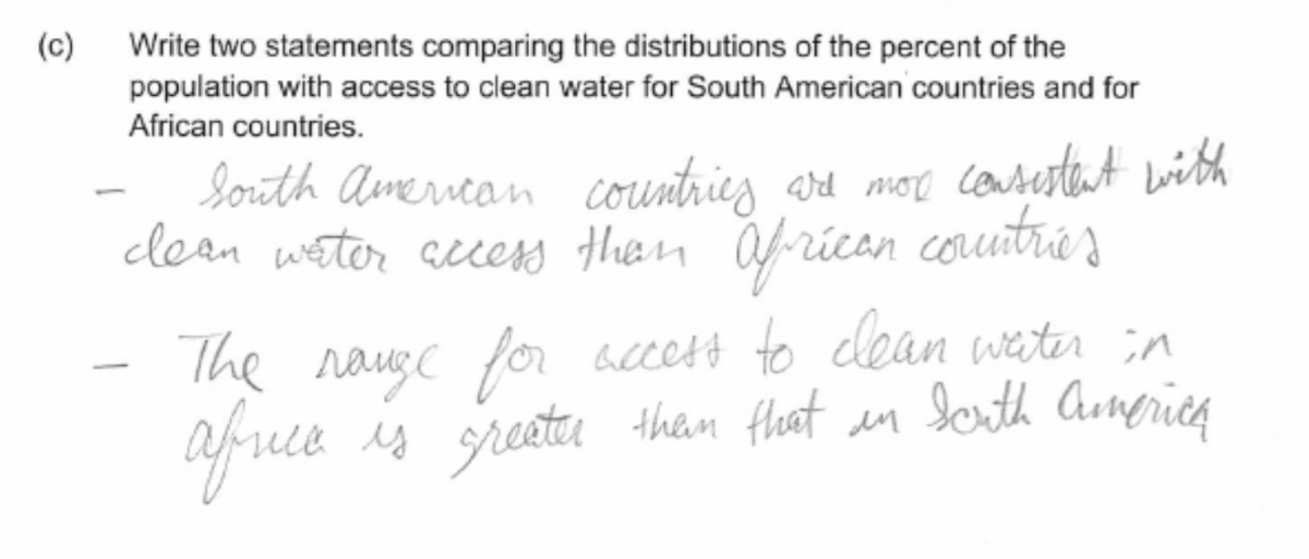
The following two responses also illustrate correct comparative statements about the two distributions, and each of these responses was also scored as essentially correct for part (c).
Common misunderstandings
Part (a): Calculate the median and quartiles for a given data set.
The majority of students were able to correctly calculate the median and the quartiles for the given data set. Responses that were not scored as essentially correct could be classified as falling into three categories: (1) those that demonstrated an understanding of what quartiles were but made an error in the calculation of one or both quartiles; (2) those that confused the quartiles with the minimum and maximum of the data set; and (3) those that did not know what quartiles are or how to calculate the quartiles of a data set.
The following response is typical of those falling into the first category. This student made an error in calculating the upper quartile and part (a) was considered to be only partially correct. However, part (b) for this student was scored as essentially correct, even though the upper end of the box was placed at 94 rather than 96 because this was consistent with the student’s answer to part (a).
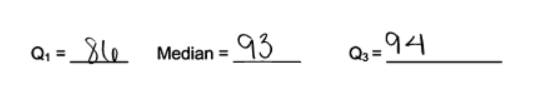
Some students also confused Q1and Q3. This is illustrated in the following student response, which was scored as partially correct for part (a). Students making this mistake were generally able to produce a correct boxplot in part (b). Note that this student has also made a minor error in calculating the upper quartile to be 97 rather than 96 or 96.5.

A surprising number of responses fell into the second category described above and reported the values of the minimum and maximum for the quartiles. Students making this mistake generally had difficulty producing a reasonable boxplot in part (b).
Finally, it was clear that some students did not know how to calculate quartiles, and so were only able to calculate the median in part (a). While such responses were considered partially correct for part (a), students in this situation were rarely able to produce a reasonable boxplot in part (b) and so tended not to score well on the other parts of this question.
Part (b): Construct a box plot.
Responses that were not scored as essentially correct for part (a) generally made one of three common mistakes, two of which indicate a lack of understanding of box plots and how the minimum, lower quartile, median, upper quartile and maximum are used to construct a box plot.
Some students just made minor errors in representing the values in the five number summary using the scale provided. This was not considered a serious error, as these students demonstrated an understanding of how a boxplot is constructed. This is illustrated in the following student response, which was scored as partially correct for part (b) because the placement of the median, upper quartile and maximum are not correct.
The following response illustrates partial understanding of how a boxplot is constructed. In this response the placement of the box (representing the lower quartile, the median and the upper quartile) is correct. However in adding in the “whiskers” the student did not use the minimum and maximum from the given data set and instead extended the whiskers to the minimum and the maximum for the other boxplot that was shown.
Finally, a number of students mimicked the look of the boxplot that was given for African countries and drew something that looked similar but that was unrelated to values of the five number summary for the South American data set. The following student response is typical of those that fall into this category. This student did not calculate the quartiles correctly in part (a), but the boxplot is not even consistent with the values given in part (a). This student response was scored as incorrect for part (b).
Part (c): Use information provided by box plots to compare two data distributions.
Students who were able to produce a boxplot in part (b) were generally able to provide good answers to part (c). To be considered essentially correct, responses needed to provide two different comparative statements about the distribution of percent of the population with access to clean water. Some students overlooked the request for two statements and only provided a single comparison. This is illustrated in the following student response, which was considered as partially correct for part (c).
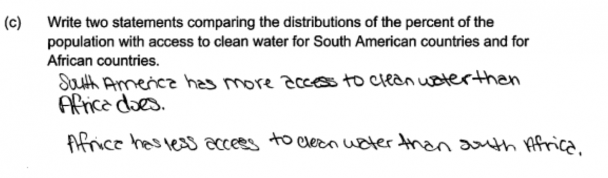
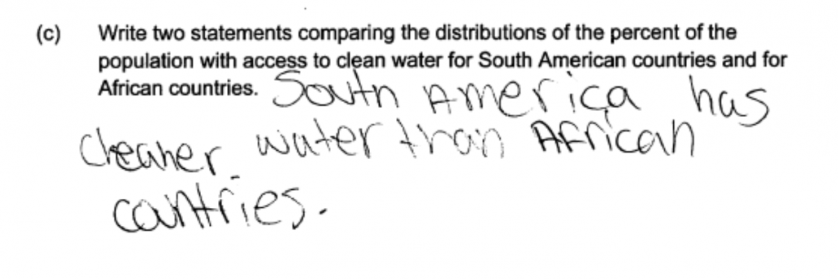
Other students actually wrote two statements, but the statements were really making the same comparison. This is illustrated in the following two student responses. In the first response, the statement “South America has more access…” is the same as the statement “Africa has less access…” In the second response, both statements are saying that there is more variability in the data for African countries. Both of these student responses were scored as partially correct for part (c) because they did not provide two comparisons that were different.
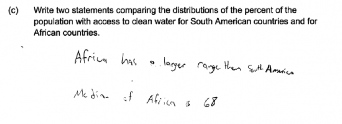
In order to be considered essentially correct for part (c), the statements made needed to be comparative in nature. Some students made statements based on the boxplots but did not involve a comparison of the two distributions. For example, the following response was scored as only partially correct for part (c) because only the first statement is one that compares the two distributions. The second statement is only about the data for African countries.
 Finally, some students made statements that are not correct—or at least are not statements that can be justified by the given data and boxplots. The following two responses illustrate responses making this error. In the first response, while the second statement was considered as a correct comparison, the first statement does not follow from the given data and boxplots. In the second response, the statement given also does not follow from the given data.
Resources
Resources
More information about the topics assessed in this question can be found in the following resources.
Free Resources
Common Core Progressions Documents
A discussion of comparing distributions with box plots related to Common Core standard 6.SP.4 can be found in Common Core Tools progressions document for statistics in grades 6 – 8.
See the discussion on pages 4 - 5.
Lessons
Statistics Education on the Web (STEW) has peer reviewed lessons plans. Some lessons related to the topic of this question are:
Arm Spans: This lesson has students collect data and then use that data to construct boxplots and compare distributions.
Bubble Trouble: This lesson has students collect data and then use that data to construct boxplots and compare distributions.
Classroom and Assessment Tasks
Illustrative Mathematics has peer reviewed tasks that are indexed by Common Core Standard.
A task that involves constructing box plots and comparing distributions is Comparing Test Scores.
A task that also involves constructing boxplots and comparing distributions that is similar to this Locus question is:
Guideline for Assessment and Instruction in Statistics Education (GAISE)
Published by the American Statistical Association and available online, this document contains a discussion of using boxplots to compare distributions (pages 46 – 48).
Resources from the American Statistical Association
Bridging the Gap Between Common Core State Standards and Teaching Statistics is a collection of investigations suitable for classroom use. This book contains an investigation in which students collect data, construct comparative box plots, and compare distributions. (How Far Can You Jump?, pages 112 – 125).
Resources from the National Council of Teachers of Mathematics
The NCTM publication Developing Essential Understanding of Statistics in Grades 6 – 8 includes a section on comparing distributions on pages 42 – 50.