A public library is currently open from 9 a.m. to 5 p.m. on Saturdays. The director is considering whether or not to keep the library open until 8 p.m. on Saturdays. A library employee develops a one-question survey. The question is, Would you use the library between the hours of 5 p.m. and 8 p.m. on Saturdays? The survey was administered using two different methods.
In Method 1, 100 individuals were selected at random from a list of people who have library cards at that library.
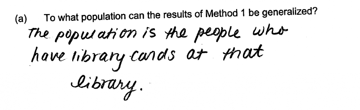
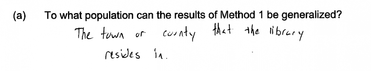
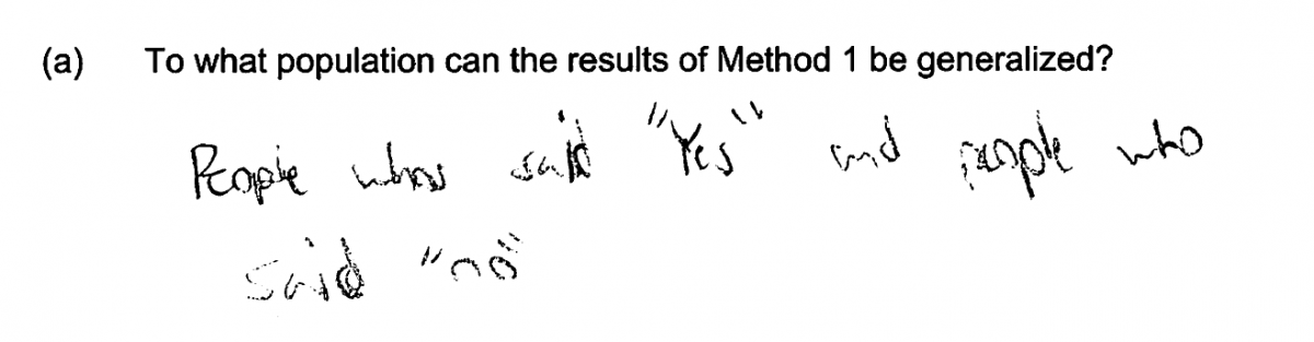
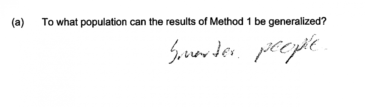
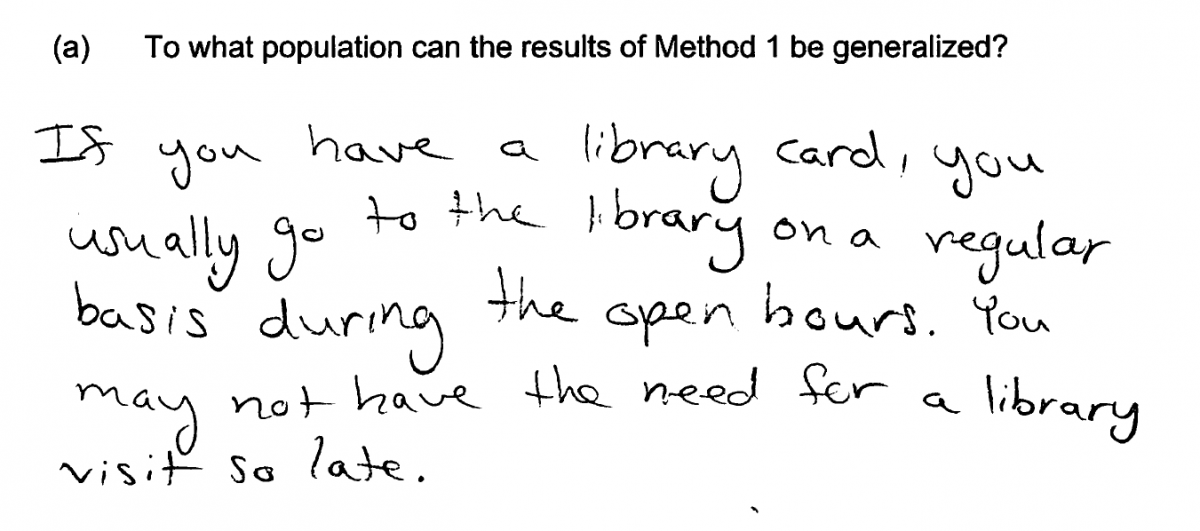
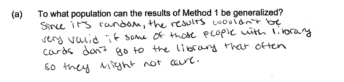
(a) To what population can the results of Method 1 be generalized?
In Method 2, the survey was given to all 25 individuals who were in the library at 4:45 p.m. on a particular Saturday. The results of the two surveys are summarized in the table below.
| Method | Yes | No |
| 1 | 30 | 70 |
| 2 | 15 | 10 |
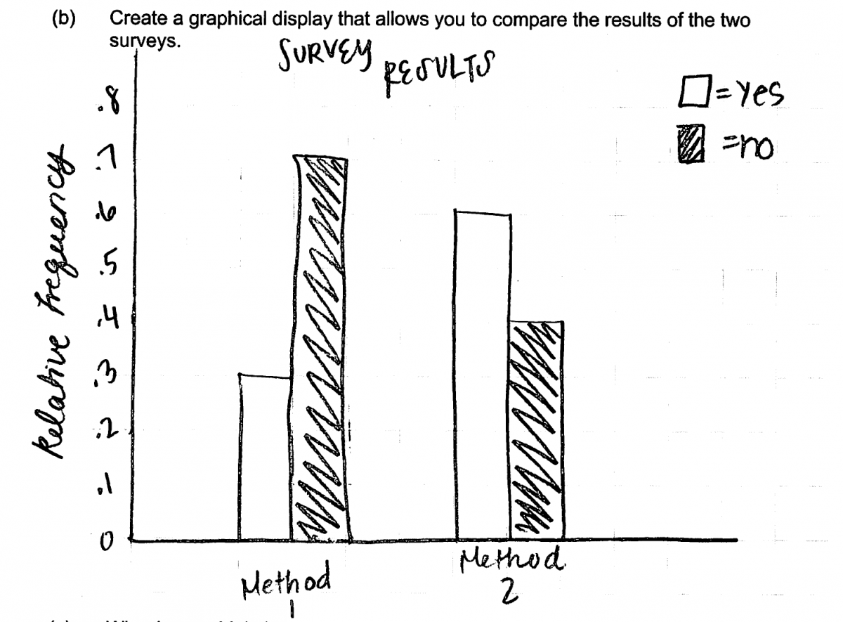
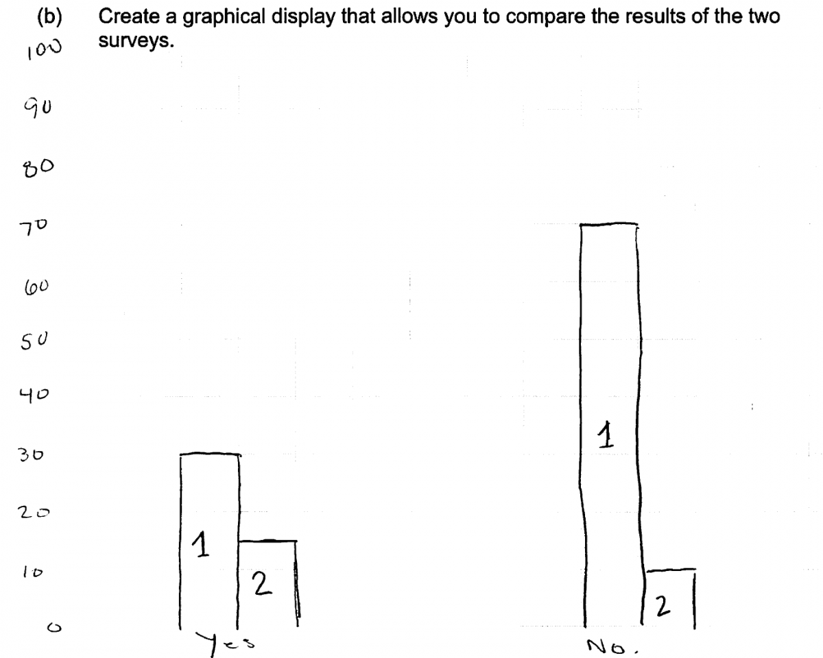
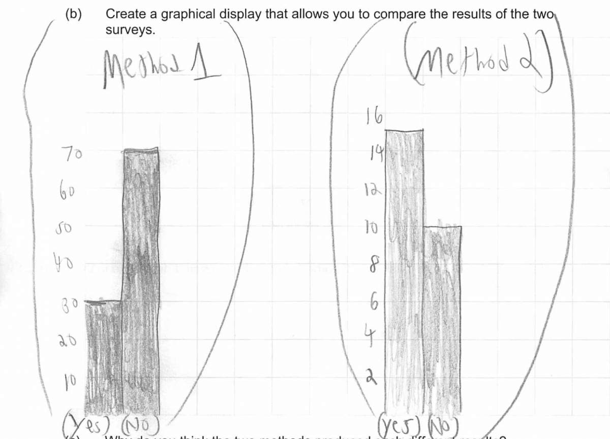
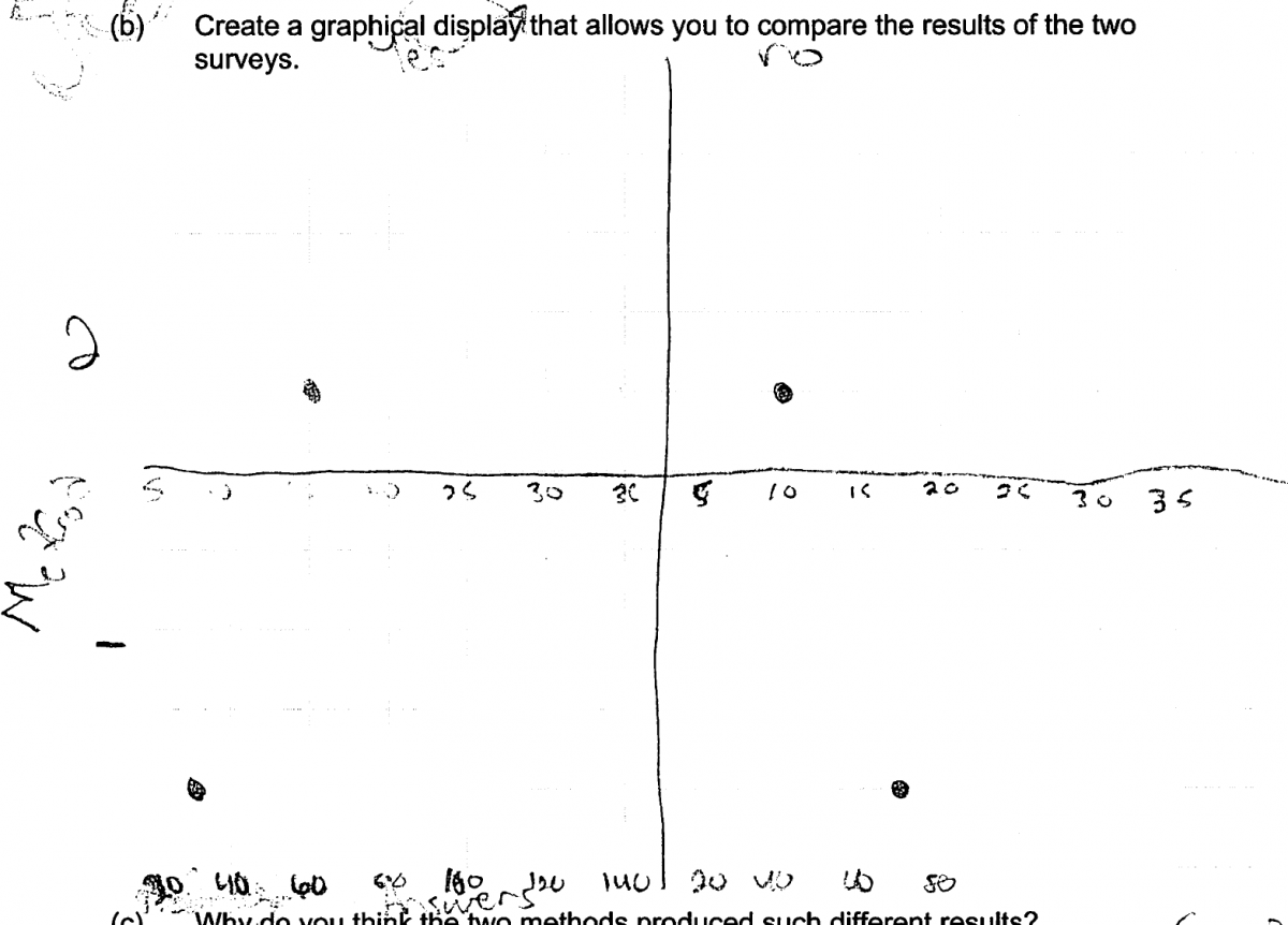
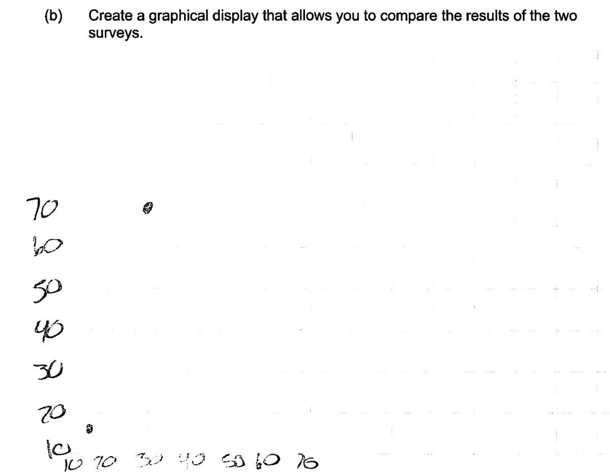
(b) Create a graphical display that allows you to compare the results of the two surveys.
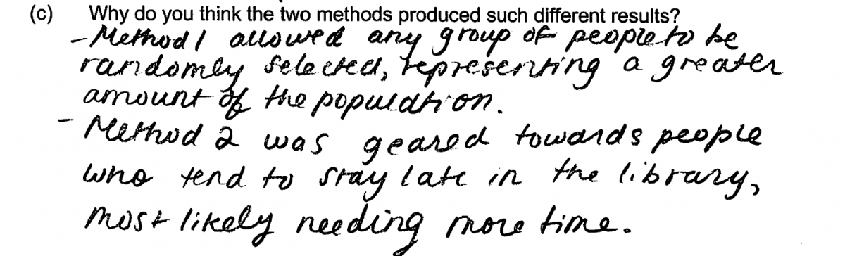
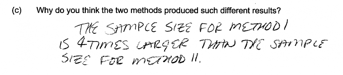
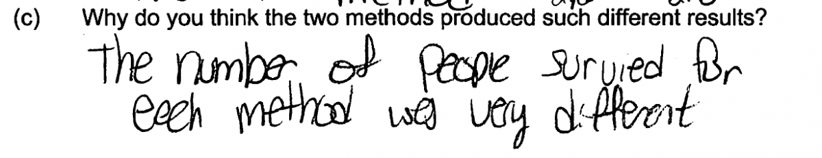
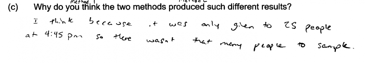
Why do you think the two methods produced such different results?
Overview of the question
This question is designed to assess the student’s ability to:
1. Identify the population to which it is reasonable to generalize conclusions based on sample data (part (a)).
2. Create an appropriate graphical display (part (b)).
3. Identify bias introduced by a sampling method that does not use random selection (part (c)).
Standards
6.SP.4: Display numerical data in plots on a number line, including dot plots, histograms, and box plots.
7.SP.1: Understand that statistics can be used to gain information about a population by examining a sample of the population; generalizations about a population from a sample are valid only if the sample is representative of that population. Understand that random sampling tends to produce representative samples and support valid inferences.
S-ID.1: Represent data with plots on the real number line (dot plots, histograms, and box plots).
S-IC.6: Evaluate reports based on data.
Ideal response and scoring
Part (a):
Part (a) asks students to recognize that conclusions based on a random sample can be generalized to the population from which the sample was selected. In this case, the sample was selected at random from a list of library card holders, so an ideal response identifies the appropriate population as all library card holders. Responses that identify the population as only those who use the library or as some other subset of library card holders were considered to be partially correct for part (a).
Part (b):
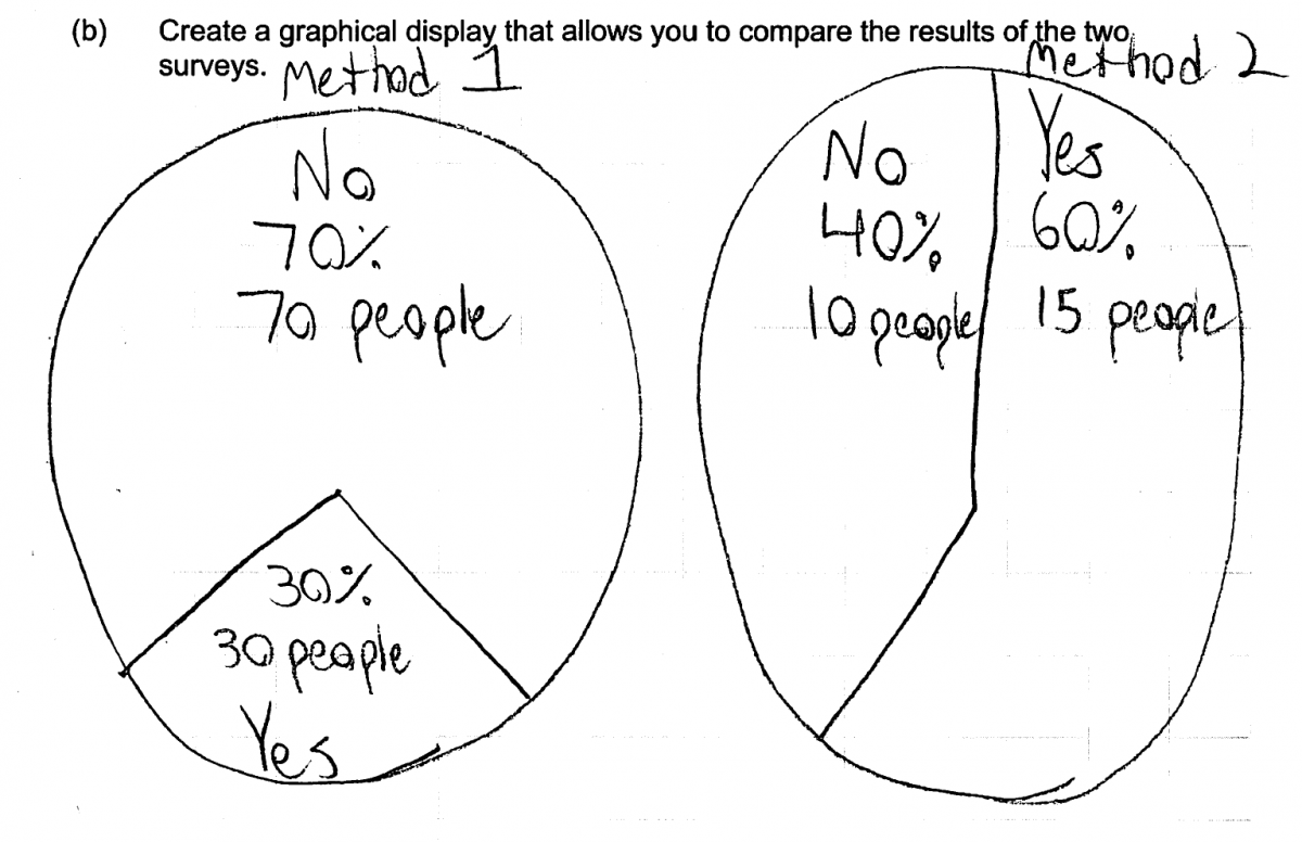
Because part (b) asks students to create a graphical display that could be used to compare the results from the two sampling methods. There are several options for the type of graphical displays that might be used in part (b), including bar charts, segmented (stacked) bar graphs and pie charts. Because the goal is to compare the distributions of responses, an ideal response to part (b) includes graphs for the two methods that are drawn using the same scale to facilitate comparison. In addition, because the sample sizes for the two methods are different (100 versus 25), the graphs must be constructed so that relative frequency or percentage is represented for the two possible responses rather than frequency. An ideal response to part (b) also includes scales and/or labels appropriate to the type of graph (scale and labels for bar charts and title and labels for pie charts).
Responses that represent frequency of responses rather than relative frequency or percentage or that do not include scales or labels are considered to be partially correct for part (b). Responses that attempt to make a graphical display that is not appropriate for categorical data are considered incorrect for part (b).
Part (c):
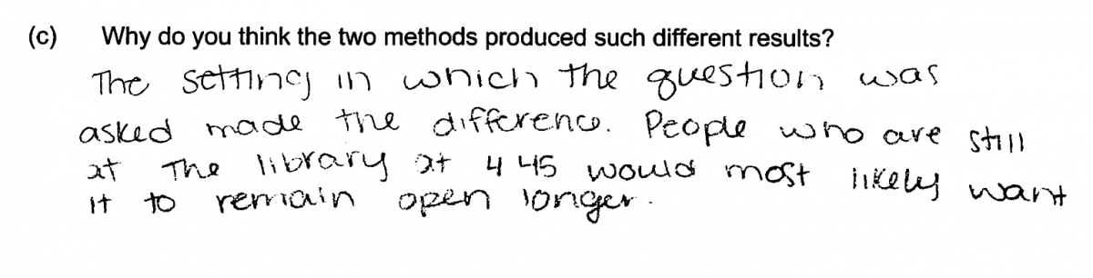
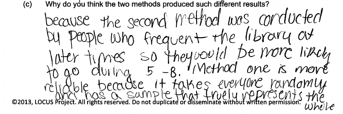
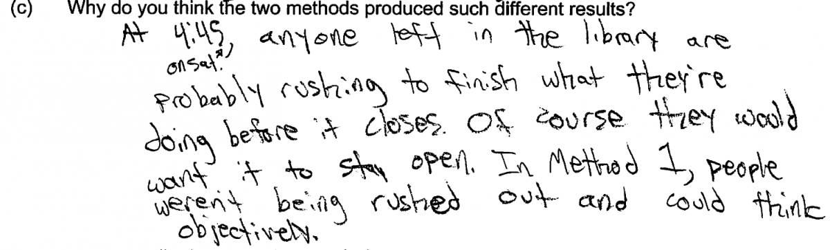
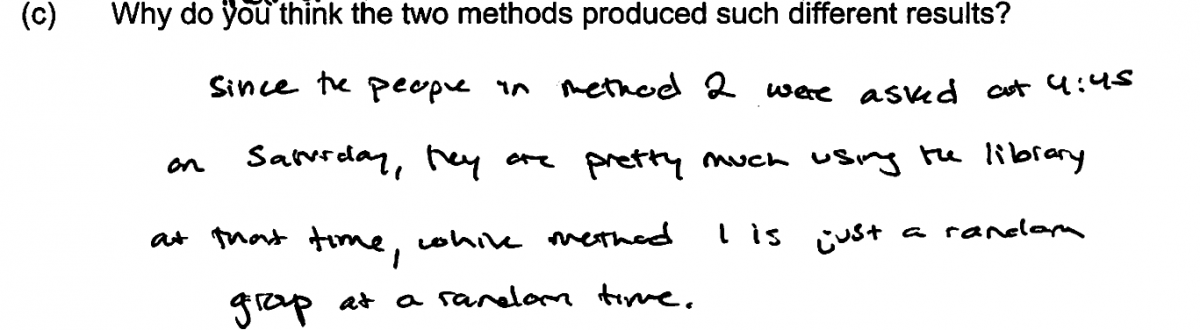
Part (c) asks students to explain why they think that the distribution of responses for the two sampling methods are different. An ideal response recognizes that Method 1 is based on a random sample of library card holders, while Method 2 is a convenience sample consisting entirely of people that are using the library near closing time on a Saturday. Responses that point out this difference and indicate that Method 2 would be biased in favor of including people who were more likely to support longer Saturday hours are scored as essentially correct for part (c). Responses that note the difference in the two sampling methods but don’t specifically address how the difference might affect the responses are considered to be partially correct for part (c).
Sample responses indicating solid understanding
The following student response shows a good understanding of the concepts assessed by this question and received a score of 4. In part (a) the response includes a clearly worded description of the population to which conclusions based on data from method 1 and be generalized. The bar charts uses the same scale for both methods and uses relative frequency on the vertical axis. The graph also includes appropriate scales and labels. In part (c), the difference between the two sampling methods is noted and the response also indicates how this might affect the survey results by saying “method 2 was geared towards people who tend to stay late in the library most likely needing more time.” All three parts of this response were scored as essentially correct and this student response received a score of 4.
Some students constructed segmented (stacked) bar graphs or pie charts in their answers to part (b). The following two student responses show segmented bar graphs and pie charts that were considered essentially correct for part (b).
There were many different ways that students could provide a correct explanation in part (c) that addressed the difference in sampling methods and the effect that the difference might have on the survey results. This is illustrated by the following three student responses, all of which were scored as essentially correct for part (c).
Common misunderstandings
Part (a): Identify the population to which it is reasonable to generalize conclusions based on sample data.
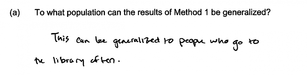
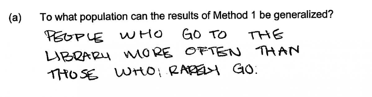
While most students were able to identify the appropriate population for the sampling method described in part (a), there were a number of relatively common student errors. The most common student error was failure to distinguish between the population of library card holders and those that are frequent users of the library. Responses making this error were scored as partially correct. This error is illustrated by the two student responses below.
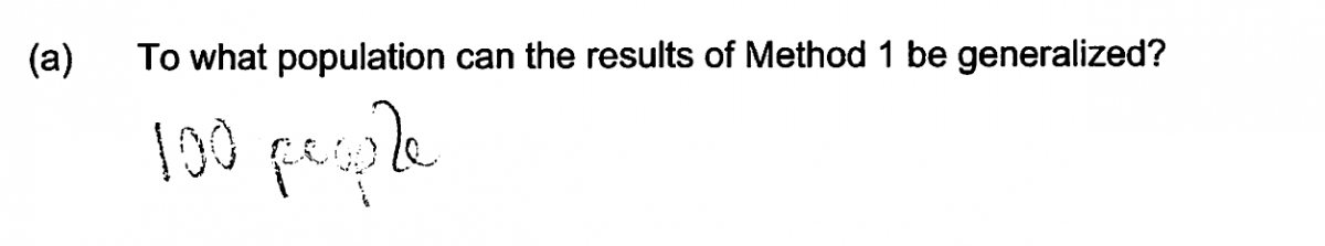
Other students indicated that the results could not be generalized and only applied to the 100 people surveyed, even though the 100 people were randomly selected from a list of library card holders. The student response below was scored as incorrect for part (a), and illustrates this conceptual error.
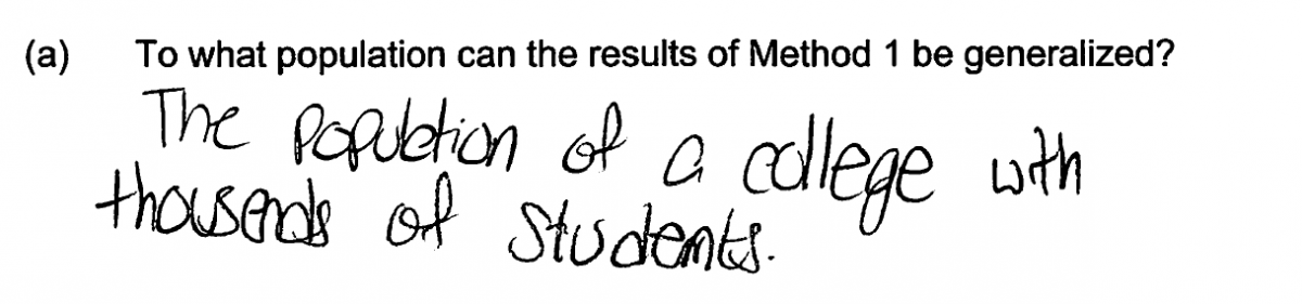
Other students specified a population that was not related to library card holders. Each of the four student responses that follow make this error and were scored as incorrect for part (a). Based on the way in which the sample was selected (method 1), it would not be reasonable to generalize to any of the groups described in these responses.
There were also a surprising number of students who did not understand the question and so chose to answer a different question! For example, see the following two student responses to part (a).
Part (b): Create an appropriate graphical display.
By far the most common error in part (b) was the failure to take the different sample sizes into account when constructing the graphical display. Because students were asked to create a graph that could be used to compare the response distributions for the two surveys, it is necessary to use either relative frequencies or percentages for the two possible responses when constructing the graphical display. Many students did not do this and constructed graphs using the actual frequencies. The following two student responses illustrate this error and were each scored as only partially correct for part (b). Notice also that the first response does not include an appropriate label for the vertical axis and that the second response is also missing this label and does not use the same scale for both graphs.
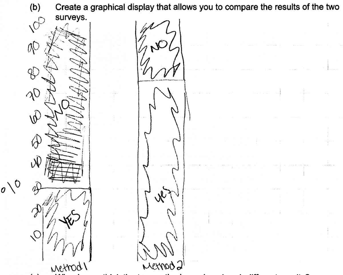
A less frequent error on part (b) occurred in responses which did not recognize the categorical nature of the survey data and so attempted to create a graphical display more suited for numerical data (such as a dotplot or a scatterplot). The two student responses that follow are typical of the kinds of graphs produced by students making this error.
Part (c): Identify bias introduced by a sampling method that does not use random selection.
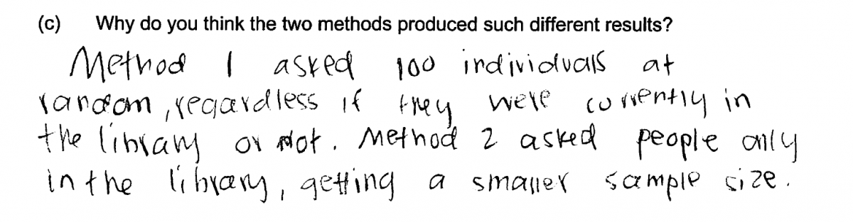
There were several common student errors in answering part (c). The most common of these errors involved failure to recognize that method 2 was unlikely to produce a sample that was representative of library card holders, and that this would result in different response distributions for the two surveys. Many students instead focused on the fact that the sample sizes were different. Although the sample sizes were different, it is unlikely that this alone would result in response distributions in which the proportions of yes responses were as different as what was observed. The following three responses are typical of those that made this error.
A similar error was made by students who believed that the observed difference was probably just the result of sample to sample variability and did not take the different sampling methods into account. For example, see the student response below which was scored as incorrect for part (c).
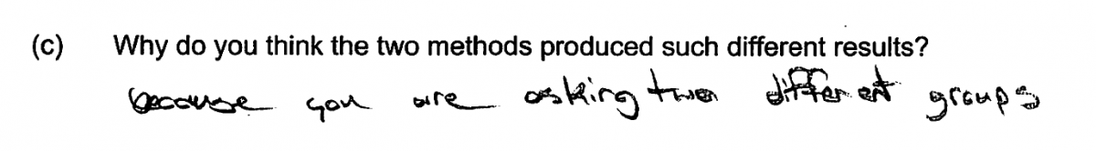
There were two other common errors that resulted in scores of partially correct for part (c). These errors were either failing to make a comparison of the two methods or recognizing the difference in the two sampling methods, and failing to explicitly indicate how this difference would impact the response distributions for the two surveys. A response that was scored partially correct because it did not compare the two sampling methods is shown below. It mentions something about method 1 that distinguishes it from method 2, but does not actually make the comparison or address how this would affect the response distributions.
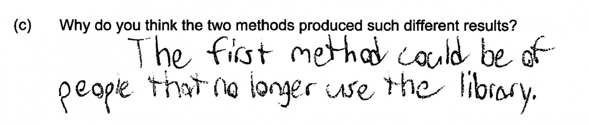
The following two student responses are typical of those that were scored as only partially correct for part (c) because they do not specify how the difference in the methods is expected to affect the response distributions.
Resources
Resources
More information about the topics assessed in this question can be found in the following resources.
Free Resources
Guidelines for Assessment and Instruction in Statistics Education (GAISE)
Published by the American statistical Association and available online, this document contains an example of comparative bar graphs and a discussion of the need to use relative frequencies or percentages when comparing groups of different sizes (pages 38 – 40). It also includes a discussion of random selection and implications for generalizing conclusions based on sample data to a larger population (pages 52 – 540).
Classroom and Assessment Tasks
Illustrative Mathematics has peer reviewed tasks that are indexed by Common Core Standard. A task relevant to topics assessed in this Locus questions are:
Resources from the American Statistical Association
Making Sense of Statistical Studies is a collection of investigations suitable for classroom use. The Overview in the section on Surveys includes a discussion of random sampling versus convenience sampling (pages 44 – 45).
Resources from the National Council of Teachers of Mathematics
The NCTM publication Developing Essential Understanding of Statistics in Grades 6 – 8 includes a section on displaying the distribution of a categorical variable (pages 13 -17).
The NCTM publication Developing Essential Understanding of Statistics in Grades 9 – 12 includes a discussion of random selection (pages 64 – 65).