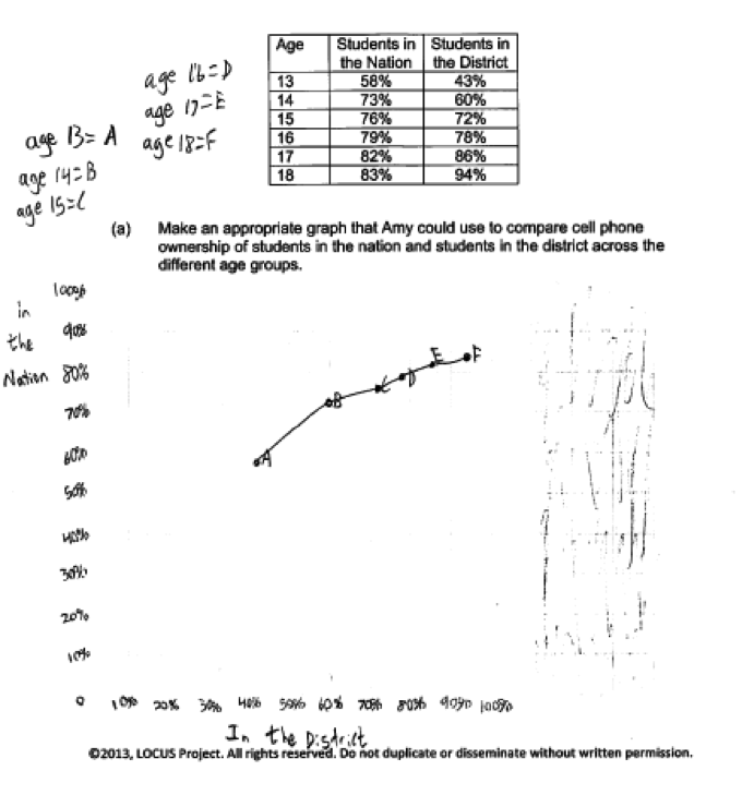
Amy is writing an article for the school paper regarding cell phone ownership. She found a national survey that reported data about whether students 13 to 18 years of age owned cell phones. She then surveyed a random sample of students aged 13 to 18 in her district. The percentages of students at each age who owned cell phones in the nation and in the district are shown in the table below.
| Age | Students in the Nation | Students in the District |
| 13 | 58% | 43% |
| 14 | 73% | 60% |
| 15 | 76% | 72% |
| 16 | 79% | 78% |
| 17 | 82% | 86% |
| 18 | 83% | 94% |
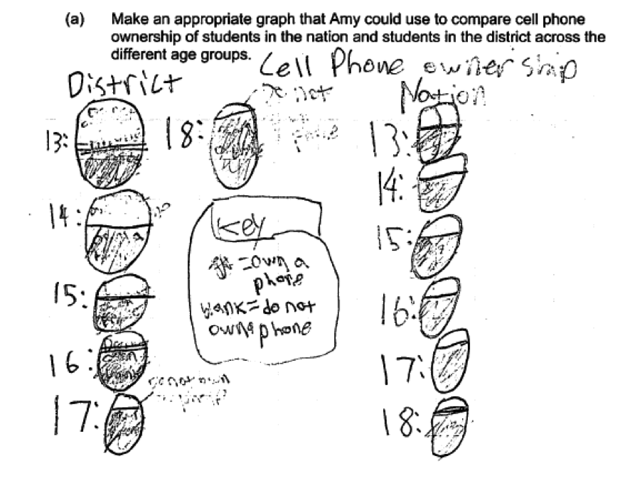
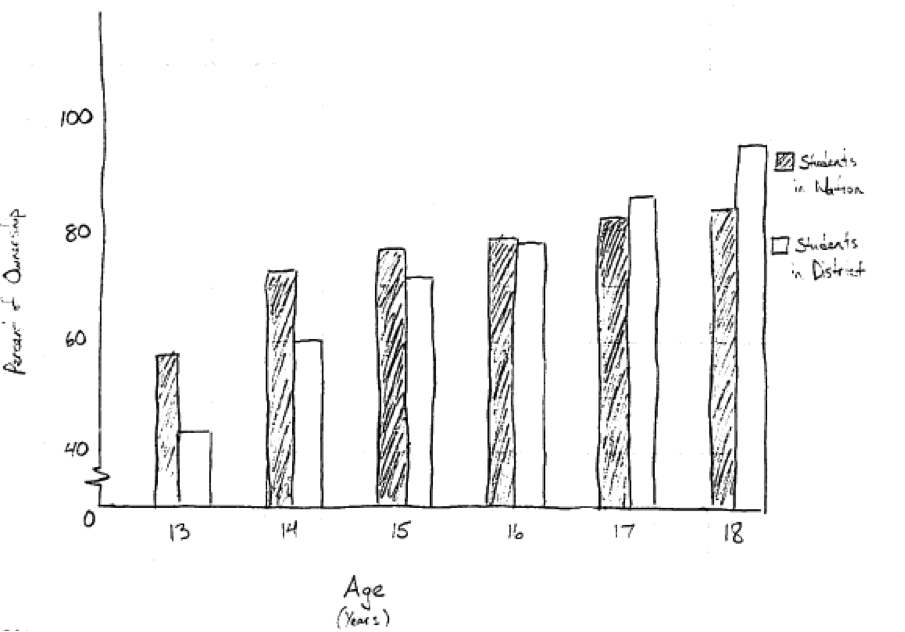
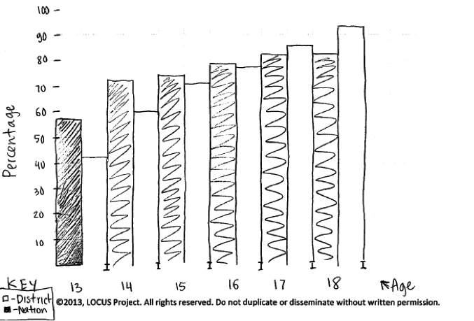
(a) Make an appropriate graph that Amy could use to compare cell phone ownership of students in the nation and students in the district across the different age groups.
(b) Make one statement that Amy could use to address how cell phone ownership in the nation is similar to cell phone ownership in the district across the different age groups.
(c) Make one statement that Amy could use to address how cell phone ownership in the nation is different from cell phone ownership in the district across the different age groups.
Overview of the question
This question is designed to assess the student’s ability to:
1. Create an appropriate graphical display (part (a)).
2. Use information from a graphical display to compare two groups (parts (b) and (c)).
Standards
6.SP.2: Understand that a set of data collected to answer a statistical question has a distribution which can be described by its center, spread, and overall shape.
6.SP.4: Display numerical data in plots on a number line, including dot plots, histograms, and box plots.
7.SP.3: Informally assess the degree of visual overlap of two numerical data distributions with similar variabilities, measuring the difference between the centers by expressing it as a multiple of a measure of
variability.
7.SP.4: Use measures of center and measures of variability for numerical data from random samples to draw informal comparative inferences about two populations.
8.SP.1: Construct and interpret scatter plots for bivariate measurement data to investigate patterns of association between two quantities. Describe patterns such as clustering, outliers, positive or negative
association, linear association, and nonlinear association.
Ideal response and scoring
Part (a):
Part (a) asks students to make a graphical display that could be used to compare cell phone ownership across ages for two groups. An ideal response to part (a) displays the data in a way that facilitates comparison of the two groups. To be considered essentially correct for part (a) the graph must show the percentages for each age for both groups and one axis of the display must represent age. Axes must also be labeled and scaled appropriately. Although the model solution in the rubric shows a scatterplot, an appropriately labeled comparative bar graph is also an acceptable graphical display.
Responses that include an appropriate graphical display but for which axis labels and or scales are incorrect or omitted are considered partially correct for part (a). A response that provides a graphical display that is not appropriate for the given data or that is not suitable for comparing the two groups across the ages is considered incorrect for part (a).
Part (b):
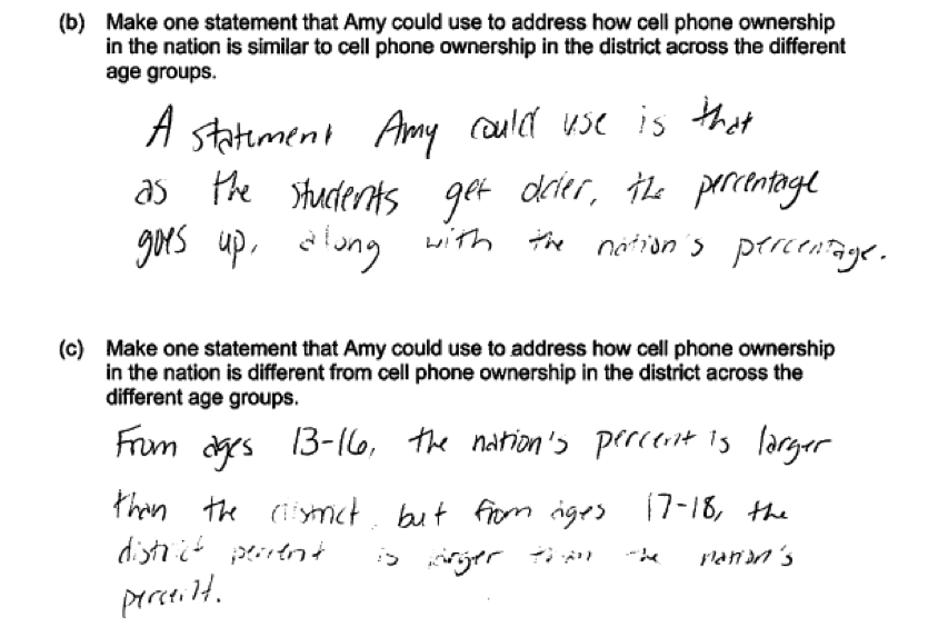
There are a several correct ways that a student might answer part (b). An ideal response to part (b) makes a correct statement about how the groups are similar that addresses more just than one age group and provides an appropriate justification for the statement. For example, the response might comment on the fact that the percentages increase with age for both groups or that the percent ownership depends on age. If a correct statement is provided but the justification is weak or missing, the response is considered to be partially correct for part (b).
Part (c):
As was the case for part (b), there are a several correct ways that a student might answer part (c). An ideal response to part (c) makes a correct statement about how the groups differ that addresses more just than one age group and provides an appropriate justification for the statement. For example, the response might comment on the fact that the percentages vary more across the age groups for the district than for the nation or that the relationship between age and percent ownership is stronger for the district than for the nation. If a correct statement is provided but the justification is weak or missing, the response is considered to be partially correct for part (c).
Sample responses indicating solid understanding
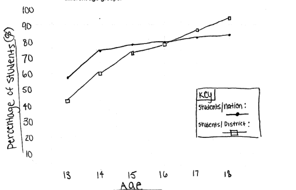
The following student response shows a good understanding of the concepts assessed by this question and received a score of 4. In part (a) the response includes an appropriate graphical display and the axes are correctly labeled and scaled.
The response in part (b) correctly notes that the ownership percentages increase with age for both groups, and in part (c) provides a well justified description of how the two groups differ with respect to ownership over the different age groups.
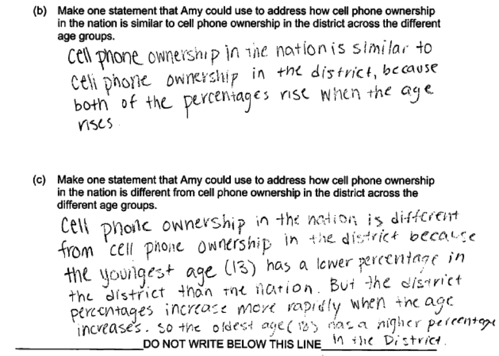 The previous student response used a scatterplot to display the data in part (a). The following student response used a comparative bar graph in part (a) and also received a score of 4. In part (b), the response points out a similarity across the age groups (“as students get older, the percentage goes up, along with the nation’s percentage”). In part (c) the response points out a difference in the ownership percentages that also addresses more than one age (“From ages 13 – 16, the nation’s percent is larger than the district, but from ages 17 – 18, the district percent is larger than the nation’s.”) All three parts of this response were considered essentially correct.
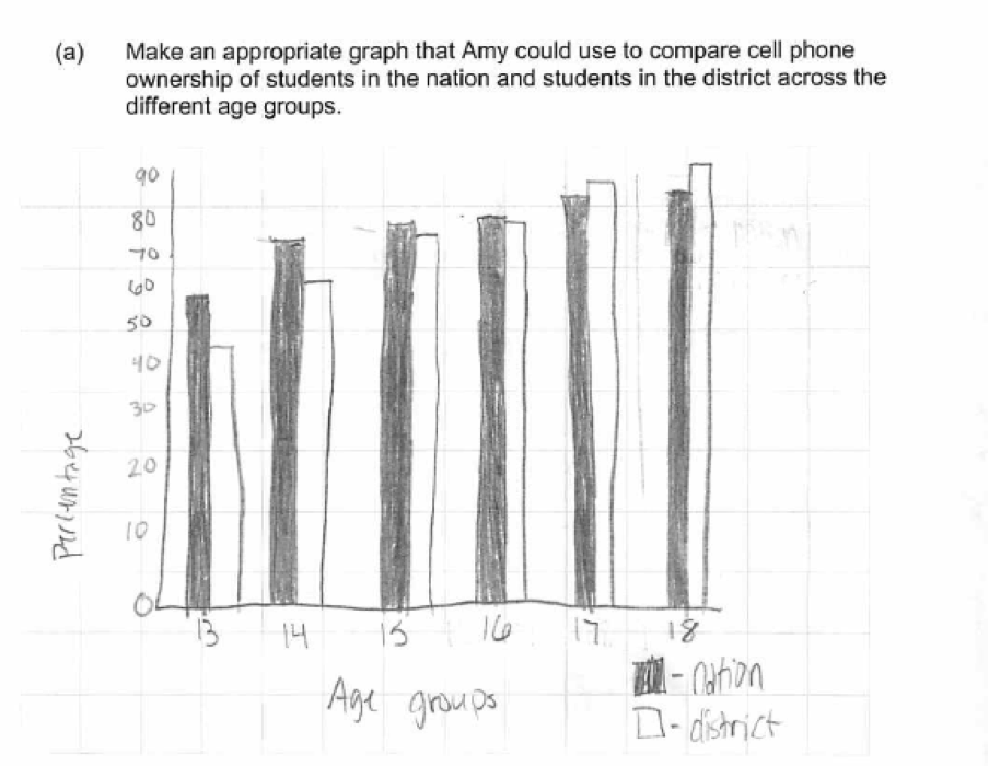
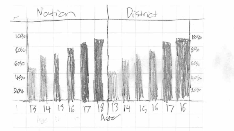
 In part (a) there were other acceptable types of graphical displays. For example, consider the following student response. While comparisons are not quite as easy with two separate bar charts as with a comparative bar chart, because both bar charts are drawn correctly and use the same scales, this student response also received a score of essentially correct for part (a).
Common misunderstandings
Part (a) Create an appropriate graphical display
There were several common student errors in constructing a graphical display in part (a). By far the most common error was to omit scales or labels on the axes of chosen graphical display. The following two student responses illustrate this error. In the first response, neither axis in the scatterplot is labeled, while in the second response the age axis is not labeled and there is no vertical scale or label given. Both of these responses are considered to be only partially correct for part (a).
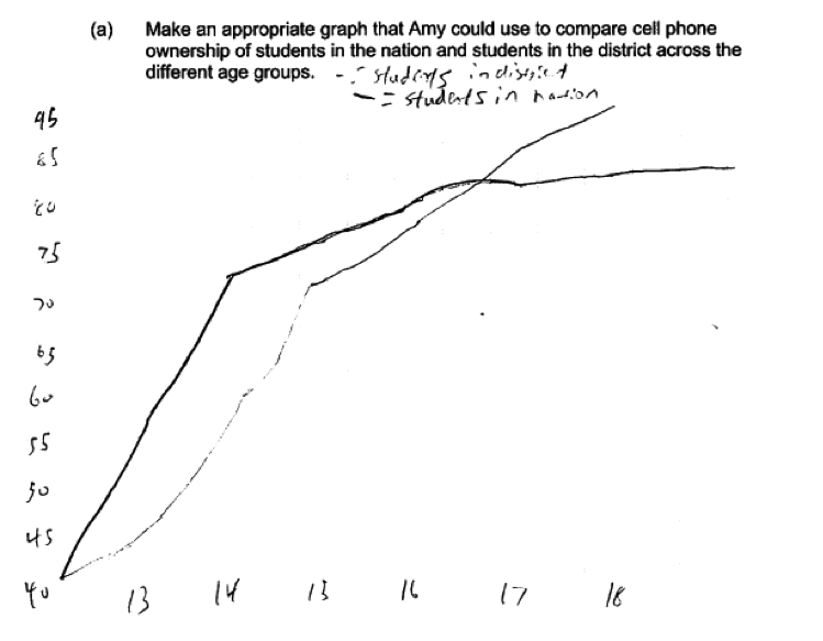
 Some students constructed graphical displays that did not use age on one of the axes, or constructed other types of displays that do not facilitate comparison of the two groups across the ages. Two examples of student responses that illustrate this error and that were scored as incorrect for part (a) follow.
 There were also two errors that were considered minor. While these errors did not impact the score on part (a), they are worth mentioning because they occurred often. Both of these errors occurred in responses that used the comparative bar chart. The first of these errors was not starting the vertical axis at 0. While it is not uncommon for axes in a scatterplot to not cross at (0,0), in bar charts or histograms, the vertical axis should always start at 0. Starting the axis at something other than 0 distorts comparisons and can make differences between groups look larger. The following student response shows a break in the vertical axis. While this response was still considered as essentially correct for part (a), the response would have been stronger if the vertical axis had been constructed correctly.
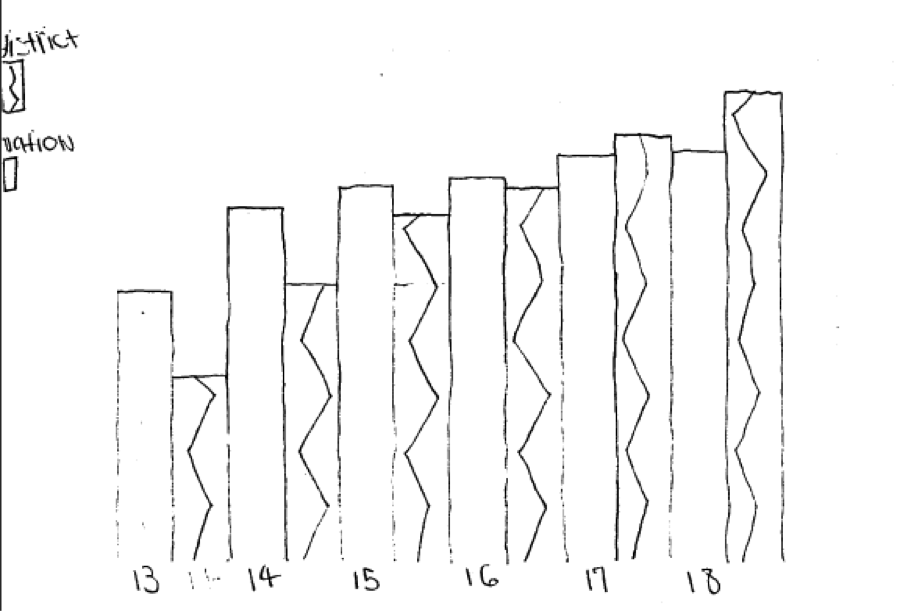
 Another common error was to run all the bars in the bar graph together. In constructing a bar graph for the given data, age is considered as an age group category, and the bars that represent categories in a bar graph are separated (as in the response shown above). The following response illustrates this error. Again, this was considered a minor error and this response still received a score of essentially correct for part (a), but the response would have been stronger if the bar graph had been correctly drawn.
Parts (b) and (c) Use information from a graphical display to compare two groups
In parts (b) and (c) there were three common errors: (1) failure to make a statement that addressed the “across the different age groups” aspect of the problem; (2) failure to make a statement that addressed both groups; and (3) providing a weak description/justification of the similarity (part (b)) or difference (part (c)).
The following student responses were all scored as incorrect for part (b) or part (c) because they do not provide a statement that acknowledges a similarity or difference across the ages.


 Some responses made general statements that failed to reference both groups. This is illustrated in the following responses to part (b), which were scored as partially correct. If these responses had indicated that the statement was true for both groups, they would have received a higher score for part (b).


The third common error in parts (b) and (c) was to provide a weak explanation or justification. This is illustrated in the following student responses, which were scored as partially correct. These responses would be stronger if they had been more specific and descriptive and referenced both age and percent ownership as well as the two groups.


 There was one other error on parts (b) and (c) that also occurred, although less frequently than the other errors mentioned here. These responses focused on the different group sizes (district versus nation) in the response. Such responses were scored as incorrect because they did not address the question asked. The following student response illustrates this, and is typical of those making this error.
Resources
More information about the topics assessed in this question can be found in the following resources.
Free Resources
Guidelines for Assessment and Instruction in Statistics Education (GAISE)
Published by the American statistical Association, this document contains a discussion of using bar graphs to compare two groups on pages 38 – 39.
Resources from the American Statistical Association
Bridging the Gap Between Common Core State Standards and Teaching Statistics is a collection of investigations suitable for classroom use. This book contains a section on comparing distributions (Section 4) that contains four activities.
Resources from the National Council of Teachers of Mathematics
The NCTM publication Developing Essential Understanding of Statistics in Grades 6 – 8 includes a section on comparing distributions on pages 42 – 55.