Each student in the eighth-grade monitored the time (in hours) he or she spent on out of school activities and the time (in hours) he or she watched TV for one week. The resulting data are summarized in the scatterplot below.
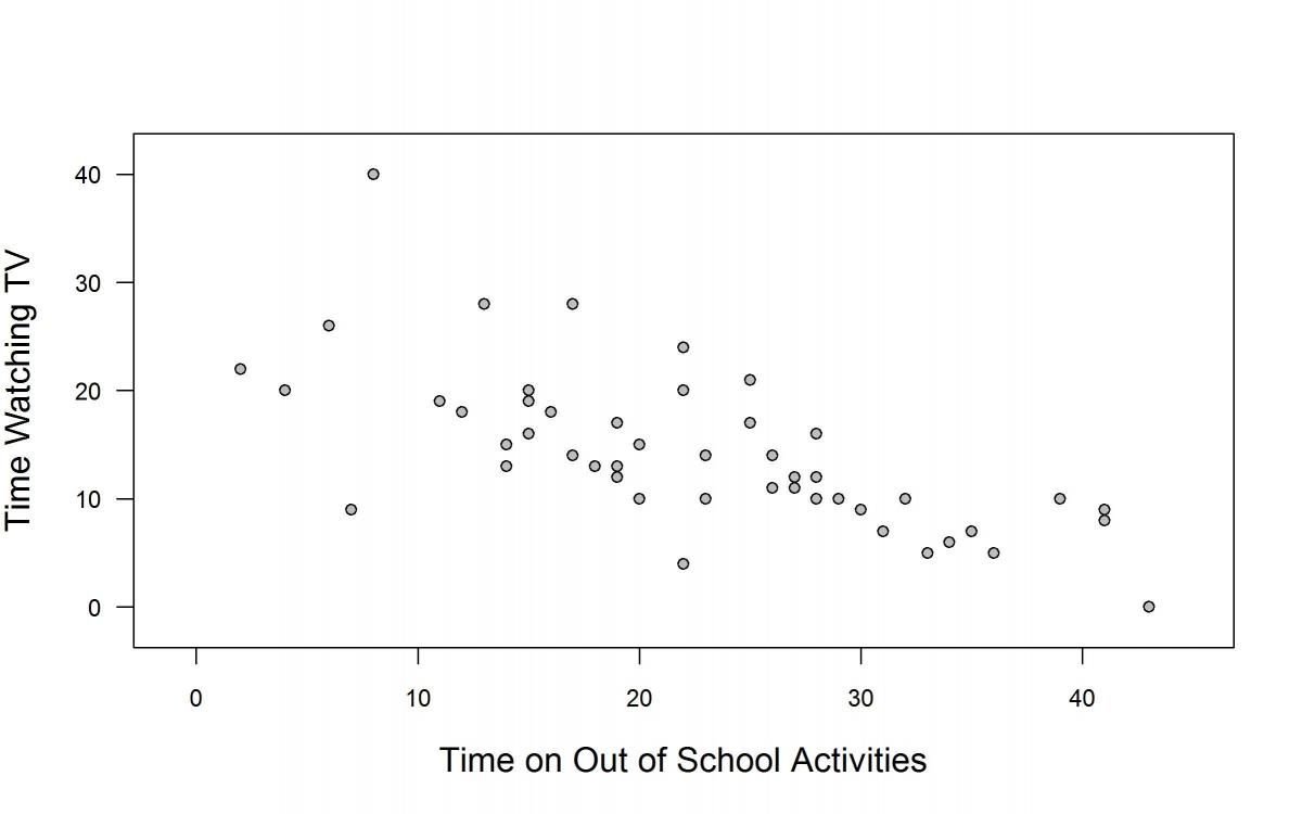
Based on the scatterplot, which of the following is a correct conclusion?
(A) Due to extreme values, we cannot tell whether there is a relationship between time on out of school activities and time watching TV.
(B) Generally, the more time students spend on out of school activities the less time they tend to spend watching TV.
(C) Generally, the more time students spend on out of school activities the more time they tend to spend watching TV.
(D) The amount of time spent watching TV does not seem to be related to the amount of time students spend on out of school activities.
Standards
8.SP.1: Construct and interpret scatter plots for bivariate measurement data to investigate patterns of association between two quantities. Describe patterns such as clustering, outliers, positive or negative association, linear association, and nonlinear association.
8.SP.3: Use the equation of a linear model to solve problems in the context of bivariate measurement data, interpreting the slope and intercept. For example, in a linear model for a biology experiment, interpret a slope of 1.5 cm/hr as meaning that an additional hour of sunlight each day is associated with an additional 1.5 cm in mature plant height.
Correct answer and commentary
Student performance
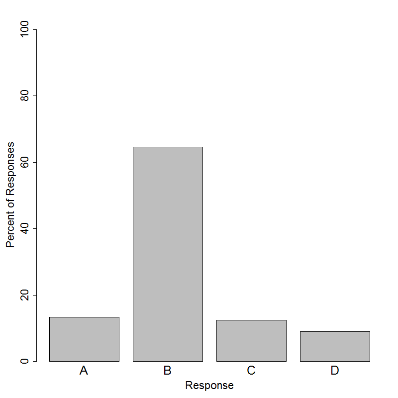
The correct answer to this question is Choice (B). The question tests the ability to interpret data presented in a scatterplot and describe the association between two variables. Although the slope of the line relating time watching TV to time on out of school activities is not given in the question, the correct answer choice is phrased as an informal interpretation of the slope. If the equation (y=mx+b) were given, we could interpret the slope by saying, “For every one hour increase in time spent on out of school activities, the time spent watching TV decreases by |m|, on average.” Without actually estimating the slope, choice (B) makes a similar interpretation of the negative association in context, noting that as time spent on out of school activities increases, the time spent watching TV tends to decrease. 65% of students answered this question correctly. Choice (C) is also phrased as an informal interpretation of the slope, but it is incorrect, because it describes a positive association between the two variables that contradicts what is shown in the scatterplot.
When interpreting data, it is important for students to consider patterns in data as well as striking deviations from those patterns. Choice (A) represents the misconception that deviations from the pattern (which in this case should probably not be called “extreme”) preclude any interpretation of the data at all. Choice (D) is a statement that no relationship can be identified between the two variables. Like most real data, these data points do not fall perfectly on a straight line, but there is a clear trend that represents a negative relationship between the two variables. Students who choose choice (D) may be uncomfortable describing association in a way that accounts for variability in data, or uncomfortable attributing an association to anything but a deterministic relationship.