The long jump has been a Summer Olympic track and field event for women since 1948. The following plot shows the length of the long jump (in meters) of the women's gold medal winner in the Summer Olympics since 1948.
Length of Long Jump for Women's Gold Medal Winner in Summer Olympics (1948-2008)
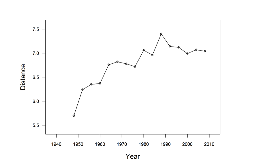
Which one of the following gives the best description of the trend in the length of the winning long jump over time?
(A) The length of long jumps increased every 4 years because more women are going into sports.
(B) The length of the longest jump tended to increase from 1948 to about 1988, but did not continue to increase beyond 1988.
(C) There has been a steady increase in the length of the women’s gold medal long jump from 1948 to 2008.
(D) There is too much irregularity in the plot to make a clear statement about the trend in the length of the winning long jump.
Standards
8.SP.1: Construct and interpret scatter plots for bivariate measurement data to investigate patterns of association between two quantities. Describe patterns such as clustering, outliers, positive or negative association, linear association, and nonlinear association.
S-ID.6: Represent data on two quantitative variables on a scatter plot, and describe how the variables are related. a) Fit a function to the data; use functions fitted to data to solve problems in the context of the data. Use given functions or choose a function suggested by the context. Emphasize linear and exponential models; b) Informally assess the fit of a function by plotting and analyzing residuals; c) Fit a linear function for a scatter plot that suggests a linear association.
Correct answer and commentary
Student performance
The correct answer to this question is Option (B). The graph is a type of scatterplot known as a time series. In a time series, one of the two quantitative variables is some measure of time and there is often dependence between different observations in the time series (contrast this with the customary assumption of independence of observations in many statistical analysis techniques). The most immediate visual distinction between a time series plot and a typical scatterplot is that line segments are often used to join consecutive points on the graph to more clearly reveal the trend, if any, that the plot displays.
This graph displays a time series that initially increases and then starts to level off, corresponding to Option (B). While we cannot determine why this is the case, speculation may be appropriate to help understand the underlying phenomenon. The initial increase may have been caused by several factors, either alone or in combination, such as an increasing number of women participating (and so naturally talented women who are better than all previous jumpers find their way into competitions), better training techniques as the sport becomes more widespread, and better overall health due to medical advances. The leveling-off that occurs may be due to some intrinsic long jump ability limit for humans.
Option (A) provides some possible speculation but is not the correct answer for two reasons: 1) we don’t know for sure that the reason cited is, in fact, the cause and 2) the length of long jumps does not increase every four years - there is a clear decrease around 1990. This decrease is also the reason why Option (C) is not correct . Lastly, Option (D) is not correct because variability/irregularity does not preclude statements about the overall trend.