A teacher collected data from each student in her class on the number of books read in February and the number of books read in March. A scatterplot of the data is given below.
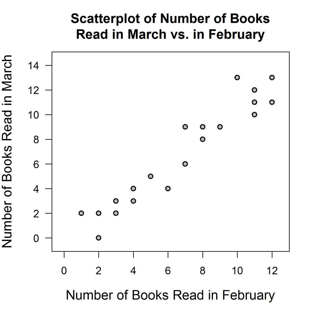
Based on the graph, what is the most appropriate conclusion?
(A) The mode number of books read in February is 10.
(B) Students who read more books in February tended to read fewer books in March.
(C) Students who read more books in February tended to read more books in March.
(D) There is no relationship between the number of books read in February and March.
Standards
8.SP.1: Construct and interpret scatter plots for bivariate measurement data to investigate patterns of association between two quantities. Describe patterns such as clustering, outliers, positive or negative association, linear association, and nonlinear association.
Correct answer and commentary
Student performance
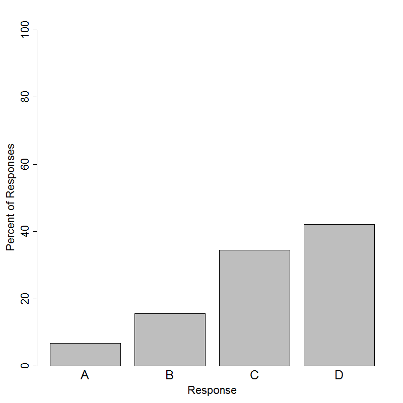
The correct answer to this item is choice (C). About 35% of the students selected the correct answer. Looking at the scatterplot, we see that the dots tend to go from the bottom left of the plot to the top right of the plot. This means that students who read more books in February tended to read more books in March.
One way to come to this realization is to select some of the dots and interpret them individually. The very first dot on the left represents a student that read 1 book in February and 3 books in March. The very last dot on the right represents a student that read 10 books in February and 11 books in March. The rest of the dots follow this same trend and therefore students who read more in February read more in March.
Some students that may be familiar with a line of best fit may attempt to imagine or draw a line through the points. This line will have a positive slope, which implies that as the number of books read in February increases, the number of books read in March increases.
This conclusion is also consistent with many students’ intuition: some students like to read and will read more books every month than students who don’t like to read. This intuition is not an acceptable way to arrive at the answer to the question, but checking an answer or conclusion against common-sense or other ideas is a common practice in statistics. (If the data suggest something counter to common-sense or our preconceptions, that doesn’t make the data wrong - it just means that we should try to figure out the reason for the disagreement.)
This item tests the ability to interpret data shown in a scatterplot and determine what type of relationship, if any, exists between the two variables. Choice (A) is incorrect because it is not true. The mode number of books read in February would be the number of books with the most dots above it. For 10 books read in February, we only see one dot and for some other numbers of books we see more than one dot. Thus, 10 is not the mode and choice (A) is incorrect. Additionally, the mode is generally not used with quantitative data. About 16% of the students selected choice (B), which represents the opposite trend in number of books read between February and March. This would be the correct conclusion if the points started in the top left and went to the bottom right. Choice (D) was the most popular answer on this item with 42% of students selecting it. This distractor was attempting to focus on students that either do not understand how to read scatterplots for the purpose of determining whether or not a relationship exists, or those who simply rely on their intuition to decide if two variables may or may not be related regardless of the data shown.