Question:
A group of 20 teenagers all play on the same soccer team. Some of the parents have been keeping track of the number of minutes each player is on the field during each soccer match. The table below presents the initials of the first and last names and the average number of minutes of play for each of the 20 players.
| Player | BH | HA | JS | TC | MM | GV | RC | SU | DH | TO |
| Average minutes of play | 29.2 | 12.9 | 22.8 | 4.9 | 9.3 | 30.3 | 3.8 | 18.6 | 7.1 | 12.2 |
| Player | RL | JB | WG | MH | BC | AA | HK | RS | CR | MD |
| Average minutes of play | 15.4 | 19.2 | 3.5 | 5.2 | 23.1 | 8.7 | 33.6 | 14.7 | 5.6 | 6.4 |
Which of the following graphs is the best display for showing the shape, center and spread of the distribution of average minutes of play?
(A)
 (B)
(B)
 (C)
(C)
 (D)
(D)
Level:
Intermediate
Standards
6.SP.4: Display numerical data in plots on a number line, including dot plots, histograms, and box plots.
S-ID.1: Represent data with plots on the real number line (dot plots, histograms, and box plots).
Correct answer and commentary
Student performance
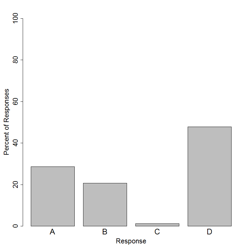
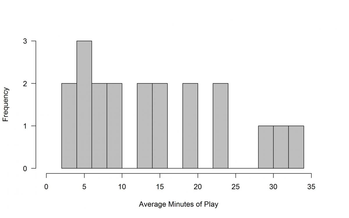
The correct answer to this item is Option (B). Only about 20% of students selected the correct choice. The data provided contains each player's initials and their average minutes of play. Since we want a display that will help visualize the center, shape, and spread of the average minutes of play, we want to plot the average minutes of play as a numerical data set. Option (B) is a frequency histogram that has the average minutes of play plotted in bins on the real number line on the x-axis, and the frequency of players with average minutes of play within each bin. This plot allows us to see the shape, center, and spread of the data.
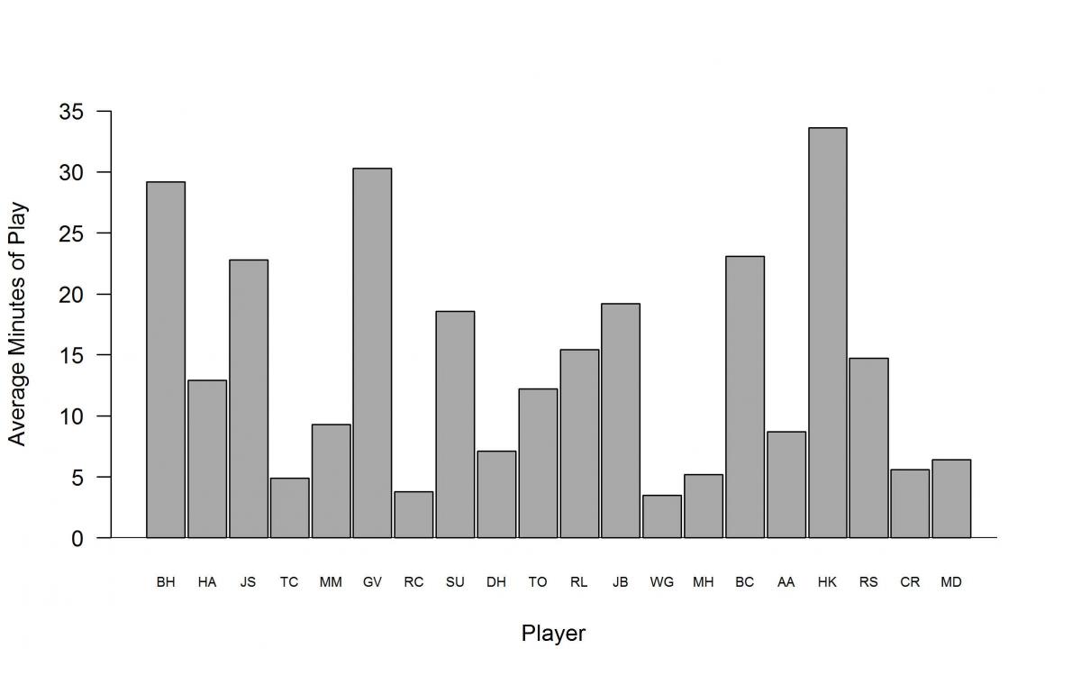
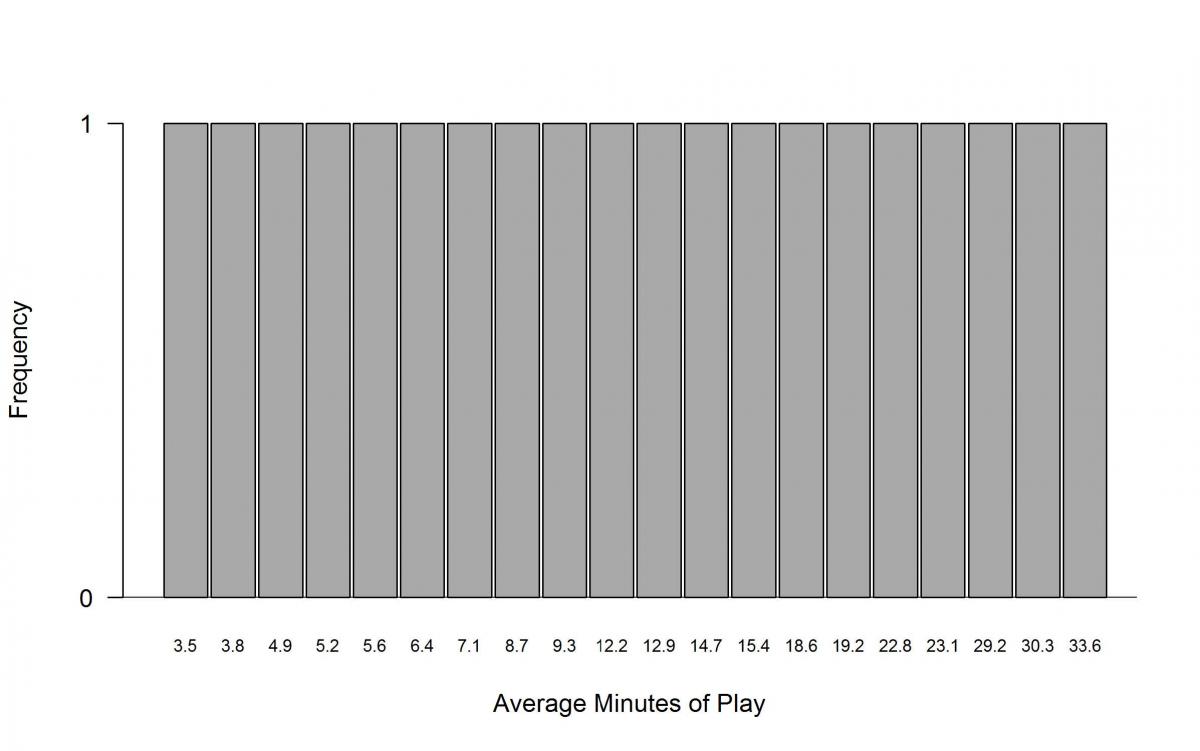
It is common for students to want to preserve all information about individuals when creating a graph of data, even if the information is not relevant to the question or problem that is posed. Options (A) and (C) were designed to mimic the types of plots that might be naïvely produced using popular spreadsheet programs, and Option (D) is essentially the same plot as (A) but deliberately rearranged to resemble a bell-shaped distribution. Options (A) and (D) preserve the connection between each player and the player’s average minutes of play, while Option (C) preserves the exact value of each player’s average minutes of play. However, being able to know the average minutes of play for each individual player is not needed to answer the question, and preserving this information actually produces plots that do not allow us to see the center, shape, and spread of the variable “average minutes of play”.
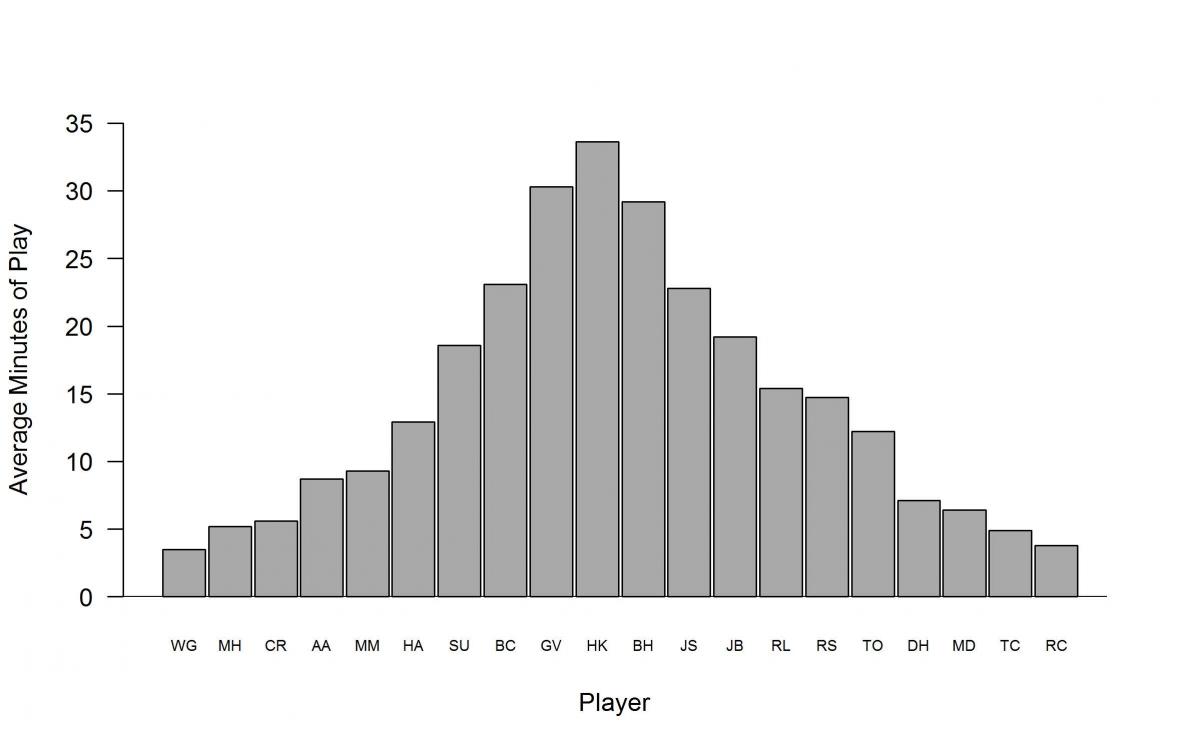
The most popular choice on this item was Option (D), with a response rate of about 48%. Choice (D) puts each player on the x-axis and their respective average minutes of play on the y-axis. While the plot appears to be symmetric and is shaped like a bell, the order of the players on the x-axis does not actually matter and could be rearranged in any order. This plot does not allow us to clearly see any measure of center for the average number of minutes played by the players and is likely chosen by students who know enough about statistics to recognize the bell shape but still have gaps in their understanding. Option (A) was the second most selected response with a response rate of about 29%. This plot is the same type of plot as in Option (D) with the players arranged on the x-axis in the same order as in the table. Only about 1% of students selected Option (C), which is a bar graph using each player’s average minutes of play as a label for each bar. While the bars are arranged in increasing order, they are evenly spaced apart, which does not accurately reflect the differences between average minutes played for the players and will not allow us to see the center, shape, or spread of the variable of interest.