A mathematics test is given to two classes. The scores are summarized in the table below.
| Class 1 | Class 2 | |
| Minimum | 42 | 57 |
| First Quartile | 53 | 66 |
| Median | 72 | 72 |
| Third Quartile | 89 | 78 |
| Maximum | 98 | 84 |
| Range | 56 | 27 |
| IQR (interquartile range) | 36 | 12 |
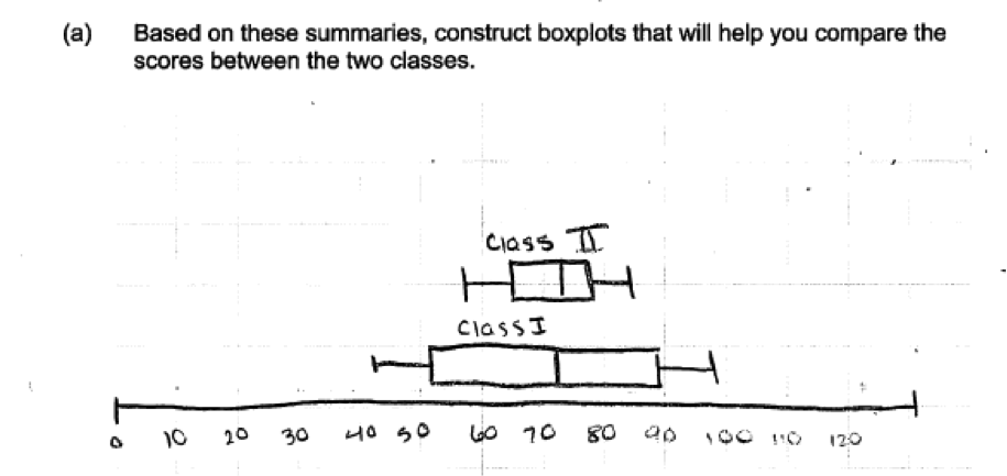
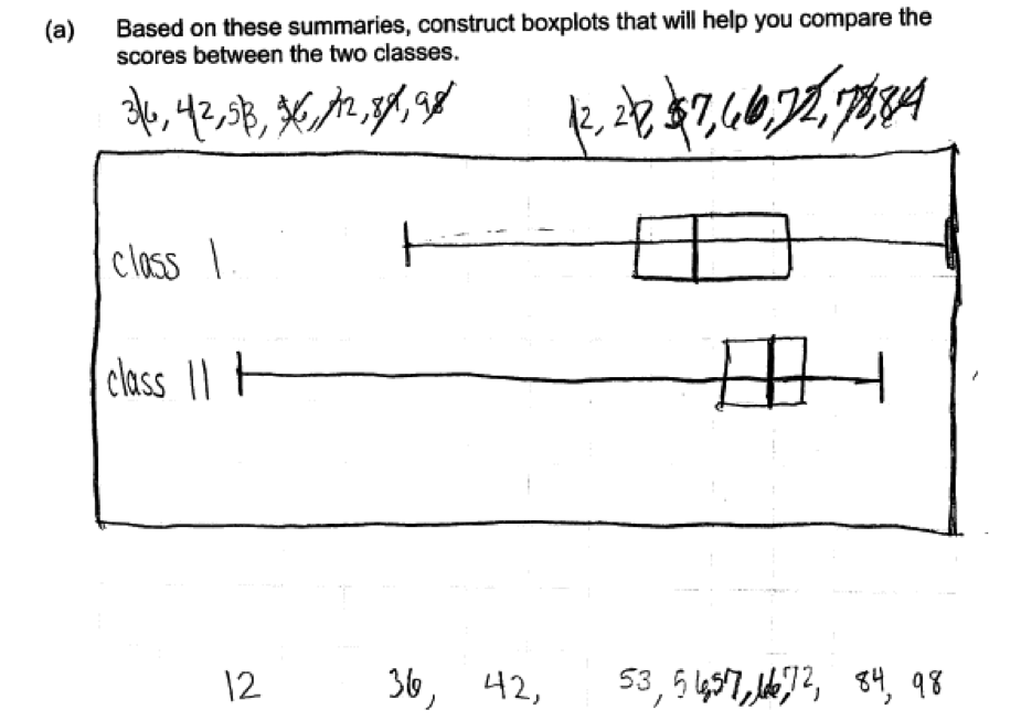
(a) Based on these summaries, construct boxplots that will help you compare the scores between the two classes.
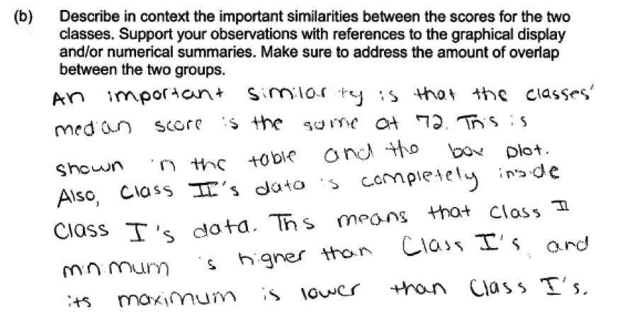
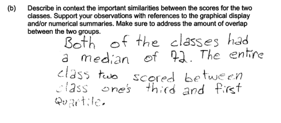
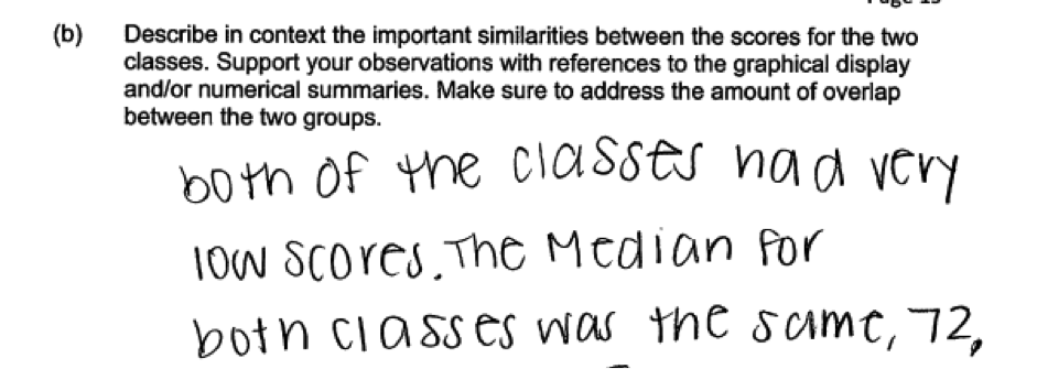
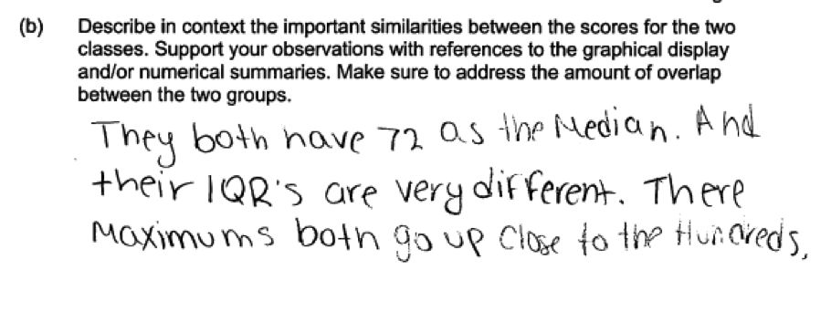
(b) Describe in context the important similarities between the scores for the two classes. Support your observations with references to the graphical display and/or numerical summaries. Make sure to address the amount of overlap between the two groups.
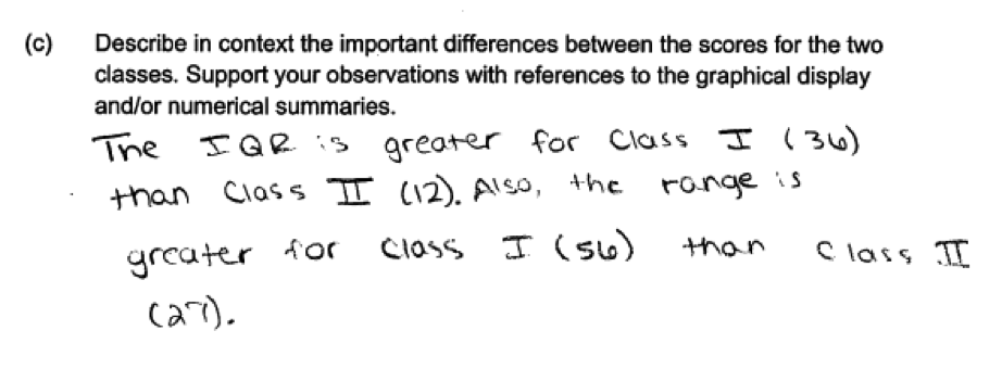
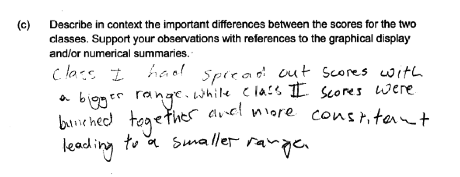
(c) Describe in context the important differences between the scores for the two classes. Support your observations with references to the graphical display and/or numerical summaries.
Overview of the question
This question is designed to assess the student’s ability to:
1. Construct a box plot using the values in a five number summary (part (a)).
2. Use information provided by box plots and numerical summaries to describe similarities and differences for two data distributions. (parts (b) and (c)).
Standards
6.SP.2: Understand that a set of data collected to answer a statistical question has a distribution which can be described by its center, spread, and overall shape.
6.SP.4: Display numerical data in plots on a number line, including dot plots, histograms, and box plots.
6.SP.5: Summarize numerical data sets in relation to their context, such as by: (a) Reporting the number of observations; (b) Describing the nature of the attribute under investigation, including how it was measured and its units of measurement; (c) Giving quantitative measures of center (median and/or mean) and variability (interquartile range and/or mean absolute deviation), as well as describing any overall pattern and any striking deviations from the overall pattern with reference to the context in which the data were gathered; (d) Relating the choice of measures of center and variability to the shape of the data distribution and the context in which the data were gathered.
7.SP.3: Informally assess the degree of visual overlap of two numerical data distributions with similar variabilities, measuring the difference between the centers by expressing it as a multiple of a measure of
variability.
7.SP.4: Use measures of center and measures of variability for numerical data from random samples to draw informal comparative inferences about two populations.
S-ID.1: Represent data with plots on the real number line (dot plots, histograms, and box plots).
S-ID.2: Use statistics appropriate to the shape of the data distribution to compare center (median, mean) and spread (interquartile range, standard deviation) of two or more di"erent data sets.
Ideal response and scoring
Part (a):
Part (a) asks students to construct boxplots from given five number summaries. The ideal response shows correctly drawn boxplots, labels the boxplots to indicate which represents Class I and which represents Class II, and includes an appropriate scale that is labeled to indicate that the variable of interest is test score. If correct boxplots are provided, but the response is missing the scale and/or labels, the response is considered to be only partially correct for part (a).
Responses that consisted of boxplots that were constructed by treating the given summary statistics as if they were data were scored as incorrect. Responses that included graphs that were not boxplots, such as a comparative bar chart of the numbers in the five number were also considered to be incorrect for part (a).
Part (b):
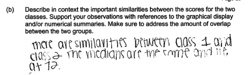
Part (b) asks students to describe similarities in the two data distributions and to comment on the amount of overlap for the two groups. To be considered essentially correct for part (b), a response must describe at least two similarities in context and provide support based on the box plots and/or numerical summaries. A discussion of the overlap in the two distributions is considered to be a description of a similarity and, because the question specifically asks students to comment on overlap, is required for a score of essentially correct on part (b).
Responses that only comment on one similarity but provide context and appropriate support are considered to be partially correct for part (b). Students responses that describe two or more similarities but which do not provide support based on the box plots or summary statistics are also scored as partially correct for part (b).
Part (c):
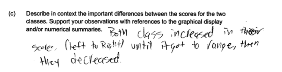
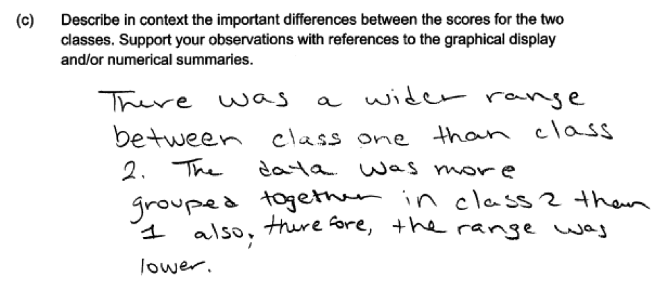
Part (c) asks students to describe differences in the two data distributions. To be considered essentially correct for part (c), a response must describe at least two differences in context and provide support based on the box plots and/or numerical summaries.
Responses that only comment on one difference but provide context and appropriate support are considered to be partially correct for part (c). Students responses that describe two or more differences but which do not provide support based on the box plots or summary statistics are also scored as partially correct for part (b).
Sample responses indicating solid understanding
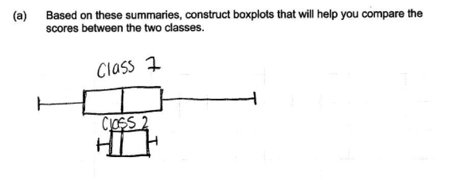
The following student response demonstrates a good understand of the content assessed in this question. In part (a) the boxplots are correctly drawn and are correctly labeled as Class I and Class II. An appropriate scale is also provided. While the response would have been stronger if the scale for the box plots had been labeled as “score,” this response was still scored as essentially correct for part (a).
In part (b), the student notes that the median is the same for the two classes and supports this statement with a reference to the given numerical summaries in the table and to the box plot. The student also addresses overlap with the statement that “Class II’s data is completely inside Class I’s data,” and supports this statement in terms of the minimum and maximum values. In part (c), two differences are described (different IQRs and different ranges) and the given numerical summaries were used to compute the IQRs and ranges. Parts (b) and (c) were both scored as essentially correct and this student response received a score of 4.
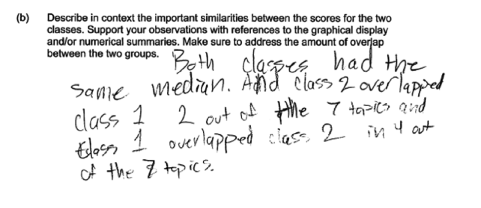
 There were a number of ways that students could address overlap in part (b). For example, consider the following student response to part (b), which describes overlap in the statement “The entire class two scored between class one’s third and first quartile.” Because this response also noted that the two medians were equal, it was considered essentially correct for part (b).
Common misunderstandings
In answering this question, many students had difficulty using statistical terminology correctly. Many student responses also indicated that they did not understand the terms used to identify the numerical summaries provided in this question.
For example, in the following student responses it is clear that the student does not understand the meaning of the terms maximum, minimum, range and IQR as they are used in the table given in this question or how these numerical summaries describe aspects of a data distribution.
Part (a) Construct a box plot using the values in a five number summary
Responses that were not scored as essentially correct for part (a) generally made one of three common mistakes, two of which indicate a lack of understanding of box plots and how the given numerical summaries are used to construct a box plot.
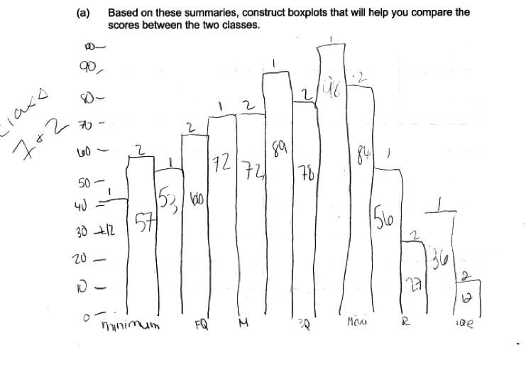
The most concerning of these mistakes is illustrated by the following two student responses. In these responses, students regarded the given numerical summaries as if they were data, interpreting them as actual test scores. These students then used the 7 numbers for each group as data to construct a box plot. Notice that in these responses, the lower whisker in the box plot labeled Class II extends down to 12, which was not the minimum test score but rather the IQR for Class II. Responses like these two were scored as incorrect for part (a).
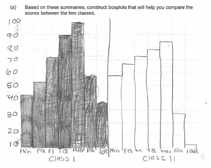
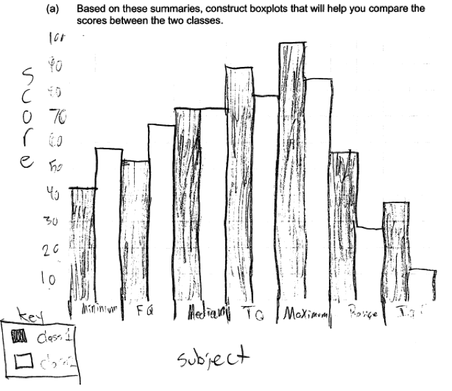
 A second common student error is illustrated by the following three student responses. These responses indicate that the student did not know how to construct a box plot and are typical of responses where the student created some form of bar graph or comparative bar graph using the numbers in the five number summary. All three of these responses were scored as incorrect for part (a).
 A third error that occurred in many student responses was the omission of labels and/or scales in the construction of the boxplots. For example, the following student response was scored as partially correct for part (a) because there is no scale indicated in the response.
Parts (b) and (c)
Use information provided by box plots and numerical summaries to describe similarities and differences for two data distributions.
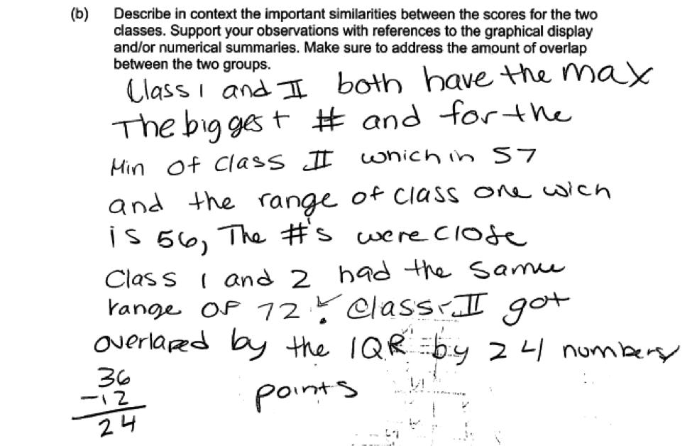
Student responses that were not scored as essentially correct on part (b) or part (c) generally made one of two common errors. To be considered essentially correct, responses needed to describe at least two similarities (part (b)) and at least two differences (part (c)) and provide support based on the given numerical summaries or the box plots. Many students provided only a single similarity or difference. This is illustrated by the following three student responses, which were scored as partially correct.
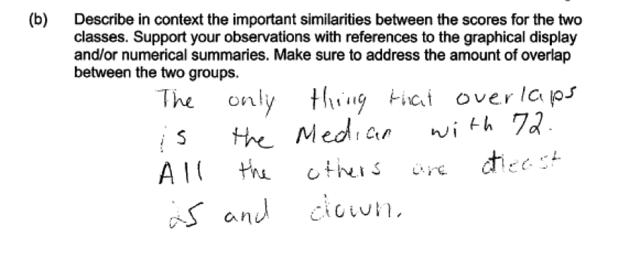
 The second common student error is illustrated by the following two student responses to part (b). In this part, students were specifically asked to comment on the overlap between the two groups. The following responses were scored as only partially correct because they did not address overlap.
Resources
More information about the topics assessed in this question can be found in the following resources.
Free Resources
Common Core Progressions Documents
A discussion of comparing distributions with box plots of Common Core standards 7.SP.2 and 7.SP.4 can be found in the Common Core Tools progressions document for statistics in grades 6 – 8. See the discussion on pages 4 - 5.
Lessons
Statistics Education on the Web (STEW) has peer reviewed lessons plans. Some lessons related to the topic of this question are
Arm Spans. This lesson has students collect data and then use that data to construct boxplots and compare distributions.
Bubble Trouble. This lesson has students collect data and then use that data to construct boxplots and compare distributions.
Classroom and Assessment Tasks
Illustrative Mathematics has peer reviewed tasks that are indexed by Common Core Standard.
A task that involves constructing box plots and comparing distributions is Comparing Test Scores.
Guidelines for Assessment and Instruction in Statistics Education (GAISE)
Published by the American Statistical Association and available online, this document contains a discussion of using boxplots to compare distributions (pages 46 – 48).
Resources from the American Statistical Association
Bridging the Gap Between Common Core State Standards and Teaching Statistics is a collection of investigations suitable for classroom use. This book contains an investigation in which students collect data, construct comparative box plots, and compare distributions. (How Far Can You Jump?, pages 112 – 125). This book also contains an investigation that involves using boxplots to make an informal inference and assessing the degree of visual overlap (How Fast Can You Sort Cards?, pages 126 – 140).
Resources from the National Council of Teachers of Mathematics
The NCTM publication Developing Essential Understanding of Statistics in Grades 6 – 8 includes a section on comparing distributions on pages 42 – 51.The discussion of similarities and differences between distributions is particularly relevant to the content assessed in this LOCUS question. For information see