Question:
The table below shows the number (to the nearest ten thousand) of cars of different colors in Denmark.
| Color of Car | Number |
| Silver | 860,000 |
| Black | 600,000 |
| White | 370,000 |
| All other colors | 620,000 |
Which of the following is appropriate for representing the data in the table above?
(A) Bar graph
(B) Scatterplot
(C) Histogram
(D) Dotplot
Level:
Beginning
Standards
6.SP.4: Display numerical data in plots on a number line, including dot plots, histograms, and box plots.
8.SP.1: Construct and interpret scatter plots for bivariate measurement data to investigate patterns of association between two quantities. Describe patterns such as clustering, outliers, positive or negative association, linear association, and nonlinear association.
Correct answer and commentary
Student performance
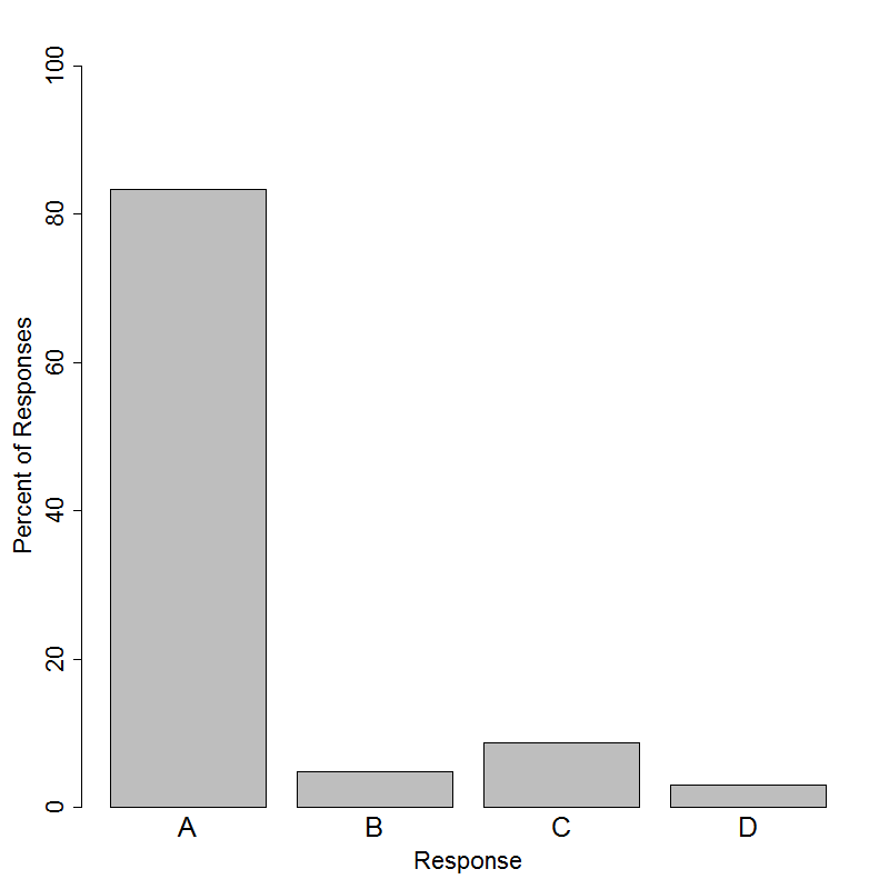
The correct answer to this question is option A. Determining appropriate ways to display data is a fundamental statistical skill. The choice of an appropriate data display requires an understanding of the variable(s) under consideration. There are many types of data displays, and in a given context, there may be several reasonable choices.
In this question, there is a single categorical variable under consideration: color of car. The frequencies for different values of this variable are given in the table.. Of the four choices, only a bar graph - option A - is appropriate for categorical data. Histograms and dotplots - options C and D - are both appropriate ways to display a single quantitative variable, and a scatterplot - option B - is appropriate for displaying two quantitative variables.
It is important for students to recognize that the variable under consideration is categorical even though numbers are present in the table. Note that these data could be recorded and displayed as an extremely long list whose entries were the colors of the cars, e.g. Silver, Black, White, Red, or Blue. Because this list would be quite unwieldly, the counts of each color are summarized in the table. Illustrating that these data could be recorded without using numbers or tally marks may help students understand that actual measurement is a name or category and, therefore, represents a categorical variable.