Your principal would like to know which day of the week students would prefer for a family statistics event. The principal has decided to have all students at the school answer a question about this topic.
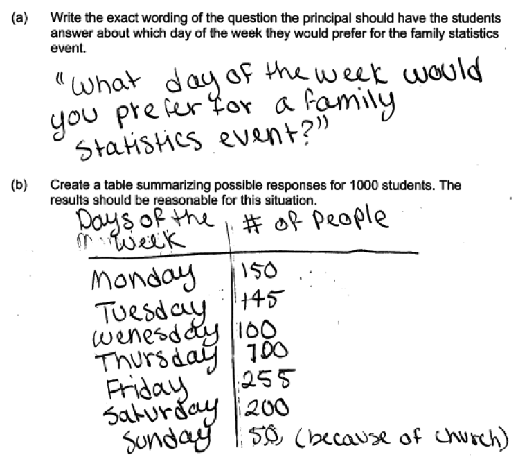
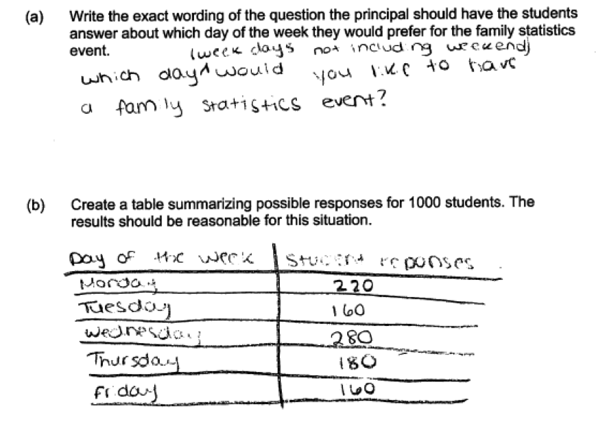
(a) Write the exact wording of the question the principal should have the students answer about which day of the week they would prefer for the family statistics event.
(b) Create a table summarizing possible responses for 1000 students. The results should be reasonable for this situation.
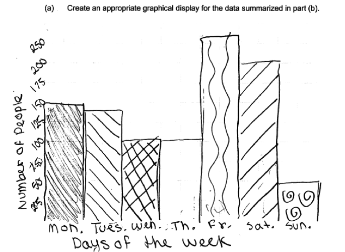
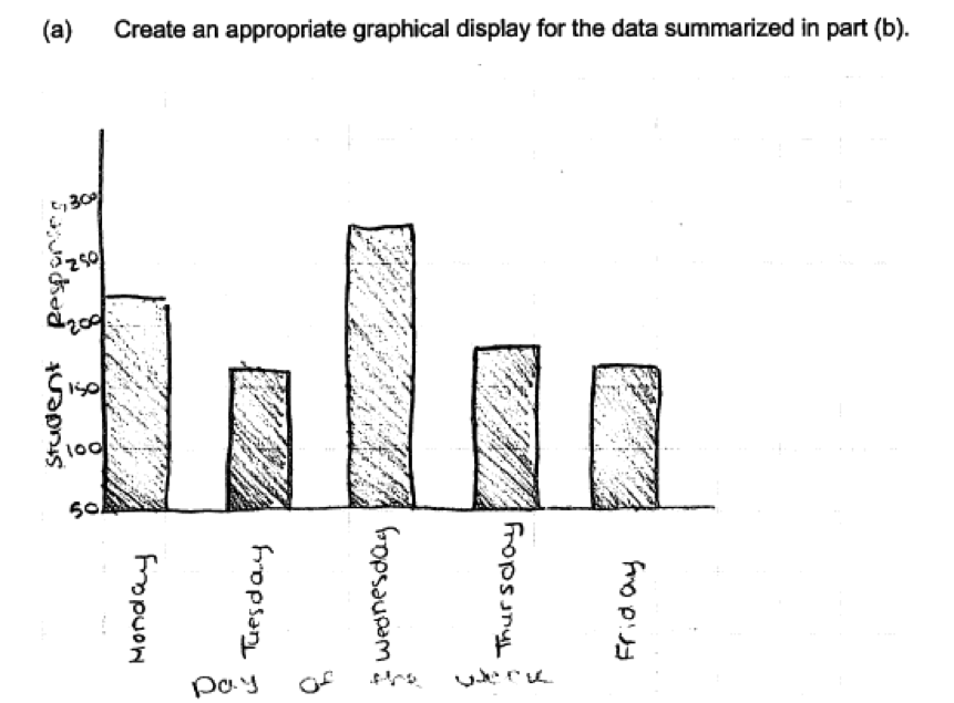
(c) Create an appropriate graphical display for the data summarized in part (b).
Overview of the question
This question is designed to assess the student’s ability to:
1. Write an appropriate survey question (part (a)).
2. Demonstrate an understanding of anticipated variability in responses to a survey question (part (b)).
3. Create an appropriate graphical display (part (c)).
Standards
6.SP.1: Recognize a statistical question as one that anticipates variability in the data related to the question and accounts for it in the answers.
Ideal response and scoring
Part (a):
Part (a) asks students to write a question that could be used as part of a survey. The goal is to collect data so that a school principal could decide which day of the week students at the school would prefer for a family statistics event.
An ideal response to part (a) is one that provides a clearly written question that would result in data that would allow the principal to make an informed decision about when to hold the event. Questions that limit the possible responses to weekdays and excluded Saturday and Sunday are still considered to be essentially correct. Responses that give a question that would result in relevant data but which are incomplete or unclear are considered partially correct.
Part (b):
Because part (b) asks students to create a table that might have resulted if 1000 students were asked the question in the response to part (a), there are many different correct ways to answer part (b). To be considered essentially correct for part (b), the response must include a table listing the possible responses and the counts associated with these possible responses that total to 1000. The counts must also be reasonable for the situation described in that they recognize that there will be variability in the responses to the question. If a student summarizes the responses in terms of percentages rather than count, the response is still considered to be essentially correct as long as the percentages recognize variability in responses and add to 100%.
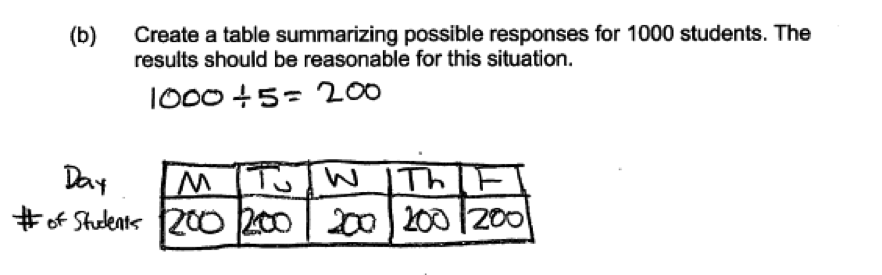
Answers for which the response counts recognize variability but do not add to 1000 (or percentages do not add to 100) are considered partially correct for part (b). Responses with counts that do add to 1000 but which are unrealistic or do not recognize anticipated variability in the responses are also considered to be only partially correct for part (b). Examples of counts that are unrealistic are answers in which all 1000 students select the same response or there are equal numbers of students in each response category (for example, 200 for each of the five weekdays).
Part (c):
Part (c) asks students to make an appropriate graphical display using the data that they provided in their answer to part (b). Because the data are categorical (day of the week), a graphical display appropriate for categorical data (bar graph or pie chart) should be used. An ideal response to part (c) includes a bar graph or pie chart that is correct for the data in part (b) and which includes scales and/or labels appropriate to the type of graph (scale and labels for a bar chart and title and labels for a pie chart).
Responses that do not include scales or labels are considered to be partially correct for part (c). Responses that include a bar graph or a pie chart, but for which the graphical display is not correct for the data given in the answer to part (b) are also considered to be only partially correct for part (c). Responses that attempt to make a graphical display that is not appropriate for categorical data are considered incorrect for part (c).
Sample responses indicating solid understanding
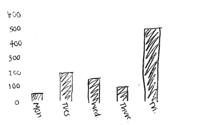
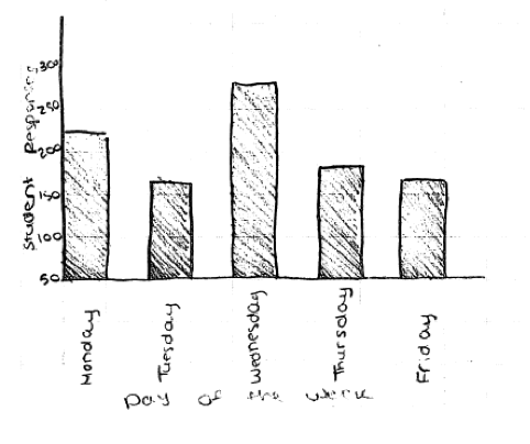
The following student response shows a good understanding of the concepts assessed by this question and received a score of 4. In part (a) the response includes a clearly worded survey question that would result in appropriate data. The table in part (b) lists the possible question responses (the days of the week) and associated counts that add to 1000 and that reflect variability in the responses to the survey question. A bar graph in shown in part (c), and the bar graph is correct for the counts given in part (b) and includes appropriate scales and labels. All three parts of this response were scored as essentially correct and this student response received a score of 4.
The following student response also received a score of 4, and provides an example in which the student limited the possible day of the week responses to weekdays.
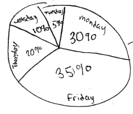
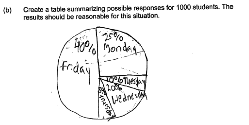
Some students constructed pie charts in their answers to part (c). The following student response shows a pie chart that was considered essentially correct for part (c).
Common misunderstandings
Part (a) Write an appropriate survey question
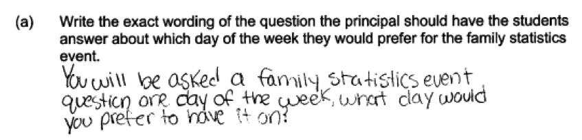
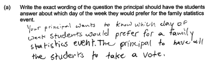
Most students were able to write a reasonable survey question in part (a), but some questions were incomplete or vague. The following two responses were considered to be incomplete as they do not make it clear that the question is asking about day of the week for a family statistics event, and these two responses were scored as only partially correct for part (a).
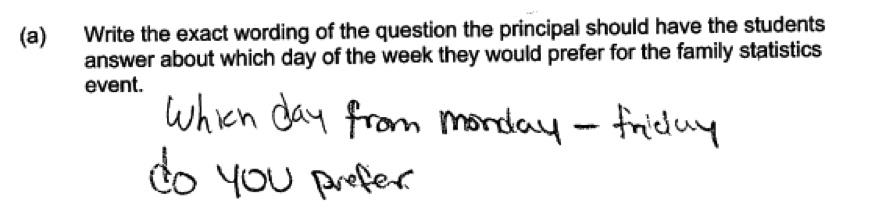
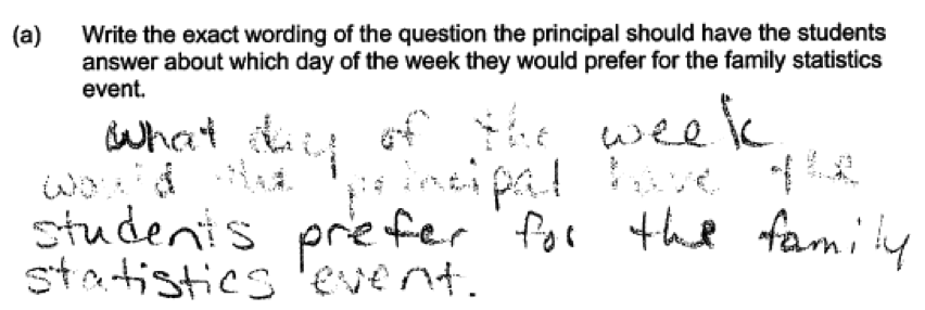
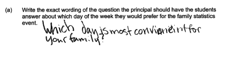 The following three student responses illustrate responses that were scored as partially correct because they are questions that are ambiguous or not clearly worded.
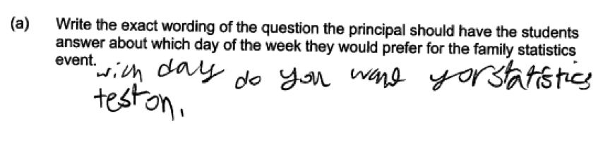
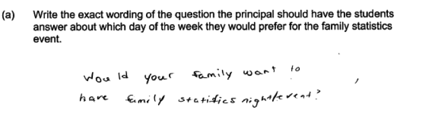
 The following student response was also considered to be only partially correct for part (a)—notice that for this student, a “family statistics event” is a statistics test!
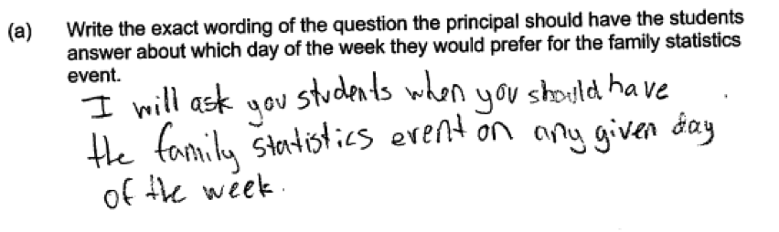
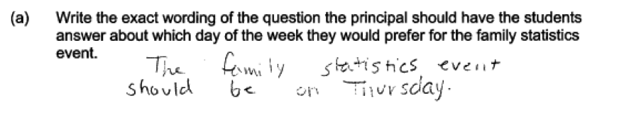
 Another student error in answering part (a) is illustrated in the following two student responses. In these responses, the student does not actually provide a question that could be used in to survey students at the school.
 The final student error observed in responses to part (a) was providing a question that would not result in appropriate data. For example, consider the following student response, which would not provide data on preferred day of the week.
Part (b) Demonstrate an understanding of anticipated variability in responses to a survey question
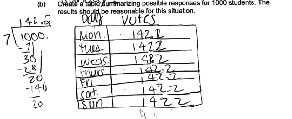
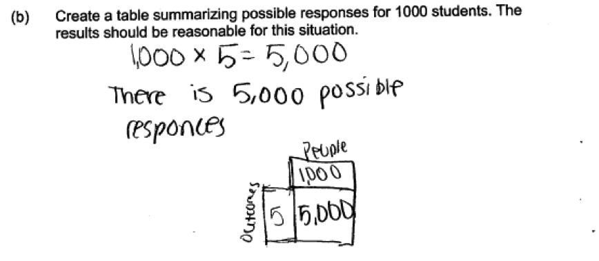
There were several common student errors in constructing the table requested in part (b). The most concerning error was failure to provide realistic counts that appropriately acknowledge anticipated variability in the responses to the survey question. This represents a conceptual misunderstanding regarding the nature of data. This is illustrated in the following two student responses to part (b). These responses were viewed as unrealistic in that the counts given for each possible response are unlikely to be identical when data is collected from 1000 students. These two responses were considered to be only partially correct for part (b).
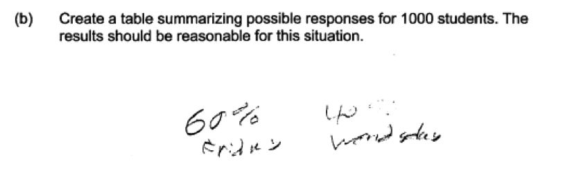
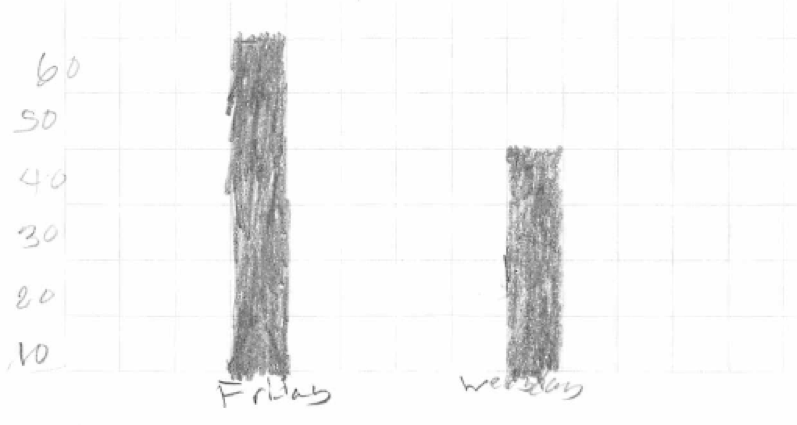
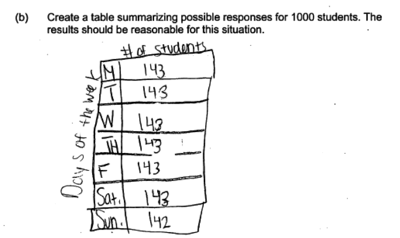 Two additional examples of student responses for which the given table and counts were considered unrealistic are provided by the following student responses. In the first example, only Friday and Wednesday are given as possible responses. In the second example, in addition to having equal counts specified for each possible response, the counts are not integers.
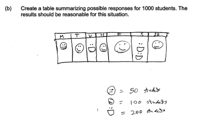
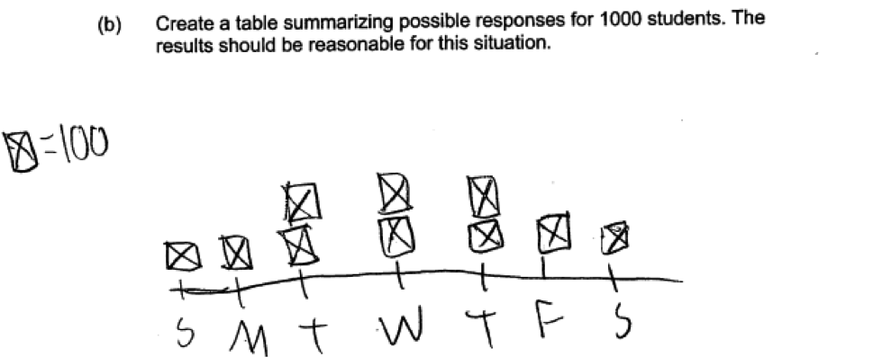
 Another common error in answering part (b) is illustrated in the following three student responses. These responses provided graphs or pictographs in part (b) even though the question asked for a table.
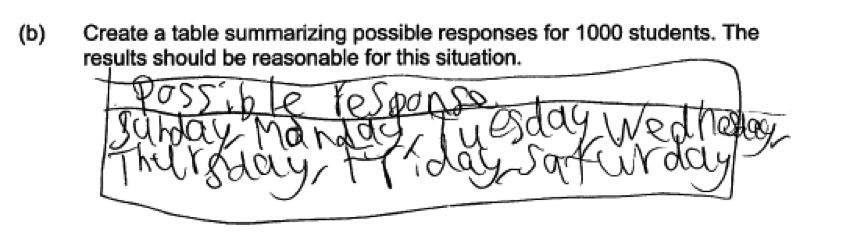
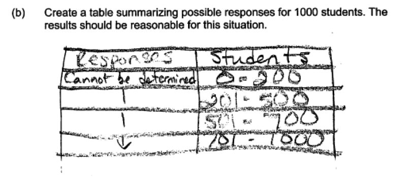
 Some students did not provide complete tables in their responses to part (b), either giving just the possible responses with no associated counts or giving counts without listing the possible responses to the survey question. This error is illustrated by the following three student responses which were scored as incorrect for part (b).
Part (c) Create an appropriate graphical display
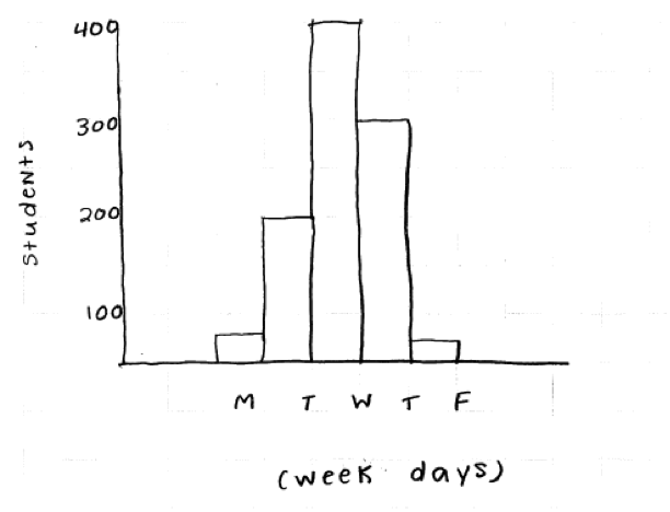
There were several common student errors in constructing a graphical display in part (c). By far the most common error was to omit scales or labels on the axes of chosen graphical display. The following two student responses illustrate this error. Both of these responses do not have a label for the vertical axis and were considered to be only partially correct for part (c).
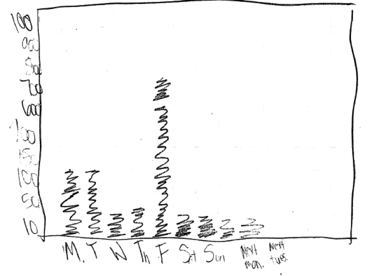
 Some students constructed a graphical display that was appropriate for categorical data, but which was not correct for the data given in their answer to part (b) of this question. For example, the following student response to part (c) included categories that were not part of this student’s answer to part (b) (Next Mon, Next Tues) and the heights of the bars did not correspond to the counts given in the student’s part (b) answer.
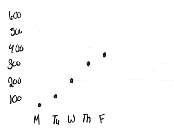
 A surprising number of students attempted to construct graphical displays that were not appropriate for categorical data. Two examples of student responses that illustrate this error and that were scored as incorrect for part (c) follow.

There was also one other common error that was considered minor. While this error did not impact the score on part (c), it is worth mentioning because it occurred often. When constructing a bar graph, many students ran all of the bars in the bar graph together. In constructing a bar graph for the categorical data, the bars that represent categories in a bar graph should be separated (as in the response shown below). While this error (illustrated in the second response below) was considered a minor error and responses making this mistake still received a score of essentially correct for part (c), such responses would have been stronger if the bar graph had been correctly drawn.
Correct Bar Graph (bars separated)
 Incorrect Bar Graph (bars run together)
Resources
More information about the topics assessed in this question can be found in the following resources.
Free Resources
Common Core Progressions Documents
Common Core Tools progressions document for statistics in grades 6 – 8 contains a section titled “Develop Understanding of statistical variability that is particularly relevant to the concepts assess in the Locus question. (pages 4 – 5)
Guidelines for Assessment and Instruction in Statistics Education (GAISE)
Published by the American statistical Association and available online, this document contains an example titled “Choosing the Band for the End of Year Party—Conducting a Survey” that is similar in content to this question. This example can be found on pager 21 – 27.
Resources from the American Statistical Association
Bridging the Gap Between Common Core State Standards and Teaching Statistics is a collection of investigations suitable for classroom use. This book contains a section titled Looking at Data (Section 2) that contains four activities that use bar graphs to summarize categorical data.
Resources from the National Council of Teachers of Mathematics
The NCTM publication Developing Essential Understanding of Statistics in Grades 6 – 8 includes two sections that are particularly relevant to the concepts assessed in this Locus question. There is a section on displaying distributions of categorical data (pages 13 – 18) and a discussion of variability in categorical data (pages 18 – 19).