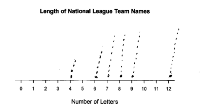
Nathan made the table below for the number of letters in the names of teams in the National Baseball League.
| National League Team Name | Number of Letters |
| Diamondbacks | 12 |
| Cardinals, Nationals | 9 |
| Phillies | 8 |
| Rockies, Marlins, Dodgers, Brewers, Pirates | 7 |
| Braves, Padres, Giants | 6 |
| Cubs, Reds, Mets | 4 |
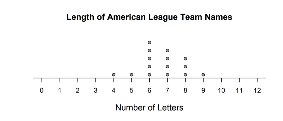
Hannah made the dotplot below for the number of letters in the names of teams in the American Baseball League.
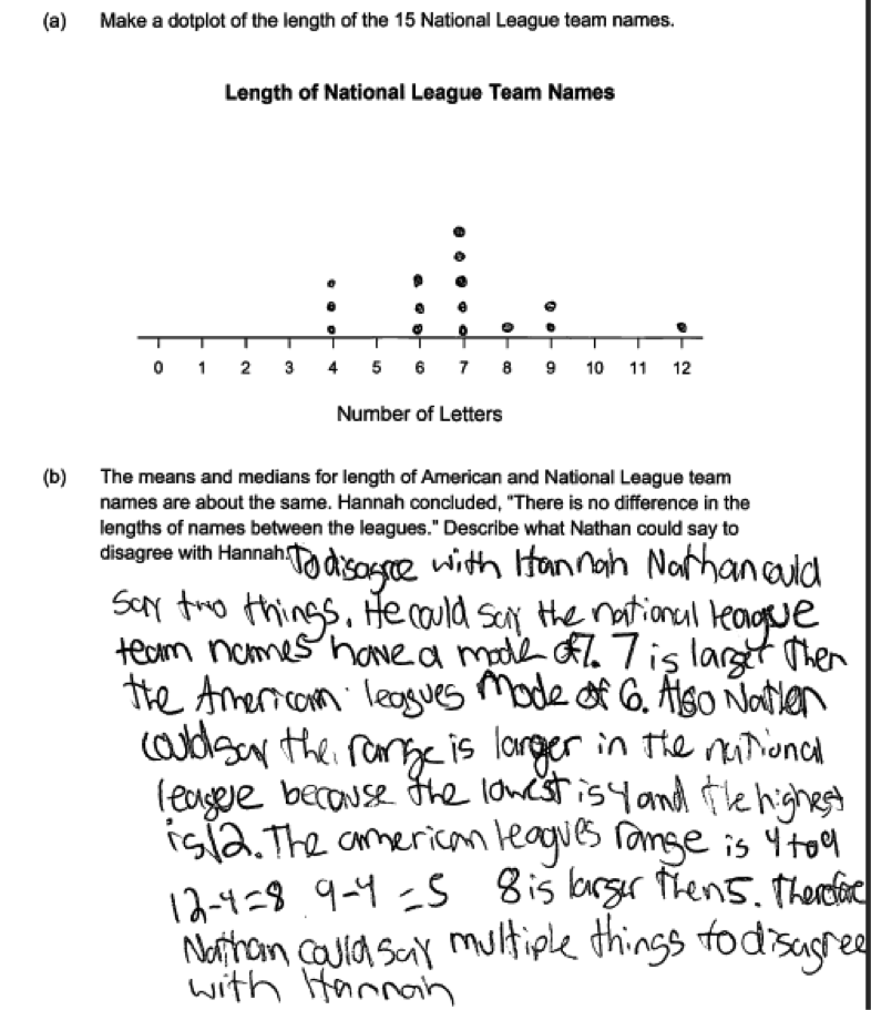
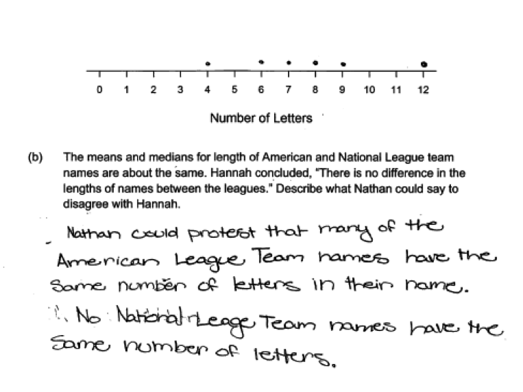
 (a) Make a dotplot of the length of the 15 National League team names.
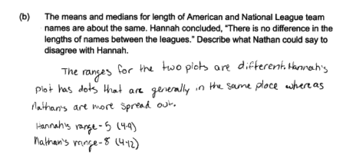
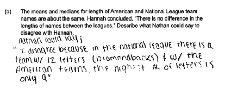
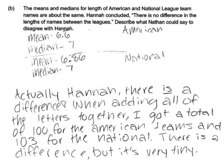
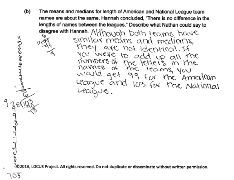
 (b) The means and medians for length of American and National League team names are about the same. Hannah concluded, “There is no difference in the lengths of names between the leagues.” Describe what Nathan could say to disagree with Hannah.
Overview of the question
This question is designed to assess the student’s ability to:
1. Construct a dot plot (part (a)).
2. Recognize that data distributions that are centered in about the same place might still differ in variability or shape (parts (b)).
Standards
6.SP.2: Understand that a set of data collected to answer a statistical question has a distribution which can be described by its center, spread, and overall shape.
6.SP.4: Display numerical data in plots on a number line, including dot plots, histograms, and box plots.
Ideal response and scoring
Part (a):
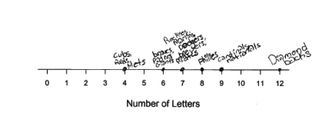
Part (a) asks students to use data on team name lengths (number of letters) for teams in the National Baseball League to construct a dot plot. A dot plot for the team name lengths for teams in the American Baseball League is given, so students have an example that can be used as a model. A labeled scale that students can use to construct the dot plot is also provided. In an ideal response to part (a), students represent each of the 15 data values as a dot placed in the appropriate location along the provided scale. Responses that include errors in the placement of the dots in the plot or that do not represent all 15 data values in the dot plot are considered partially correct.
Part (b):
In part (b), students are asked to respond to a statement that indicates that because the dot plot for American League team name lengths and the dot plot for National League team name lengths are centered in about the same place (the means and medians are about the same for the two distributions), there is no difference in the distributions of name lengths for the two leagues. An ideal response to part (b) demonstrates and understanding that center is only one characteristic of a distribution and that distributions are also described in terms of variability and shape.
Responses that indicate disagreement with the given statement and that justify this by commenting on differences in either spread (pointing out that there is more variability in the name lengths for the National League teams) or shape are considered essentially correct as long as they provide a description of how the spread or shape differs for the two distributions. A response that mentions a difference in spread or shape but does not provide a reasonable description of the difference is considered partially correct.
Sample responses indicating solid understanding
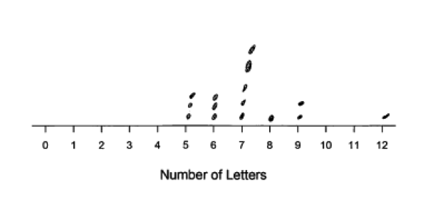
The following student response shows a good understanding of the concepts assessed by this question and received a score of 4. In part (a), the dotplot is drawn correctly and all 15 data values are represented in the dot plot. In part (b), the response correctly points out that the range is greater for the National League teams than for the American League teams and supports this by calculating the value of the range for each group. The response also recognizes that the mode is not the same for the two distributions. This is a correct statement, but the response would have been scored as essentially correct even if the statement about the modes had not been included. Had the response pointed out that the modes were different but failed to include the comparison of the ranges, the response would have been considered as incorrect because it would have failed to address either spread or shape.
 The following two responses were also scored as essentially correct for part (b) and illustrate other ways to word a comparison of spreads for the two distributions.

Common misunderstandings
Part (a) Construct a dot plot
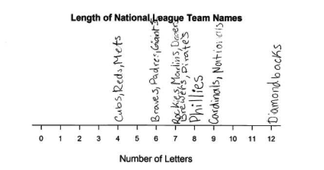
Responses that were not scored as essentially correct for part (a) generally made one of four common mistakes. A few students knew how to construct a dot plot, but misplaced one of more of the dots. This is illustrated in the following student response in which the three dots corresponding to teams with 4 letter names have been shown above 5 rather than correctly placed at 4. This response was scored as partially correct for part (a).
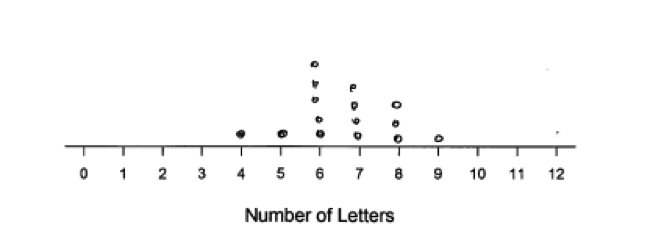
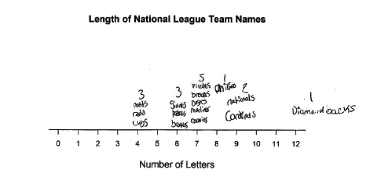
 By far the most common error was made by students who did not take the time to understand the data that presented in the given table. These students took the values in the second column of the table as the complete data set. They did not realize that there were three teams whose names contain 4 letters, three teams whose names contained 6 letters, and so on. This resulted in dot plots like the one in the following student response. Because students producing a dot plot like this one show an understanding of what a dot plot is and how to construct a dot plot, these dot plots were scored as partially correct for part (a).
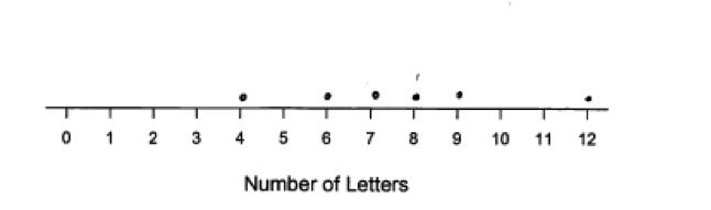 Other students did not read the question carefully and so did not realize it was asking for a dot plot of the data for the National League teams. These students just reproduced the given American League team name length dot plot. The following student response provides an example of this error.
 Finally, a number of students did not seem to know what a dot plot was and did not realize that they could model their plot on the dot plot for American League teams that was provided. These students produced incorrect graphs. In the following student response, the student recognizes that there are name lengths of 4, 6, 7, 8, 9 and 12 but then constructed a plot by putting 4 dots at 4, 6 dots at 6, 7 dots at 7, and so on. This response was scored as incorrect for part (a).
 The following three student responses were also scored as incorrect for part (a), because the display constructed is not a dot plot. Students who constructed displays such as these then had a difficult time answering part (b) because it made it difficult to compare the length distributions for the two leagues.
Parts (b) Recognize that data distributions that are centered in about the same place might still differ in variability or shape
Part (b) asks students to compare two distributions. The most common errors in part (b) are the result of focusing on individual values in each data set rather than considering the distribution as a whole. For example, in the following response, the student focuses on one data value in the American League distribution (5 letters) and points out that there is no team in the National League with a name that has exactly 5 letters. This student is not considering differences in the distributions.
 Other students focused only on the outlier in the National League data set. Again these students are not thinking about the distributions as a whole. This is illustrated in the following two student responses.

 Students who produced an incorrect dot plot in part (a) often had difficulty in answering part (b). In the student response below, because the dot plot was not constructed in a way that showed multiple teams with the same length names, the student incorrectly concludes that the difference between the American League team name lengths and the National League team name lengths is that the American League had some teams that had the same number of letters in their names.
 Even though the questions stated that the mean and median team name lengths for the two leagues were “about” the same, some students chose to focus on the fact that the means or medians were not exactly equal. This is illustrated in the following two student responses, which were scored as incorrect as they did not consider other characteristics of the distributions, such as spread or shape.
Resources
More information about the topics assessed in this question can be found in the following resources.
Free Resources
Lessons
Statistics Education on the Web (STEW) has peer reviewed lessons plans. The following two lessons focus on comparing two distributions. Although these lessons ask students to make the comparison based on box plots rather than dot plots, it would be easy to adapt these lessons to use dot plots.
Classroom and Assessment Tasks
Illustrative Mathematics has peer reviewed tasks that are indexed by Common Core Standard.
A task that involves creating and interpreting graphical displays for numerical data is
A task that has students compare distributions for two numerical data sets is
A task that could be the basis for a classroom discussion of the distinction between center and spread of a data distribution is
Is It Center Or Is It Variability?
Guidelines for Assessment and Instruction in Statistics Education (GAISE)
Published by the American Statistical Association and available online, this document contains a section on comparing groups using numerical data (pages 27 – 30).
Resources from the American Statistical Association
Bridging the Gap Between Common Core State Standards and Teaching Statistics is a collection of investigations suitable for classroom use. This book contains two investigations that involve constructing and interpreting dot plots (Who Has the Longest First Name?, pages 72 – 84 and How Expensive is Your Name?, pages 85 - 97). The first of these investigations uses data on name lengths that is similar to the data on team name lengths in the Locus question. The second of these investigations involves using constructing a dot plot, with a focus on considering the shape of the distribution. There are also two investigations that develop the idea of comparing distributions (How Far Can You Jump?, pages 112 – 125 and How Fast Can You Sort Cards, pages 126 – 140). Although these investigations ask students to make the comparison based on box plots rather than dot plots, it would be easy to adapt these investigations to use dot plots.
Resources from the National Council of Teachers of Mathematics
The NCTM publication Developing Essential Understanding of Statistics in Grades 6 – 8 includes a section on making and interpreting dot plots on pages 19 – 21 and a discussion on identifying similarities and difference between distributions on pages 42 – 51.For information see