A random sample of 10 high school students was selected to investigate the relationship between standardized test scores in 8th grade and GPA (grade point average) in 9th grade.
The scatterplot below shows the relationship between standardized math test scores in 8th grade and GPA (grade point average) in 9th grade.
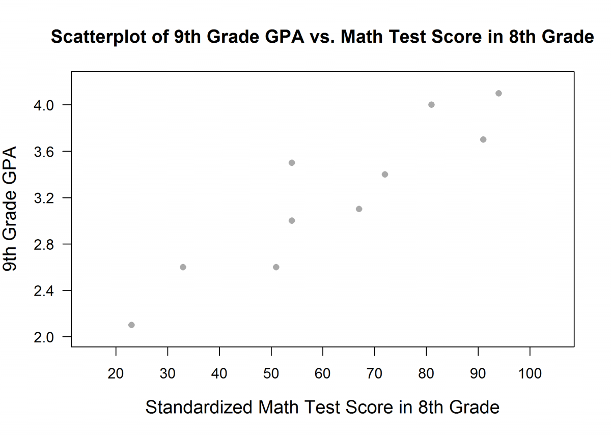
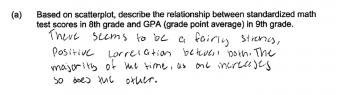
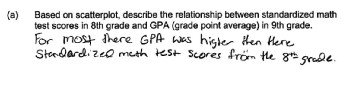
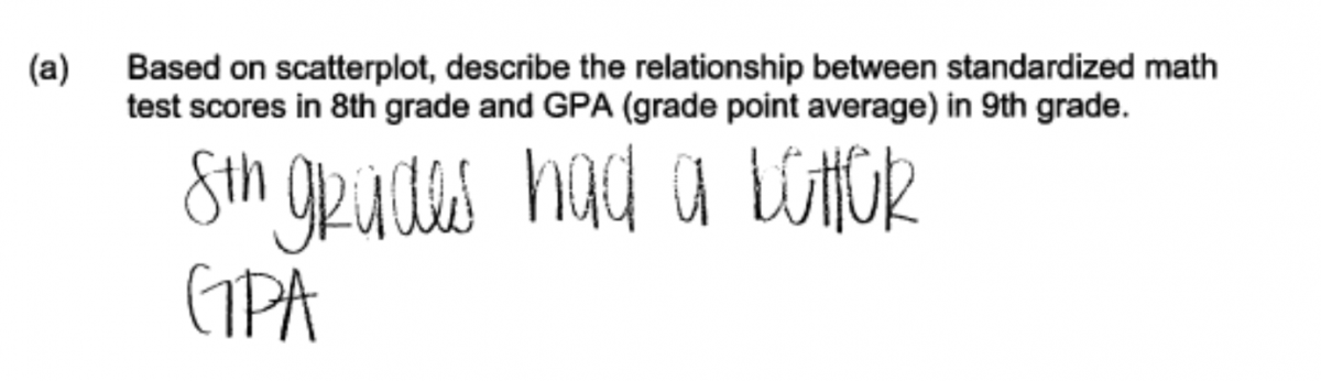
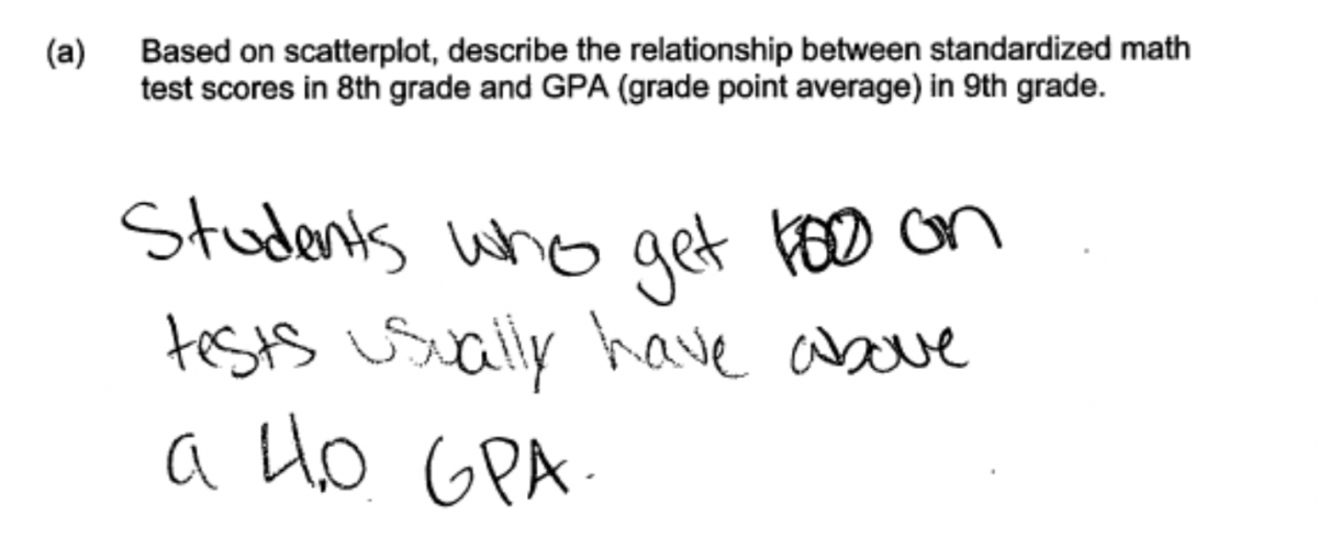
(a) Based on scatterplot, describe the relationship between standardized math test scores in 8th grade and GPA (grade point average) in 9th grade.
For the data on standardized math test score in 8th grade and GPA in 9th grade, the value of the correlation coefficient is r = 0.92. The scatterplot below shows the relationship between standardized verbal test scores in 8th grade and GPA (grade point average) in 9th grade.
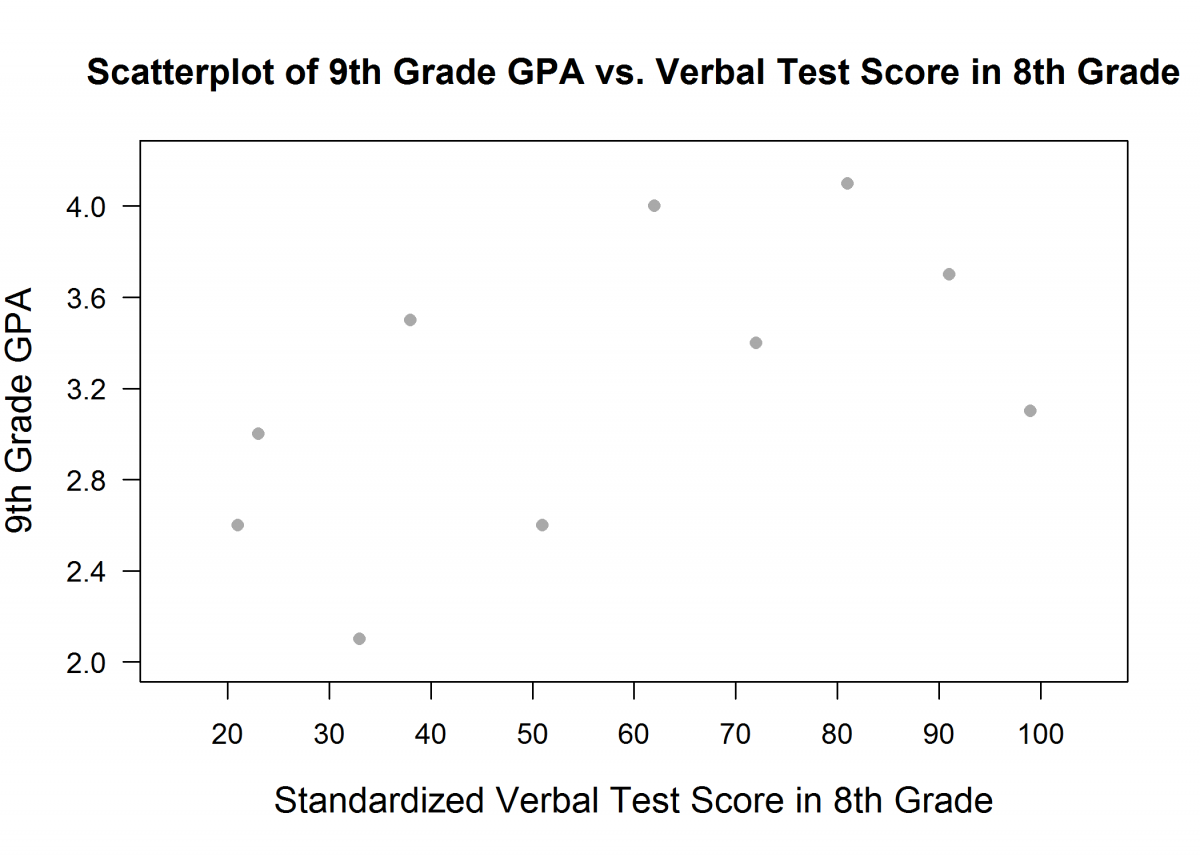
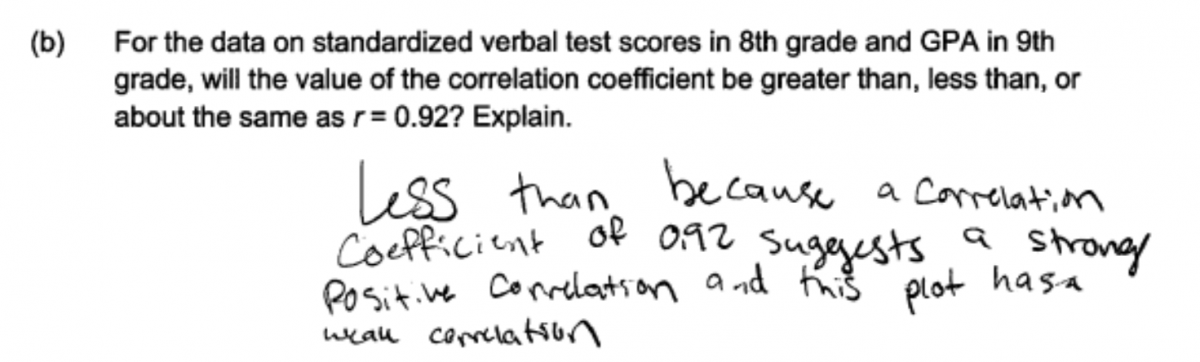
(b) For the data on standardized verbal test scores in 8th grade and GPA in 9th grade, will the value of the correlation coefficient be greater than, less than, or about the same as r = 0.92? Explain.
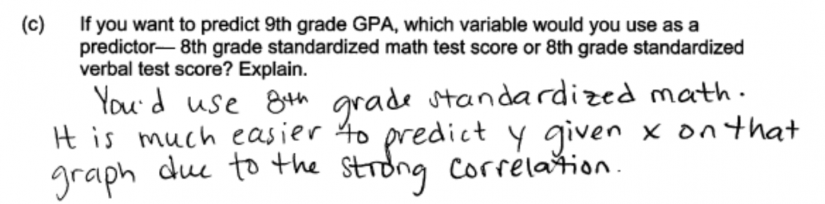
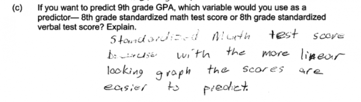
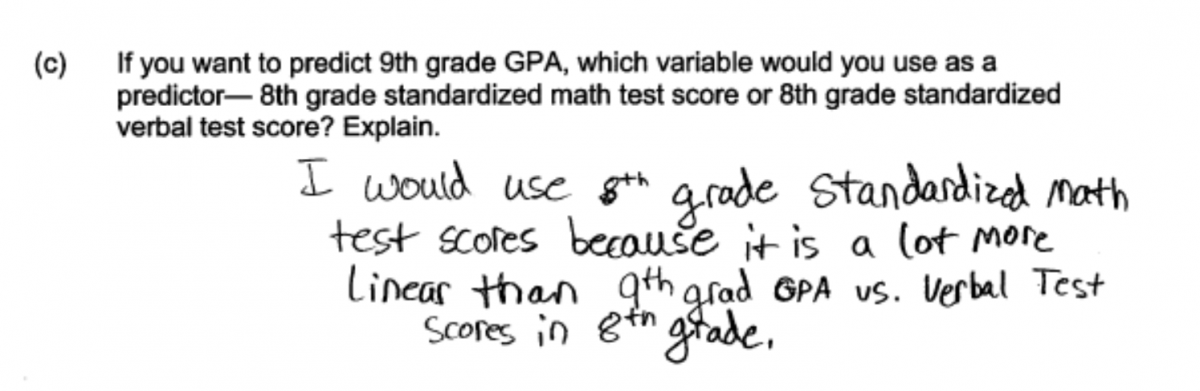
(c) If you want to predict 9th grade GPA, which variable would you use as a predictor— 8th grade standardized math test score or 8th grade standardized verbal test score? Explain.
Overview of the question
This question is designed to assess the student’s ability to:
1. Interpret graphical displays of bivariate numerical data and describe the relationship between two numerical variables (part (a)).
2. Determine which of the two scatterplots represents the stronger linear relationship (part (b)).
3. Describe the relationship between the strength of a linear relationship and the value of the correlation coefficient (part (b)).
4. Choose between two independent variables that could be used to predict the value of a dependent variable and explain how the choice is related to the strength of the relationship between an independent variable and a dependent variable (part (c)).
Standards
8.SP.1: Construct and interpret scatter plots for bivariate measurement data to investigate patterns of association between two quantities. Describe patterns such as clustering, outliers, positive or negative association, linear association, and nonlinear association.
S-ID.6: Represent data on two quantitative variables on a scatter plot, and describe how the variables are related.
a. Fit a function to the data; use functions fitted to data to solve problems in the context of the data. Use given functions or choose a function suggested by the context. Emphasize linear, quadratic, and exponential models.
b. Informally assess the fit of a function by plotting and analyzing residuals.
c. Fit a linear function for a scatter plot that suggests a linear association.
S-ID.8: Compute (using technology) and interpret the correlation coefficient of a linear fit.
Ideal response and scoring
Part (a):
An ideal response to part (a) notes that the relationship between standardized math test score in 8th grade and 9th grade GPA is approximately linear and that the relationship is strong and positive (higher values of 9th grade GPA tend to be paired with higher 8th grade math test scores). The ideal response also includes context—it is not enough to just say “strong, positive, and linear.” This means that the ideal response indicates that the relationship is strong, linear, and positive and is in context. If a response is missing one or two of these four elements, it is considered partially correct for part (a). If it is missing more than two, it is considered incorrect for part (a).
Part (b):
Part (b) asks students to indicate whether the correlation coefficient for the data displayed in the scatterplot of 9th grade GPA versus 8th grade verbal test score would be greater than 0.92, the given value of the correlation coefficient for the data displayed in the scatterplot of 9th grade GPA versus 8th grade math test score. An ideal response to part (b) correctly indicates that the value of the correlation coefficient would be less than 0.92 and provides an explanation based on the fact that the approximate linear relationship in the second scatterplot (GPA versus verbal test score) is weaker than the approximate linear relationship in the first scatterplot (GPA versus math test score). Responses that correctly indicate that the correlation coefficient for GPA versus verbal test score will be less than 0.92 but that provide an explanation that is considered weak or incomplete are considered to be partially correct for part (b).
Part (c):
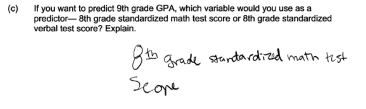
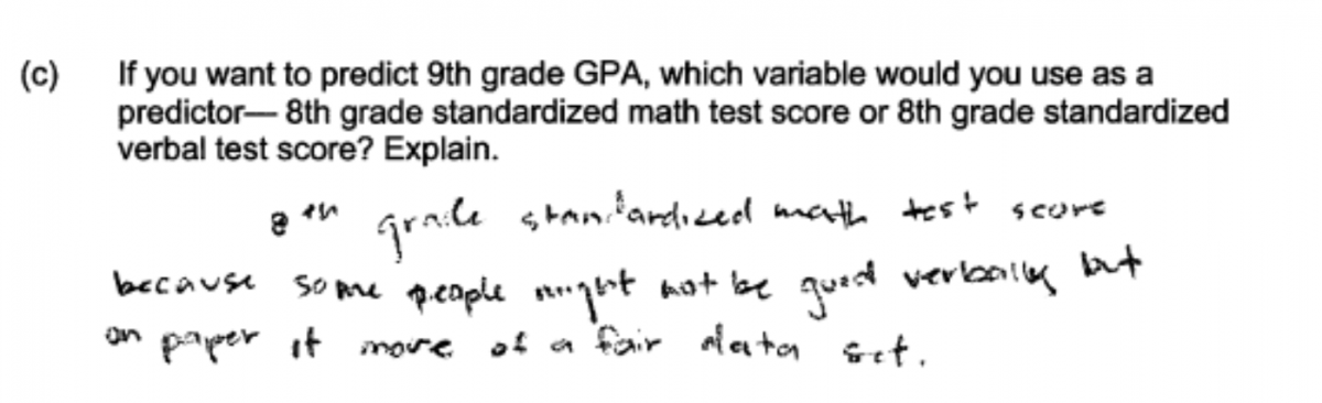
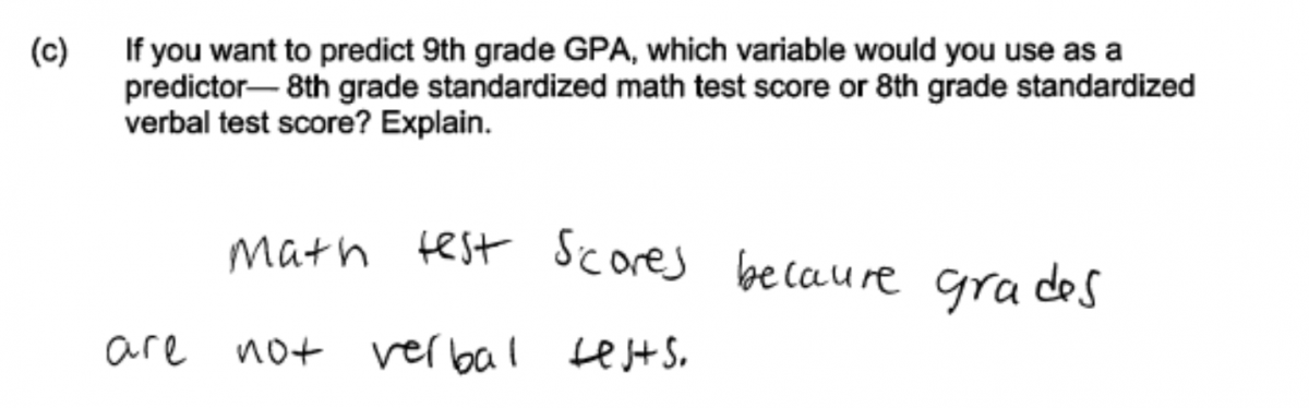
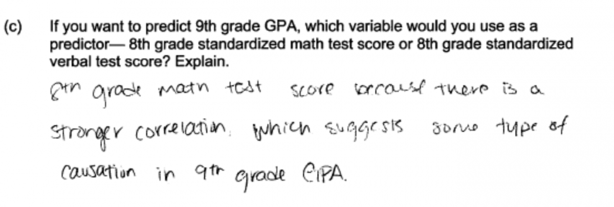
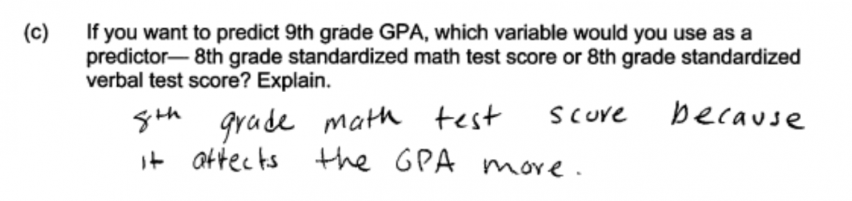
Part (c) asks students to choose between 8th grade math test score and 8th grade verbal test score as a predictor of 9th grade GPA. An ideal response to part (c) chooses math test score as the predictor and justifies this choice based on a comparison of the strength of relationship between 9th grade GPA and each of the two potential predictors.
Responses that choose math test score as the predictor but provide an explanation that is weak or incomplete are considered to be only partially correct for part (c). Also considered partially correct for part (c) are responses that give a good explanation of the role that strength of the relationship plays in making a choice between predictors but that do not actually make a choice. That is, they fail to actually state that math test score is the chosen predictor. Responses that do not include an explanation for the stated choice or that provide an explanation that is not based on the data displayed in the given scatterplots are scored as incorrect for part (c).
Sample responses indicating solid understanding
Part (a):
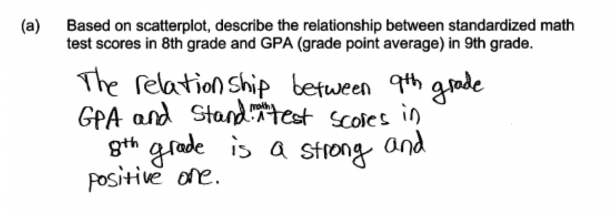
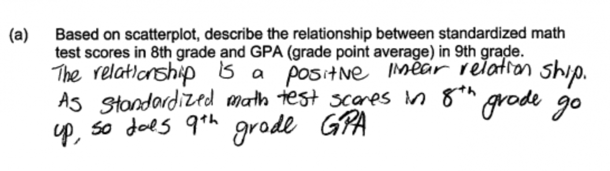
The following two students demonstrate understanding of the concepts assessed in part (a) of this question and both were scored as essentially correct for part (a). Each response indicates that the relationship is linear and also addresses direction (positive) and strength of the relationship. The relationship is also described in the context of test scores and GPA.
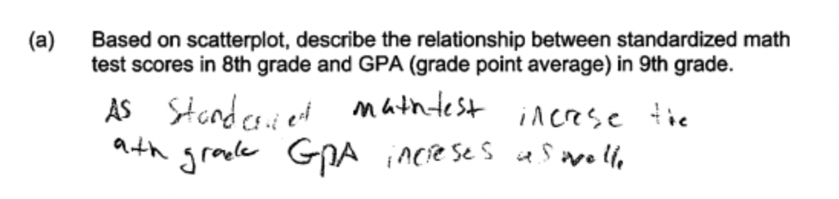
In describing the direction of the relationship, it is acceptable to describe the direction as positive or to describe the direction in words. The response below describes the direction of the relationship in context. This response was scored as partially correct because although it has direction and context, it does not state that the relationship was linear or address the strength of the relationship. When describing relationships in bivariate data, students should think about the form of the relationship, direction, and strength.
Part (b):
There are two ways that students could demonstrate that they understand the relationship between strength of the relationship and the value of the correlation coefficient. The first way was to state that the value of the correlation coefficient for verbal test score and GPA would be less than 0.92 and to justify this choice by noting that the reltionship in the scatterplot for GPA versus verbal test score is weaker than the relationship in the scatterplot for GPA versus math test score. Because the value of the correlation coefficient for GPA and math test score is given as 0.92, the weaker relationship between GPA and verbal test score means that the correlation coefficient for GPA and verbal test score will be less than 0.92. This approach is illustrated in the following two student responses. These responses were both scored as essentially correct for part (b).
Another way to demonstrate understanding of the relationship between strength of relationship and the value of the correlation coefficient is to just note that a value of r = 0.92 implies a strong linear relationship and then to note that the relationship in the scatterplot of GPA versus verbal test score does not apapear to be strong. This would then lead to the conclusion that the value of the correlation coefficient for GPA and verbal test score would be less than 0.92. This approach is illustrated by the following two student repsonses, which were scored as essentially correct for part (b).
Part (c)
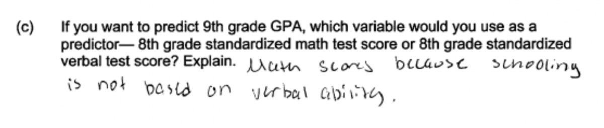
Responses that indicate an understanding of the concepts assessed in part (c) indicate that 8th grade math test score would be the preferred predictor and justify this choice by noting that there is a stronger relationship between GPA and 8th grade math test score than between GPA and 8th grade verbal test score. The three student responses below were all considered to be essentially correct for part (c). Statements such as “strong correlation” and “more linear” were interpreted as meaning stronger relationship.
Common misunderstandings
Part (a): Interpret graphical displays of bivariate numerical data and describe the relationship between two numerical variables.
To be considered essentially correct for part (a), the response needed to describe the relationship in terms of form, direction and strength in context (four components: form, direction, strength, context). By far the most common student error in part (a) was not including all four of the required components.
Many students described the direction of the relationship in context, but neglected to describe strength and form. This is illustrated by the following two student responses, which were scored as partially correct for part (a).
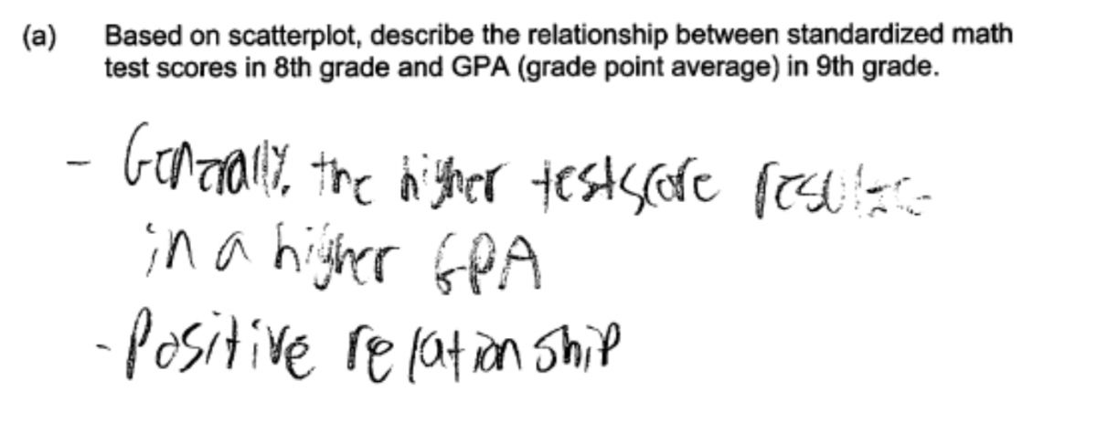
Other student responses included three of the required components, but missed one of them. For example, consider the following two responses. The first response describes strength and direction in context, but does not describe the relationship as approximately linear. This response was scored as partially correct. The second response below was also scored as essentially correct because it describes form and direction (positive linear relationship) in context, but does not describe the strength of the relationship.
While most students did provide a description that was in the context of the problem, a few students did not provide context in their descriptions. This is illustrated by the following student response.
A number of students either failed to describe a relationship or made statements that could not be justified by the given scatterplot. An example of a student response that was scored as incorrect for part (a) is shown below. The statement in this response (Higher the GPA the better) is not based on the scatterplot and does not describe a relationship between 9th grade GPA and 8th grade math test score.

The following three responses are typical of those that were scored as incorrect because they include statements that do not follow from the given scatterplot.
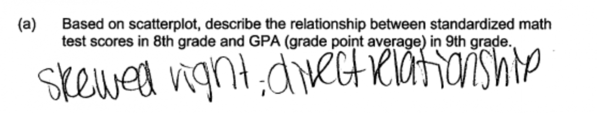
A few student responses revealed that students did not understand that a scatterplot is a graphical display of bivariate data. These students attempted to describe a distribution rather than a relationship between two variables and used terms that are appropriate for describing the distribution of a single numerical variable. This error in thinking is illustrated by the following two student responses that include terms like “normal distribution” and “skewed right”. These responses were scored as incorrect for part (a).

Part (b): Determine which of two scatterplots represents the stronger linear relationship. Describe the relationship between the strength of a linear relationship and the value of the correlation coefficient.
Student responses that were not scored essentially correct for part (b) generally made one of two errors. Some reached a correct conclusion about the value of the correlation coefficient but provided an explanation that was judged to be weak or incomplete. Others reached an incorrect conclusion about the value of the correlation coefficient.
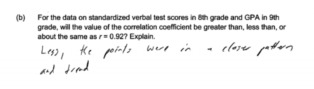
The following four student responses were scored as partially correct because the explanation was weak or incomplete. For example, in the first response below, the student states that “the points were in a closer pattern and trend” but it is not clear whether this statement is in reference to the scatterplot of GPA versus math score or the scatterplot of GPA versus verbal score. Because of this omission, this explanation was considered incomplete and the response was scored as partially correct for part (b).
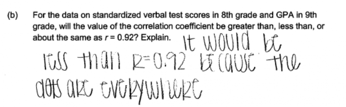
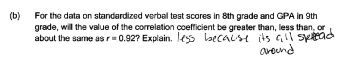
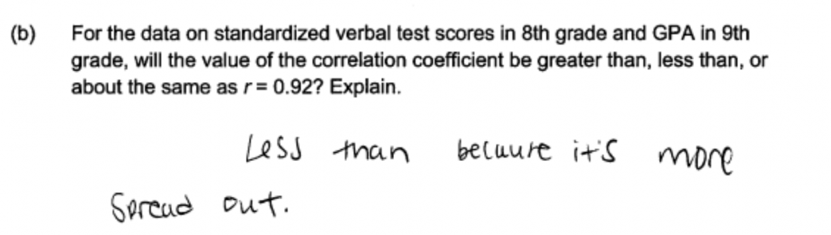
The explanations in the following three responses were considered to be weak and these three responses were scored as partially correct for part (b). These three responses are trying to address the fact that the relationship depicted in the scatterplot of GPA versus verbal test score is not very strong, but the statements “the dots are everywhere,” “all spread around,” and “more spread out” were not considered to be a clear explanation of why the correlation coefficient for GPA and verbal test score would be less than 0.92.
The second common error was made by students who reached an incorrect conclusion about the value of the correlation coefficient. Responses with an incorrect conclusion in part (b) were scored as incorrect.
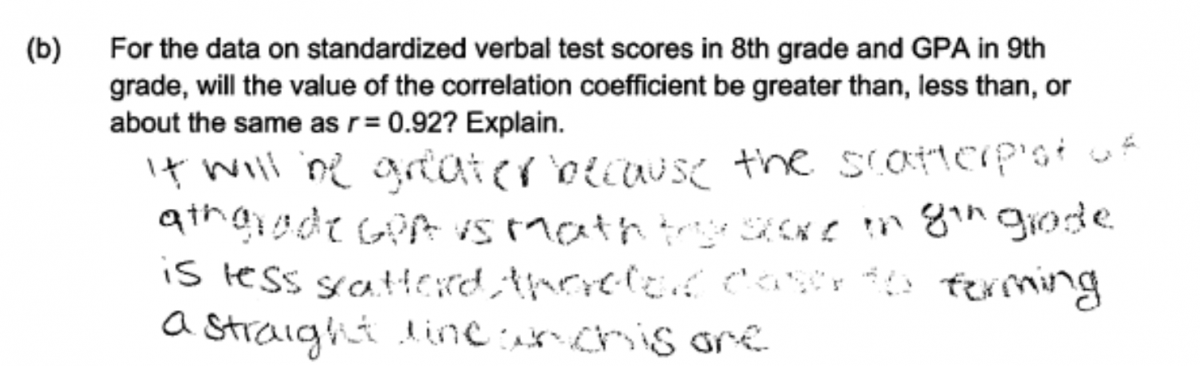
In the following two student responses, the students are confused about the value of the correlation coefficient when there is a weak relationship. In each of these responses, the student incorrectly thinks that the weaker relationship or the greater scatter in the GPA versus verbal test score scatterplot means that the correlation coefficient will be greater than 0.92.

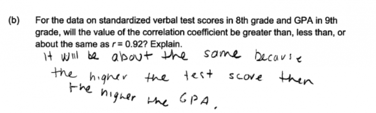
Some students responded that the correlation coefficient for GPA and verbal test score would be about the same as 0.92, the value of the correlation coefficient for GPA and math test score. This error is illustrated in the following two student responses. In the first response, the student confuses direction with strength, indicating that the correlation coefficient will be about the same because the direction of the relationship between GPA and verbal test score is also positive (the same direction as the relationship between GPA and math test score). In the second response, the student incorrectly thinks that the correlations coefficients will be about the same because the two tests (standardized math test and standardized verbal test) are similar.

Part (c): Choose between two independent variables that could be used to predict the value of a dependent variable and explain how the choice is related to the strength of the relationship between an independent variable and a dependent variable.
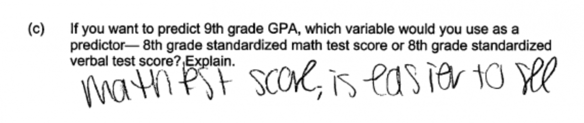
As was the case in part (b), a common student error in answering part (c) was providing an explanation for the choice of potential predictor that was considered to be weak or incomplete. For example, even though a correct choice of predictor variable is made, the following response was scored as incorrect for part (c) because no explanation was provided.
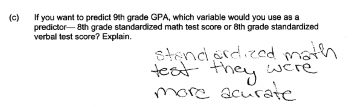
The following two student responses were scored as partially correct and illustrate explanations that are considered to be weak or incomplete.
An error of more concern is that a surprising students provided explanations that were not based on the given scatterplots and the data used to construct them. The following four student responses are based on personal beliefs and were all scored as incorrect for part (c).
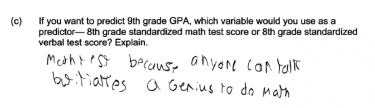
Finally, the following student responses illustrate a serious conceptual error. In each of these two responses, the student interprets the observed relationship in terms of cause and effect. This is not reasonable based on the given data, which were the result of random sampling and were observational in nature.
Resources
Resources
More information about the topics assessed in this question can be found in the following resources.
Free Resources
Lessons
Statistics Education on the Web (STEW) has peer reviewed lessons plans. A lesson related to the topic of this question is:
Classroom and Assessment Tasks
Illustrative Mathematics has peer reviewed tasks that are indexed by Common Core Standard.
A task that involves describing the strength and direction of a linear relationship is:
Guidelines for Assessment and Instruction in Statistics Education (GAISE)
Published by the American Statistical Association and available online, this document contains a discussion of the strength of association between two numerical variables (pages 48 – 49).
Resources from the American Statistical Association
Bridging the Gap Between Common Core State Standards and Teaching Statistics is a collection of investigations suitable for classroom use. This book contains a section on exploring relationships (Section 5). Investigations 5.1 and 5.3 in this section develop the skills assessed in part (a) of this question.
Resources from the National Council of Teachers of Mathematics
The NCTM publication Developing Essential Understanding of Statistics in Grades 6 – 8 includes a section on using scatterplots to display bivariate numerical data and interpreting the correlation coefficient on pages 56 – 62.